No matter how beautiful your landing pages are, it’s the copy that makes the most difference to how effectively a landing page converts visitors. From the headline to the call-to-action (CTA), every aspect of landing page copywriting is fundamental to helping you to achieve your goal of getting leads and sales.
In this guide, we look at how to write landing page content that converts. We also share some best practices and content landing page examples to inspire you.
Before You Build
Of course, before you jump into creating your landing page, it’s important to cover some basics to make sure you’re heading in the right direction. Review the following questions to establish a strong foundation for your landing page:
What is the goal?
If you’re not sure what you’re trying to accomplish, your landing page is never going to perform effectively. And, different goals require different types of landing pages, so you need to determine this early on in the planning stages.
So, do you want to gather email addresses (lead generation) or sell products (sales)? The answer to that question will go a long way toward deciding what to include in your landing page.
Who is my competition?
It makes sense to scope out what your competition is doing for two main reasons:
- You’ll get some great ideas of what you do and don’t want to emulate as you develop your own landing page content.
- You’ll quickly get a feeling for which landing page designs and content are most successful in your field. (Hint: they’re the ones you see popping up most often as you try various search terms.)
Who is my audience?
A clear understanding of your target audience is vital to any successful marketing effort. When it comes to creating high-converting landing page content, you’ll want to tailor each landing page variation you write to just one persona. (Come on, you didn’t think you could just make one and be done, right?)
Bonus points if you can actually personalize the landing page content with the visitor’s name, location, or other details. Many powerful marketing automation tools like Unbounce and HubSpot include this ability.
How did they get to the page?
It’s a given at this point that your landing pages should be optimized for viewing on any size screen. If your visitor arrives at your landing page on their mobile device, they shouldn’t have to zoom in and slide all over the page to read it.
Additionally, the journey from wherever they started to your landing page should be seamless, not jarring. This can be achieved by making sure the copy and visuals in your ads or links are referenced immediately when your landing page comes up.
8 Landing Page Copywriting Tips with Examples
Here are our top tips on how to write landing page content that converts to help you win leads and sales.
1. Write a Compelling Headline
Here’s ‘how to write a good landing page 101.’ Your headline is one of the most important parts of the landing page. That’s because, as Nielsen Norman Group points out, people tend to skim the content of any web page to make sure it’s giving them what they need. This applies to landing pages, too.
The best landing page headlines reassure visitors that they’re in the right place and let them know there’s something worth their while in the page content. If you follow landing page content best practices, your headline will:
- Relate to the copy that brought people to the landing page in the first place, fulfilling the promise of your promotion or post
- Be personal and active – use the word “you” and include a verb
- Address the visitor’s core problem and your solution
- Be clear and easy to see
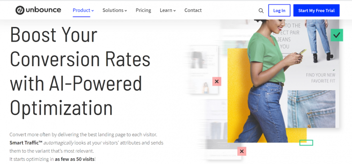
Since headlines are usually short, many people use the subhead to add more information and keep visitors interested. The example below from Unbounce gets a lot of things right (including a few tips I’ll share later in this guide). It:
- Addresses visitors directly
- Highlights the benefit of increased conversion
- Shows that the process is quick and easy (in the copy below the headline)
2. Sell the Experience or Solution
Here’s another tip about landing page content marketing: nobody cares about the features of your product or service, not at first anyway. What they DO care about is whether you understand and can solve their problem. And, they also care about how they will feel when you solve their problem.
That’s why the best landing page copywriting focuses on benefits, rather than features. It’s about what’s in it for your visitor, rather than what you want to achieve. Get the balance right, and you make visitors happy and meet your own business goals. Ideally, your landing page copy will make your visitors’ experience an emotional one, where they understand how your solution will change their lives.
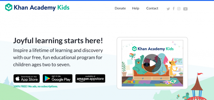
Khan Academy Kids focuses on joyful learning in its headline – who doesn’t want that, right? The copy supports this with words such as “discovery” and “fun.” There’s also a video to reinforce how wonderful the learning experience is.
3. Make Your Landing Page Scannable
Since visitors tend to skim, give their eyes a reason to pause. The headline and subhead are good starting points, but continue that in the copy too. Formatting, such as bold text, gives visitors something to pay attention to, and you can also use bullet points to break up your copy and highlight key information.

In the example above, life coach Thomas Edwards highlights key phrases in bold. These correspond to the pain points his visitors experience.
4. Back Up Your Claims
Another useful landing page content strategy tip is to get specific about facts and figures. The more you generalize, the more shady you look. In contrast, when you cite specific numbers and percentages, your landing page copy is immediately more trustworthy and believable. This backs up your claim that your product or service helps your visitors.
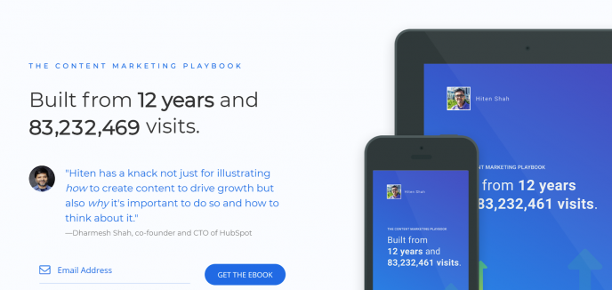
This landing page for the Content Marketing Playbook is excellent. It uses two sets of numbers to impress visitors. First, there’s the number of years its creator has been collecting the information. Second, there are the tens of millions of visitors that support the book’s content. In addition, there’s a simple CTA and a testimonial.
5. Include Testimonials
Related to that, people want to know that others like them trust you. Social proof is a powerful tool. Think about it: when you read positive reviews, don’t they nudge you a little closer to deciding to buy? It’s the same for your landing page visitors.
Customer testimonials improve the trust factor and make visitors more comfortable, so include them. You’ll have to test to see whether a static or video testimonial works best, but one way or another you need a testimonial or two on that landing page.
Let’s return to Unbounce for an example.
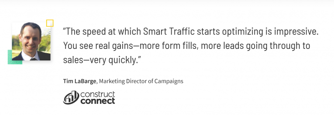
This testimonial is useful because it:
- Includes the name and face of a real person, building trust
- Mentions the benefits
- Builds more trust by adding the logo of a known brand
6. Use Plain Language
That same Nielsen Norman research shows that clear, concise content wins over flowery words and phrases every time. Use obscure language and you lose your visitors before they have time to convert.
The best landing page content keeps it simple. Depending on the context, you can do this by:
- Addressing visitors directly, using “you”
- Using everyday language
- Using short sentences
- Being conversational
The more you write like a person talking to another person, the more likely your landing page will convert. Oh, and don’t be afraid to break a couple of pedantic grammatical rules – that’s how real people talk.
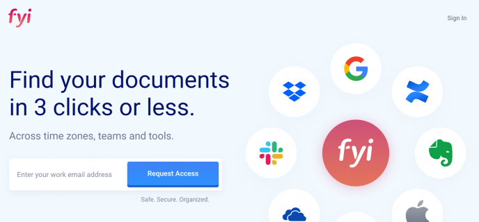
You can’t get much plainer language than the example above from FYI. Here’s what it does right:
- Uses the headline to address the visitor’s pain point (not being able to find stuff)
- Shows key integrations in an image, and backs it up with the subhead copy
- Qualifies visitors by asking for a work email address
- Adds additional benefits just under the CTA button, which draws the eye
7. Close the Deal With Your CTA
The CTA is where you ask landing page visitors to take action. That’s why nailing the CTA is one of the most crucial landing page best practices. The thing is: if you don’t ask, you won’t get. So, not only do you have to make sure all your landing page copy and images support the CTA, you also have to ask your visitors to act.
CTA button copy is usually short, so every word counts. Depending on the situation, you’ll likely use a verb or address the reader directly, along with a time-based word, if it’s appropriate.
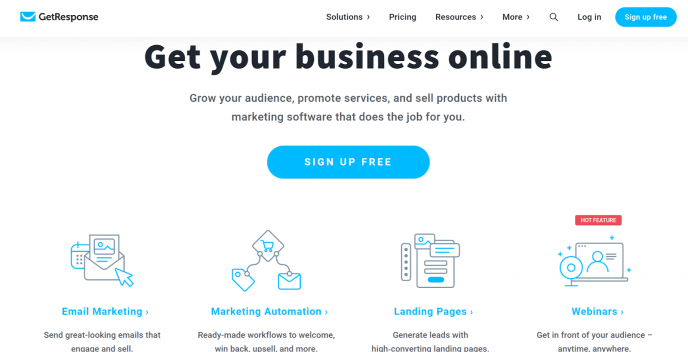
This landing page from GetResponse works because it:
- Addresses its visitors’ key priority – marketing their business online
- Includes a subtle CTA in the headline
- Has a simple CTA that emphasizes that there’s no cost, minimizing risk
- Repeats the CTA at the top of the page, so visitors have two chances to click
8. A/B Test Your Copy
Finally, running landing page tests is an essential aspect of landing page copywriting. It’s the only way to be sure your copy gets the best results. A/B testing is a useful conversion optimization tool that lets you change one element at a time to see which version of a landing page gets better conversions.
You can use Taboola as an A/B testing tool for your landing page copy, looking at options for headlines, videos, and more.
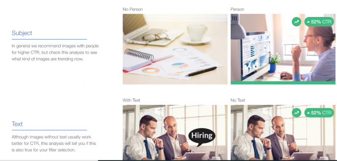
Once you figure out which element works best, move on to test other parts of the landing page till you have the perfect combination.
Landing Page Content Examples and Ideas
Here are some more examples of landing pages that are doing it right.
Shopify
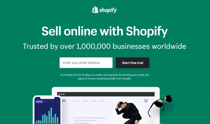
Shopify’s growth over the last few years has been absolutely staggering. And, there’s no doubt that their reliance on clean and simple landing pages like this one factor into that success.
- The headline is short, sweet, but powerfully targeted to the prospective owner of an ecommerce store.
- Social proof that’s hard to argue with (“trusted by over 1,000,000 businesses worldwide”) is prominently above the fold while a testimonial rounds out the page at the bottom.
- The call-to-action is clear and emphasizes a frictionless, risk-free opportunity to explore.
Airbnb
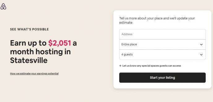
This example marries simplicity with clever personalization to create a truly compelling CTA above the fold. Once someone fills out the form — likely out of curiosity more than anything else — they’ve already started their actual listing, moving them quite a ways further down the sales funnel on the first click. Of course, for anyone who hesitates to do so, the rest of the page is packed with reasons to believe and social proof.
- Clever use of location data to create a dynamic, personalized headline that focuses on the prospect’s key desire (how much can I earn?) and prompting them to fill out the form immediately.
- Effective use of page design to build the full story, putting the prospect at ease with a focus on how easy it is to be a host and backing that up with tons of available support and social proof from current hosts.
Bills.com
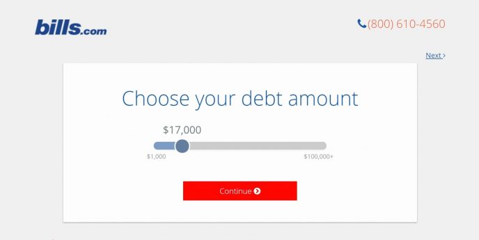
Once again, simplicity and instant engagement make this landing page tough to ignore when the target audience finds their way to it. By doing the only thing they can do on this page, the visitor moves quickly through a very brief survey, ending up with a highly-personalized outline of what the Bills.com service can do for them.
- Very minimal design – there’s literally nothing for the visitor to do but move down the funnel as designed.
- Highly personalized in that the visitor is building their own argument for a buying decision as they move through the survey.
Webprofits
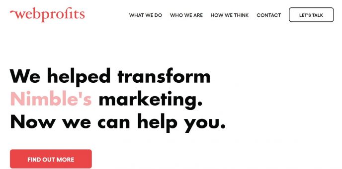
The Webprofits landing page uses social proof as the lead attention grabber and supporting elements to earn a click.
- The uniquely engaging headline cycles through a long list of satisfied clients, providing instant cred and curiosity.
- The only other element on the page besides the headline and CTAs is a scrolling list of powerful testimonials that back up the headline’s messaging.
How to Build a Landing Page
At its core, a landing page is simply a content page with a laser focus on the CTA. That could be a “buy button,” a lead capture form, a “make an appointment” opportunity, or literally anything else. The only thing it can’t be is unclear. You can build a landing page in any website building platform or software, from WordPress to Wix and everywhere in between.
However, there are tools out there that can really turbocharge your landing page creation, optimization, and conversion rates. Some of the most popular include Unbounce, Instapage, Leadpages, Lander, and Landingi.
Conclusion
If you’re wondering how to generate leads, landing page copywriting is a good starting point. The landing page content examples above show how your headline, subhead, copy, testimonials, and CTA work together to attract and convert visitors. Now, it’s over to you to get started with your own landing page content.