Landing page optimization is crucial for engaging consumers in advertising campaigns—especially as marketers work to optimize messaging to align with today’s rapidly changing climate.
By optimizing your landing pages you increase conversions and keep customers on your website, where they continue to learn about your products and messaging, no matter the environment.
This article explores why landing page optimization is important. It also highlights key landing page optimization case studies, tactics, and tools publishers can use to build more effective user experiences.
The Advertiser's Launch List for Landing Pages that Convert
What Is Landing Page Optimization?
Landing page optimization is the process of improving design, layout, navigation, imagery, and messaging on a landing page. Publishers can use consumer data, behaviors, and surveys to understand which components of their landing pages need updating.
There are also different types of landing pages that publishers can use and optimize, including splash pages, squeeze pages (designed specifically to capture email addresses), sales pages, referral pages, and thank you pages.
Splash pages, for example, are for completing a specific goal, such as asking a consumer to verify their age or choose language preferences.
Why Is Landing Page Optimization Important?
Landing page optimization is important for improving conversion rates, generating leads and sales, and conveying important messages from your publication or brand. Optimization creates a more intuitive and seamless experience for the person who visits your landing page after clicking on an ad.
There are ways to create landing pages that yield more conversions. A high-converting landing page includes features such as call-to-action (CTA) buttons, easy-to-use navigation tabs, and clear and concise headlines. By driving more conversions from your landing page you derive more value from your ad spend and decrease the costs of customer acquisition.
Landing Page Optimization Tactics
Landing page optimization doesn’t have to intimidate or confuse. Let’s look at ten key landing page optimization tactics you can use to increase conversions:
1. Keep Design Simple
Avoid overwhelming landing page visitors with too much content and information. Choose one core message and build your page around that. This means keeping the page design minimal by incorporating white space or negative space and using single-column layouts with just enough text to get your message across.
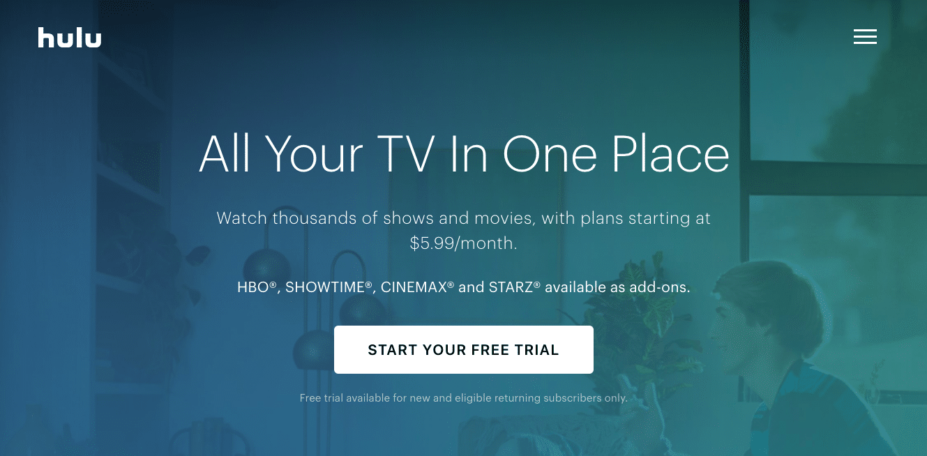
Take this welcome page for potential Hulu customers; it uses one background image, muted with a colored filter, and crisp, white text presenting a straightforward offer.
2. Utilize CTA Buttons
Your landing page must have a clear purpose. Most often this is inviting visitors to complete a simple action, such as signing up for a newsletter, downloading a brochure, accepting a special offer, or starting a free trial. To make your offer obvious, describe it in your CTA button.
Target, for example, includes a clear CTA above the fold of its product landing page for women’s clothes: 30% off selective dresses online. Visitors just have to click “Get the deal” to learn more or start shopping.

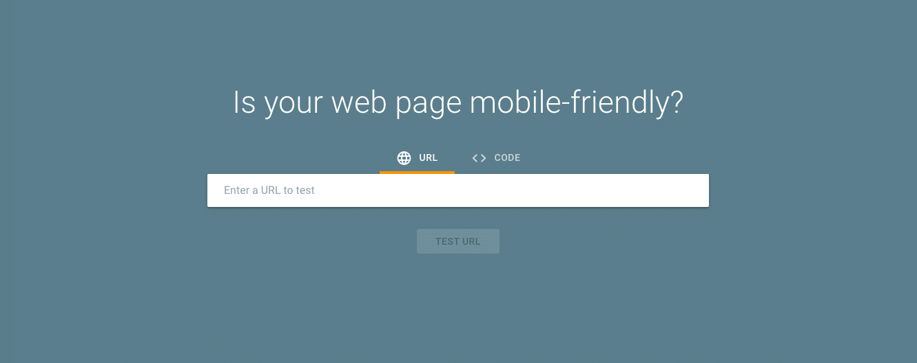
3. Make it Mobile-Friendly
You must optimize your landing pages for mobile devices. Mobile Internet usage surpassed desktop back in 2016—meaning most people access digital content on their phones and tablets—and mobile dependency continues to grow.
Publishers must ensure their mobile landing pages load quickly and properly across devices. They should also include images, text, and video that aren’t warped by smaller screen sizes. Use Google’s Mobile-Friendly Test to see how easily visitors can access and use your landing page on a mobile device.
4. Include Customer Testimonials
In a time when consumers are losing trust in brands and publishers, it’s important to provide testimonials from satisfied customers who speak on behalf of your product. In fact, 91% of people read online reviews and 84% trust those reviews as much as personal recommendations.
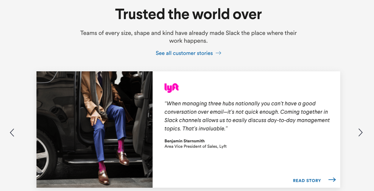
Slack, for instance, includes quotes from happy clients who’ve had positive experiences using its platform. It even includes a CTA inviting visitors to read more about the customer’s story.
5. Add Social Share Buttons
Customer engagement doesn’t have to end once a visitor leaves your website. Include social share buttons to inspire visitors to share what they’ve learned or earned on your landing page.
Put these buttons in the top or bottom navigating bars of your page, so as not to distract customers from completing your main CTA.
6. Ensure Continuity with Ads
If people are accessing your landing page via an ad, you must deliver what’s promised in that ad on your landing page.
To create a more seamless and intuitive customer experience, the visual elements of your ad should also be continuous with those on your landing page. If your ad shows a certain product, for example, the landing page should include more information about that product or a link to purchase it.
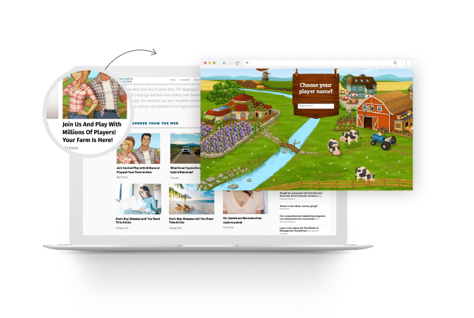
Game development company Goodgame Studios, for example, launched native ads inviting new users to register for one of its games.
Ads included a screenshot of characters from the game with headlines such as, “Join Us and Play With Millions of Players!” One click took users to a landing page for the advertised game, where they could sign up and start playing right away.
7. Place Important Features above the Fold
Unlike a print page, there is no physical ‘fold’ on a webpage. Digital marketers and publishers refer to ‘above the fold’ as the part of a webpage visitors see before they have to begin scrolling.
The question is: What do you want users to see before they take an action on your landing page?
The answer is: The most important information. This usually includes an engaging and illustrative image, headline, text, and a CTA.
By placing important features above the fold, you get your main message across quickly. Once you’ve hooked users, they can decide if they want to keep scrolling to learn more.
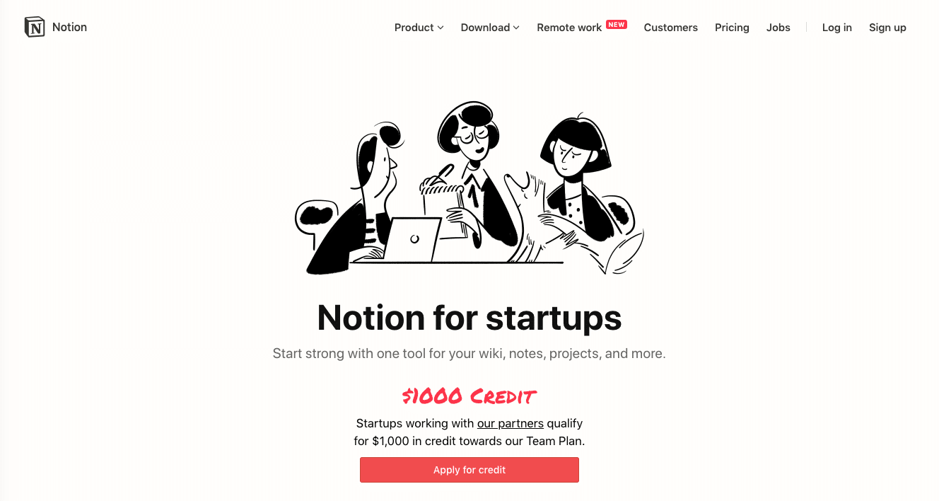
Notion, a note-taking app, uses this tactic on its landing page for startups. It includes a simple but strong description of its product and even a special offer. If visitors decide to scroll down, they’ll see an interactive walkthrough of Notion’s features, customer testimonials, and an FAQ section.
8. Incorporate SEO Keywords
Search engine optimization (SEO) makes your landing page more easily discoverable by users searching for relevant terms.
If you sell tennis rackets, for example, you’ll want to see which search terms potential customers are using.
Use SEO research tools such as SpyFu or SEMrush and discover that many people are searching for the term “blue control tennis racket,” for example, then you can launch a landing page incorporating this term making it more likely to show up in search results.
9. Use Concise Copy
Make your landing page copy straightforward and to-the-point. You can offer more information later through additional product pages, downloads, or email newsletters. When you want visitors to complete a specific goal, align all text towards that goal and keep it brief.
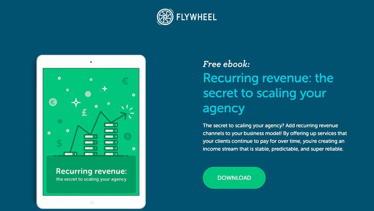
This landing page for an ebook from Flywheel, for instance, includes an offer, ebook title, and short description—just enough information to entice the reader and motivate them to click “Download.”
10. A/B Test Key Elements
A/B testing is fundamental for landing page optimization. Don’t guess which elements of your landing page work best, test them against each other and let your audience data tell you.
You can conduct a landing page test to see which CTA drives more clicks: “Download now” or “Get your free ebook,” for example. Or you can run a test to see if a white background or a blue background keeps consumers on the page for longer.
The number of potential A/B tests you can run is near limitless. Test images, headlines, copy, colors, buttons, layout, or page length, but only test one element at a time for clear results.
Landing Page Optimization Case Studies
These landing page optimization case studies provide practical insights about which tactics work best and how they look in action. Use these optimized landing page examples to guide you.
PANDORA Increases Conversions by 130%
Jewelry brand PANDORA ran native advertising campaigns to boost brand awareness and customer acquisition in France. Its native ads sent people to landing pages featuring glossy, high-quality, distraction-free images of relevant products from the advertised collection.
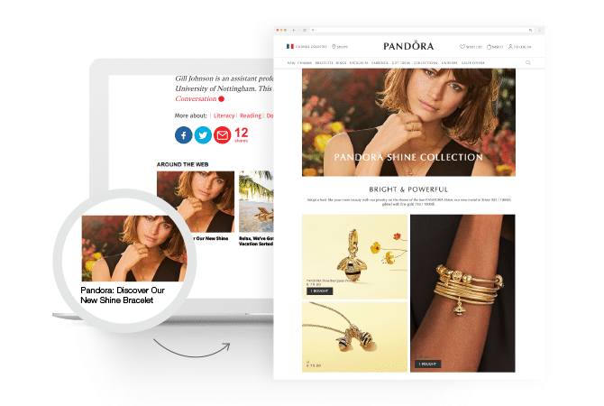
As a result, visitors spent an average of 217 seconds on the site and PANDORA increased its conversion rate by 130%.
AIG Israel Uplifts Purchase Intent by 30%
American International Group, Inc. (AIG), a leading global insurance corporation, launched video ads to educate its Israeli consumers about its products and improve purchase intent. Once users completed the videos, they were retargeted with sponsored content—a landing page that prompted them to speak with a representative.
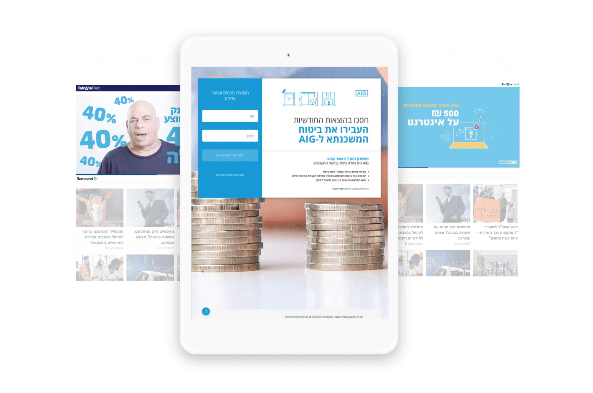
The landing page used a simple and sleek design and a clear CTA inviting visitors to take the next step in the customer journey. The campaign reached 400,000 people and uplifted purchase intent by 30% in just 30 days.
Novartis Drives 133% Year-over-Year Increase in Leads
Novartis, a global healthcare company, launched sponsored content to increase brand awareness and quality leads. The sponsored content led consumers to an engaging landing page that included an interactive quiz about a specific health condition. The quiz ended with an invitation to sign up and learn more.
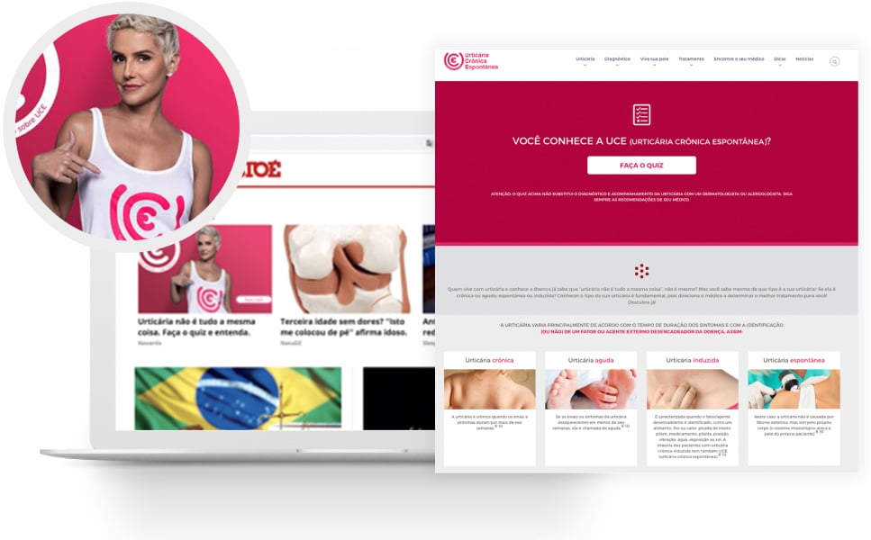
The campaign yielded a 133% year-over-year boost in quality leads for the company, and the quiz provided Novartis with valuable information about its target audience.
Landing Page Optimization Tools
Data collection and audience communication are crucial to landing page optimization. Here are seven landing page optimization tools publishers can use to enhance and simplify these processes.
1. Intercom
Intercom allows publishers and brands to consistently collect feedback from customers. You can use these insights to develop more effective messaging and A/B test experiments.
2. UserTesting.com
UserTesting.com connects brands and publishers with a global panel of ‘testers’ who provide real-time analyses and written reports on your website. You can use these qualitative insights to improve landing pages and acquisition strategies.
3. Taboola Title Analyzer
Taboola Title Analyzer, part of Taboola Trends, helps you find the best-performing titles and headlines to optimize your campaigns. Enter your copy into the “Test My Title” field and receive a forecast of how it will perform, including whether it’s predicted to yield a low CTR or a high CTR. Taboola Trends also includes other landing page optimization tools, such as real-time insights for creating higher-converting images and videos across verticals.
4. Ethn.io
Ethn.io lets you build a testing panel of your own website visitors based on audience personas and target segments. You can use these panels to A/B test headlines, images, and CTAs, yielding a more data-informed landing page.
5. CrazyEgg
CrazyEgg is a heat-mapping software that shows how and where audiences are engaging with your website pages. Its scroll maps also reveal how much of your pages are read. You can use this information to see which landing page features are driving more engagement, and then optimize your layout and design to better accommodate user behavior.
6. Optimizely
Optimizely is an A/B testing platform that lets you experiment with different types of landing page content. Test value propositions, formats, copy, and imagery to understand what your audience wants.
7. SumoMe
Sumo is a suite of free tools that helps you gauge landing page performance, drive email sign-ups, and generate leads. Features include content analytics, contact forms, and sharing buttons to keep audiences engaged with your brand or publication, even after they leave your landing page.
Landing Page Optimization Checklist
Creating content that converts is a multi-step process. Use this landing page optimization checklist to ensure you’re hitting all the key points:
1. Write your content
Inform first, sell second – People are discovering your website for the first time, start on the right foot by telling them what they need to know about your brand or publication.
Be precise – Speak directly about your product and value proposition.
2. Design your landing page
Keep it short – 400-600 words is enough copy to get your point across without asking too much of the user.
Include an image – Placing a picture at the top or middle of your page keeps users interested and engaged.
Stay simple – Don’t overwhelm people with complicated fonts and colors. Simple black text on a white background does the trick.
Make it readable – Use bolded sub-headers, relatively big fonts, and short paragraphs for easily digestible and scrollable content.
3. Consider user experience
Link carefully – If you need to link outside of your site, make sure it opens in a new tab.
Pop smartly – People instinctively close pop-up windows without reading them. If you need to use a pop-up, make sure it launches only after a user has spent time on your page or completed a specific goal.
4. Use CTA do’s and don’ts
When it comes to CTA Location:
Do: Add a less aggressive CTA a third of the way down the page. Hyperlinked text in its own row works well for this.
Do: Place the CTA button immediately below the article body.
Don’t: Place your primary CTA in the right rail on desktop. People will miss it because they’re busy reading your content.
Don’t: Place your CTA below share buttons and comments. It’s too easy to miss or skip over.
When it comes to copy:
Do: Tell the user why they should take action in a simple manner.
Do: Provide an incentive for completing the action, such as a discount, demo, trial, or price quote.
Do: Tell the user what to expect post-click. Use precise, action-oriented language, such as “buy” or “sign up.”
Don’t: Emphasize multiple actions. Give users a sole action that contributes to your primary goal, such as driving email sign-ups.
When it comes to format:
Do: Find creative ways to turn the action into a game, such as using a quiz format.
Don’t: Make the CTA look like a banner or separate it with a block of background color. Users have banner blindness and will ignore it.
Don’t: Rely on a floating CTA in the footer. It’s too easy to miss.
5. Keep innovating
Always be testing – Regularly A/B test major elements of your landing page to adapt to ever-changing audience behaviors and interests.
Experiment with new formats – Quizzes, photo galleries and videos can unlock new audiences and engagement opportunities. Just keep the above rules in mind!
In Conclusion
Landing page optimization is crucial for increasing website conversions, generating leads, and keeping audiences engaged with your messaging. High-converting landing pages don’t just help build a better user experience, they also decrease customer acquisition costs and ensure that you’re driving the most value possible from your advertising campaigns.
In review, here are ten tactics to use to optimize your landing pages and increase conversions:
- Keep Design Simple
- Utilize CTA Buttons
- Make it Mobile-Friendly
- Include Testimonials
- Add Social Share Buttons
- Ensure Continuity with Ads
- Place Important Features Above the Fold
- Incorporate SEO Keywords
- Use Concise Copy
- A/B Test Key Elements