The chief purpose of all well-crafted landing pages is to motivate those who land on it to take an important step.
This step may be making a purchase, subscribing to a newsletter, beginning a free trial, setting an appointment––really, this action can be any number of things. The importance is that the landing page is set up in such a way to help people take action.
Before someone makes the decision to to (or not to) take their relationship with your brand any further, your landing page is what they see.
To help you ensure that your lead generation landing pages are doing their job to convert customers, we’ve rounded up seven tips for creating high converting landing pages that you can implement today.
The Advertiser's Launch List for Landing Pages that Convert
What is a Good Conversion Rate for a Landing Page?
Before we dive into the variables that make a landing page successful, it’s important to understand the benchmark of that success.
The average landing page conversion rate across all industries currently clocks in at about 2.35%.
But, this number doesn’t tell the whole story. Landing page performance varies greatly across industries, so understanding the standard of “good” in your particular industry is key for setting your own KPIs.
Here is just one industry-specific breakdown found by WordStream.
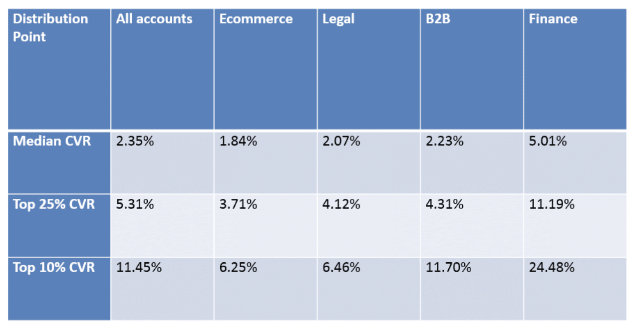
(Source: WordStream)
Examples of Landing Pages that Convert
1. PANDORA – Fashion & Beauty – Increased conversion rate by 130%
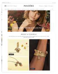
To compel customers to purchase jewelry pieces from a new collection, PANDORA created a landing page free of distractions. They created eye-catching imagery, used simple and clear words and titles, and highlighted specific items from the collection.
2. Mornin’ Glory – Retail – Increased conversion rate by 1483%
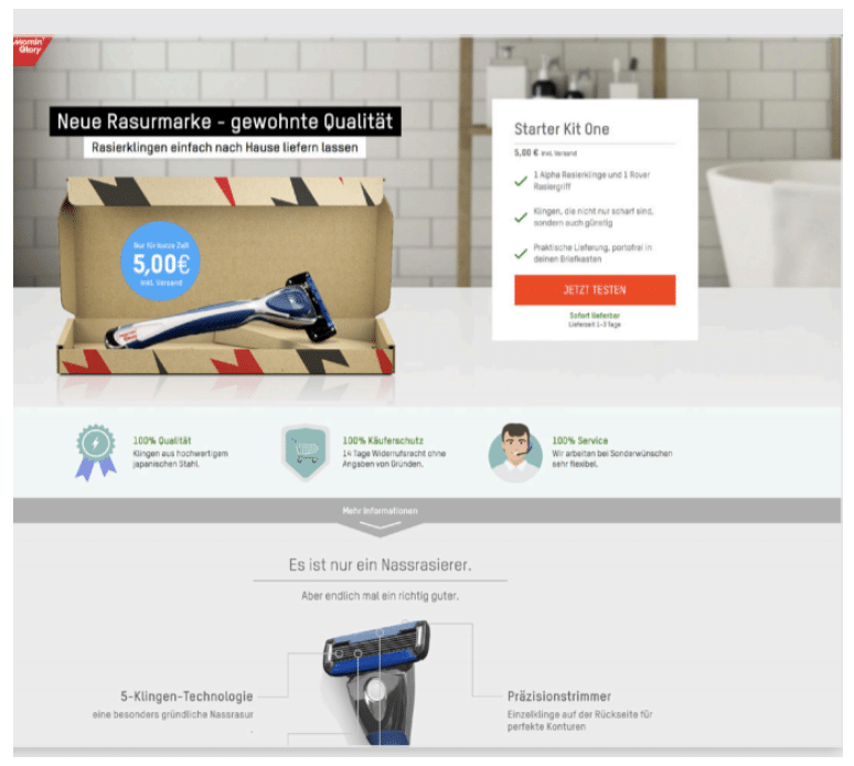
With an incredibly visual landing page featuring some key trust-builders and information on their high-quality and affordable razors, Mornin’ Glory was able to improve their conversion rate substantially.
3. Israeli Ministry of Tourism – Travel – Increased conversions by 40%
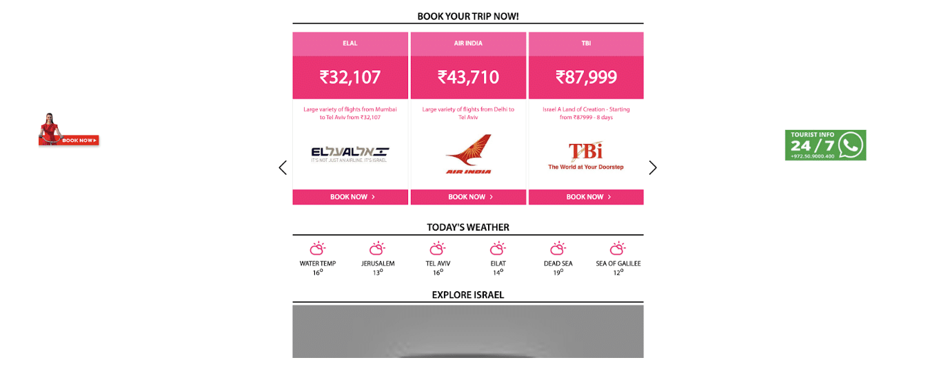
In light of a new direct flight from India to Israel, the Israeli Ministry of Tourism set off to create a landing page aimed at getting more travelers to book a trip. The above screenshot is just a snippet of the highly interactive and eye-catching landing page featuring guides of places to go and things to see, high-quality video content, and the above flights and weather. By providing potential visitors with relevant information, the Israeli Ministry of Tourism was able to increase conversions.
4. Simply Business
Insurance––62.26% CVR
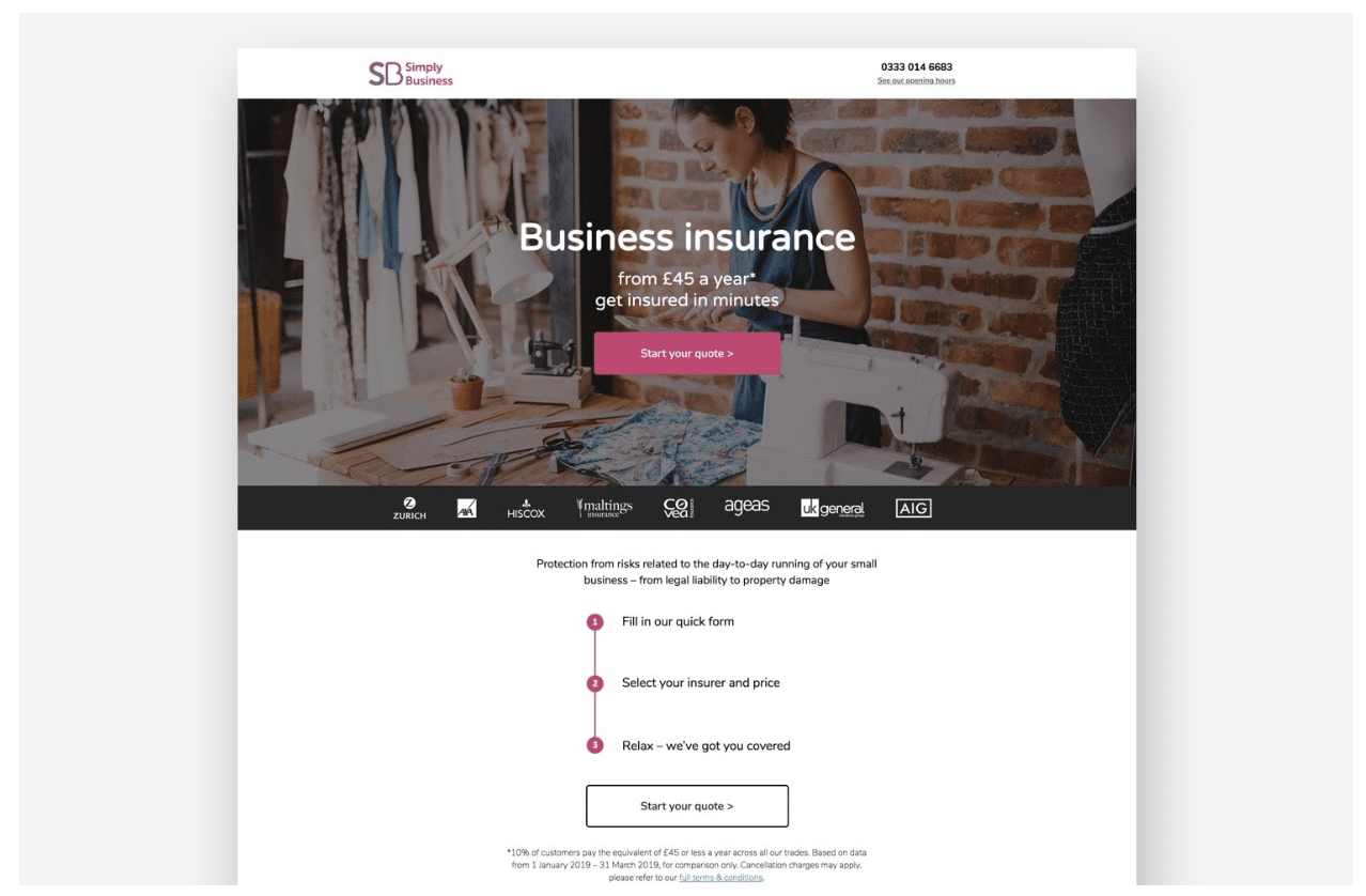
(Image courtesy of Simply Business for Unbounce)
As a notoriously complicated industry, insurance is not often portrayed as approachable. Simply Business’ mission in creating this landing page was to do exactly that––take the mystery out of securing business insurance. By breaking the process down into three steps, using casual and concise language, and by presenting a clear CTA, Simply Business sees a conversion rate that is well above average.
5. Backlinko – Business – Increased CVR by 10%
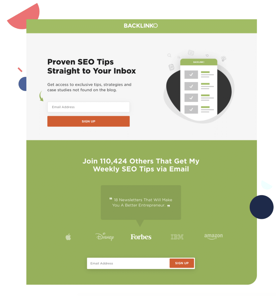
(Image courtesy of Backlinko for ConvertKit)
How do you take a successful landing page and make it even better? Give users another chance to convert. In this example, that’s exactly what Backlinko’s founder, Brian Dean, did. By adding a second CTA below the fold, this page was able to increase conversions by 10%. In addition to the double CTA success, the page also clearly conveys the value behind converting and uses social proof to build credibility.
6. CollegeBoard – Education – 77.38% CVR
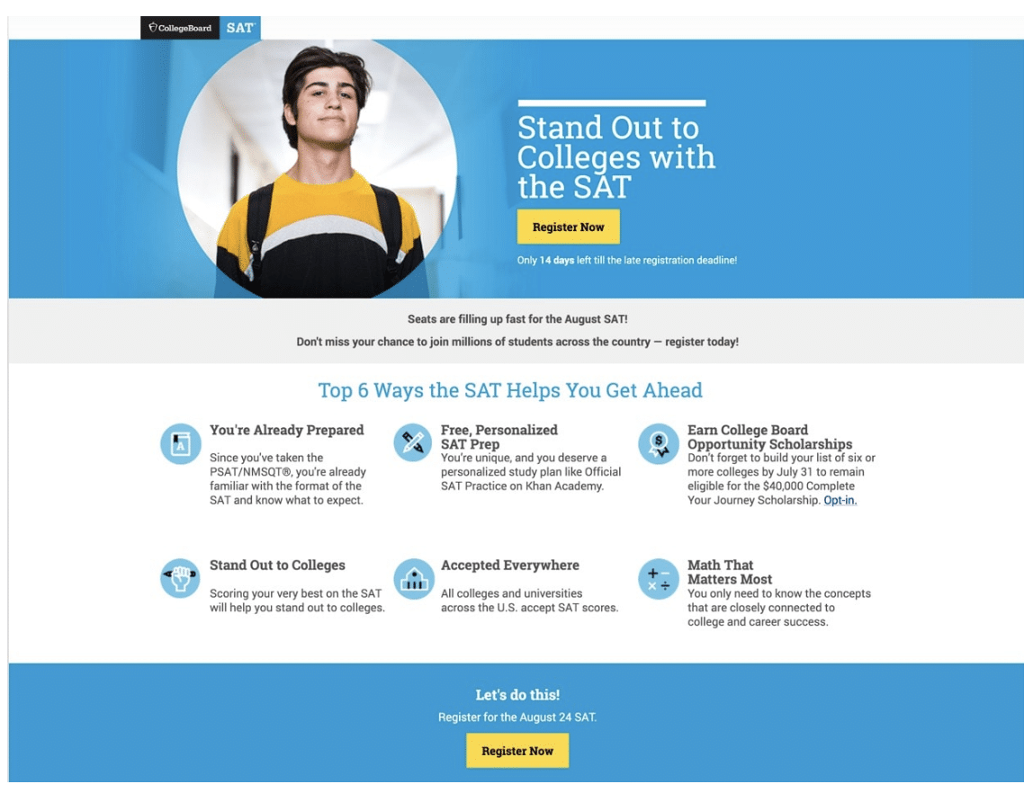
(Image courtesy of CollegeBoard for Unbounce)
What better way to get someone to convert and convert now than by creating a sense of urgency? On this landing page, CollegeBoard reminds visitors that the SATs are rapidly approaching, and that failing to sign up would result in missing an opportunity to “join millions of students across the country.” This sense of urgency, alongside a snackable list of the SAT’s value-adds contributed to the overall success of the page.
7. ConvertFlow
Digital marketing, lead generation –– Simple, sleek, and personalized
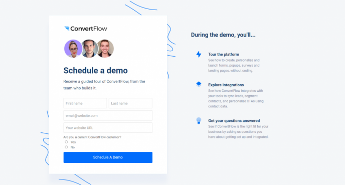
Since they’re in the business of landing pages and conversion, it makes sense that ConvertFlow would nail a killer landing page. The design is very simple and trim but includes everything necessary to educate the visitor and prompt them to fill out the form. Additionally, the final question on the brief form helps segment respondents so they are directed to the most appropriate demo scheduler, offering a more personalized experience that boosts conversion.
8. Mama and More
Home improvement, lifestyle –– Lead generation and email course conversion
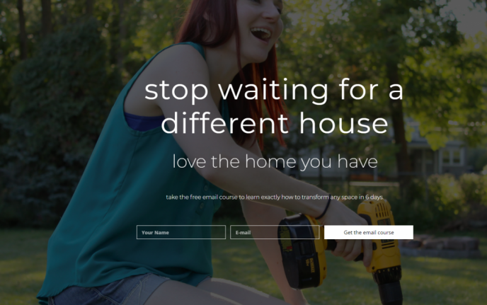
Kaylee Strozyk is a talented and experienced digital copywriter, so creating a high-converting landing page for her side hustle came naturally. This simple, informative page combines the above-the-fold simplicity that grabs targeted visitors right off the bat with sales letter-style copy that quickly convinces tire-kickers. And, since this is a free email course, the barrier to entry is low and the perceived value is incredibly high.
9. Skuma
Mineral water –– Enhanced conversion thanks to simplicity and quality copy
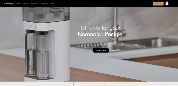
Selling water has never been a simple task since most of the world has access to the basic product for free. However, when targeting an affluent demographic with money to spend, a company like Skuma offers a powerful incentive to buy: purity and enhanced mineralization. Simplicity and effective information delivery are key factors in the success rate of this landing page which takes the visitor through three distinct waypoints: the product features, differentiation, and a clear call-to-action.
10. SoftwarePundit
Affiliate sales / SEO –– High conversions for someone else’s product
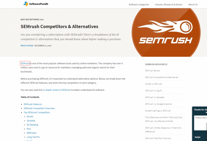
SoftwarePundit serves as an affiliate for the popular SEMRush SEO SaaS platform, and this landing page is responsible for its success. Unlike many on this list, this page relies on heavy copy to provide all the information necessary for a tire-kicker to become a paying customer. The page features a Table of Contents to facilitate quick navigation. Importantly, calls-to-action are prominent throughout the lengthy copy so visitors can move ahead the moment they’re convinced.
How to Create Effective, High Converting Landing Pages: Ideas to Expand Your Business
1. Write a clear and connected headline
The first thing the visitor will read is the headline of your landing page. Within a second or two, it should make a clear connection to the language used in whatever medium from which the reader found you.
You don’t want to:
- Disorient visitors or force any unnecessary mental gyrations
- Be overly creative or clever
In other words, kick-off your page with a dummy proof headline that assures the visitor she’s arrived at a page that offers a solution to her problem.
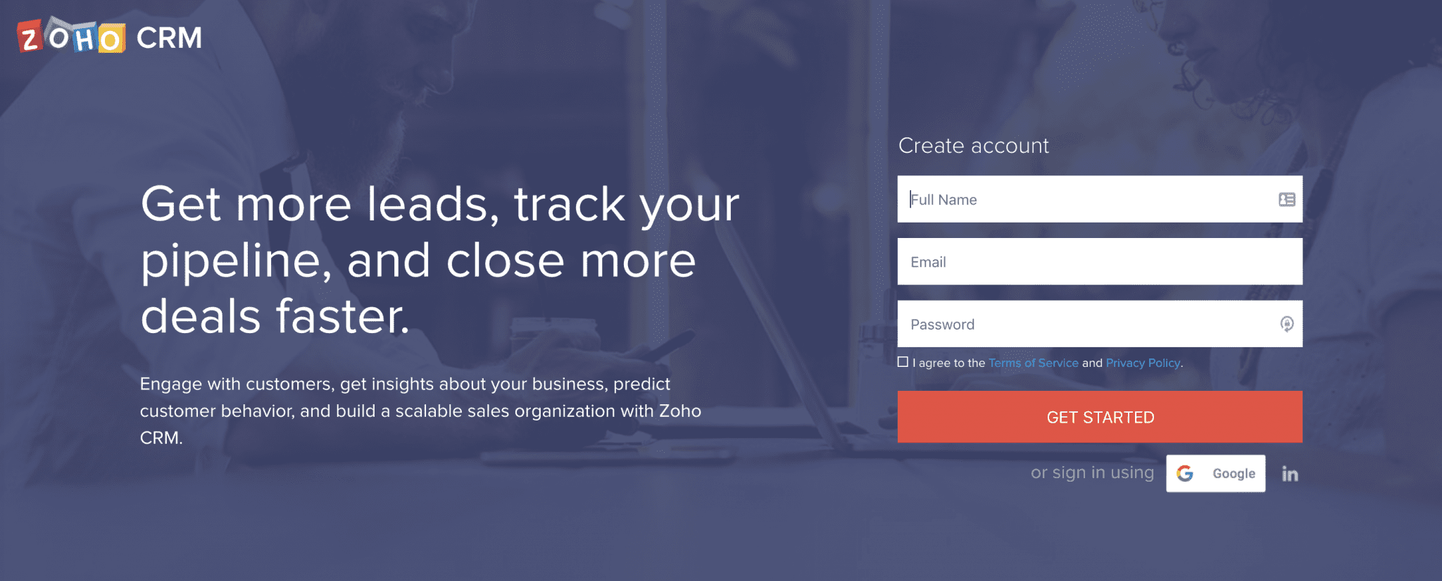
I did a search for “SaaS CRM” and clicked on an ad that read “Zoho Online CRM Software | Empower Your Sales Team.” The logo in the upper left and subheadline assured me the landing page was about CRM and the headline made clear the purpose of the platform.
2. Present a compelling call to action
Again, your landing page is a response page. You need to decide what response you seek and tee it up with a compelling call to action. At a minimum, you’ll execute the CTA with a button, but you might also include an action-oriented sub-headline.
High converting button copy is clear and specific. Make it as compelling as possible with:
- Action words—avoid generic commands such as “submit” or “click here” and instead use words such as “get,” “reserve,” “download,” “register,” etc.
- Inject value—consider reiterating the benefit of taking action. For example: Discover how to master landing page conversion.
- Go with first person—an effective CTA trick is to turn the table, such that instead of telling the reader what to do, they’re telling you. For example: Tell me how to skyrocket my conversion.
- Say “free”—is your offer free? If so, say so. Free is everyone’s favorite price.
- Make the button shine—make your buttons standout with a background color that can’t be missed and an ample amount of negative space surrounding it.
- Use directional cues—arrows or graphics leading the eye to your CTA button can increase click-through.
For more on CTA buttons, check out this study of techniques to improve your call to action buttons.
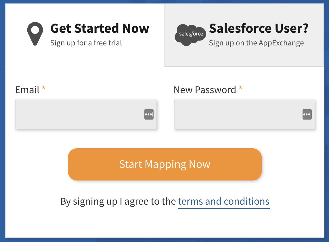
The landing page for eSpacial’s heat mapping software tells me to “Start Mapping Now” in a big, orange CTA button that’s impossible to miss.
3. Remove links
The purpose of a landing page is to get visitors to take action—but not any action—one specific action (or at least a very small selection of actions). You need to resist the temptation to invite them to do anything else, including visiting other pages.
As such, your landing page should not include a website navigation bar, links, or menus of any kind.
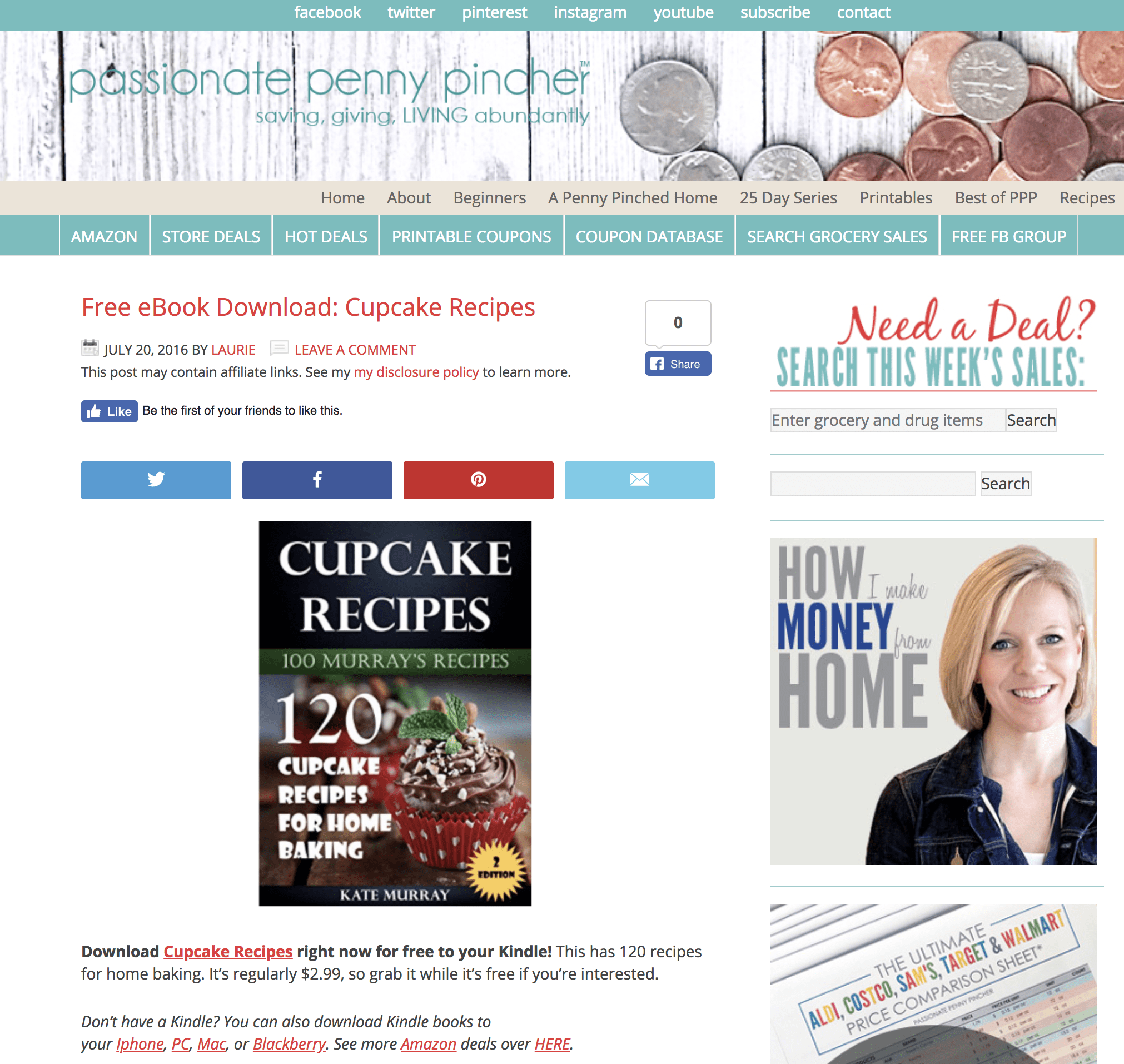
This page suffers from information overload, a serious dose of visual chaos, and hundreds of links (in three different menus) that are remarkably distracting. Oh yeah, it also features a recipe book. This is NOT how you focus on your offer.
4. Press the problem, showcase the solution
A landing page needs to get to the point. State the value of your offer immediately in your copy and reiterate it where appropriate. Like most effective sales copy, a problem-solution sequence will serve you well.
Should your page be brief? Usually, yes.
What if you believe including several details, say features and benefits, will make the offer more compelling? Include them. Make them skimmable with design elements that break the story up into small pieces.
Whether your landing page is 50 words or 1,000, give it a thorough fluff test and take out anything that doesn’t make it more compelling to respond.
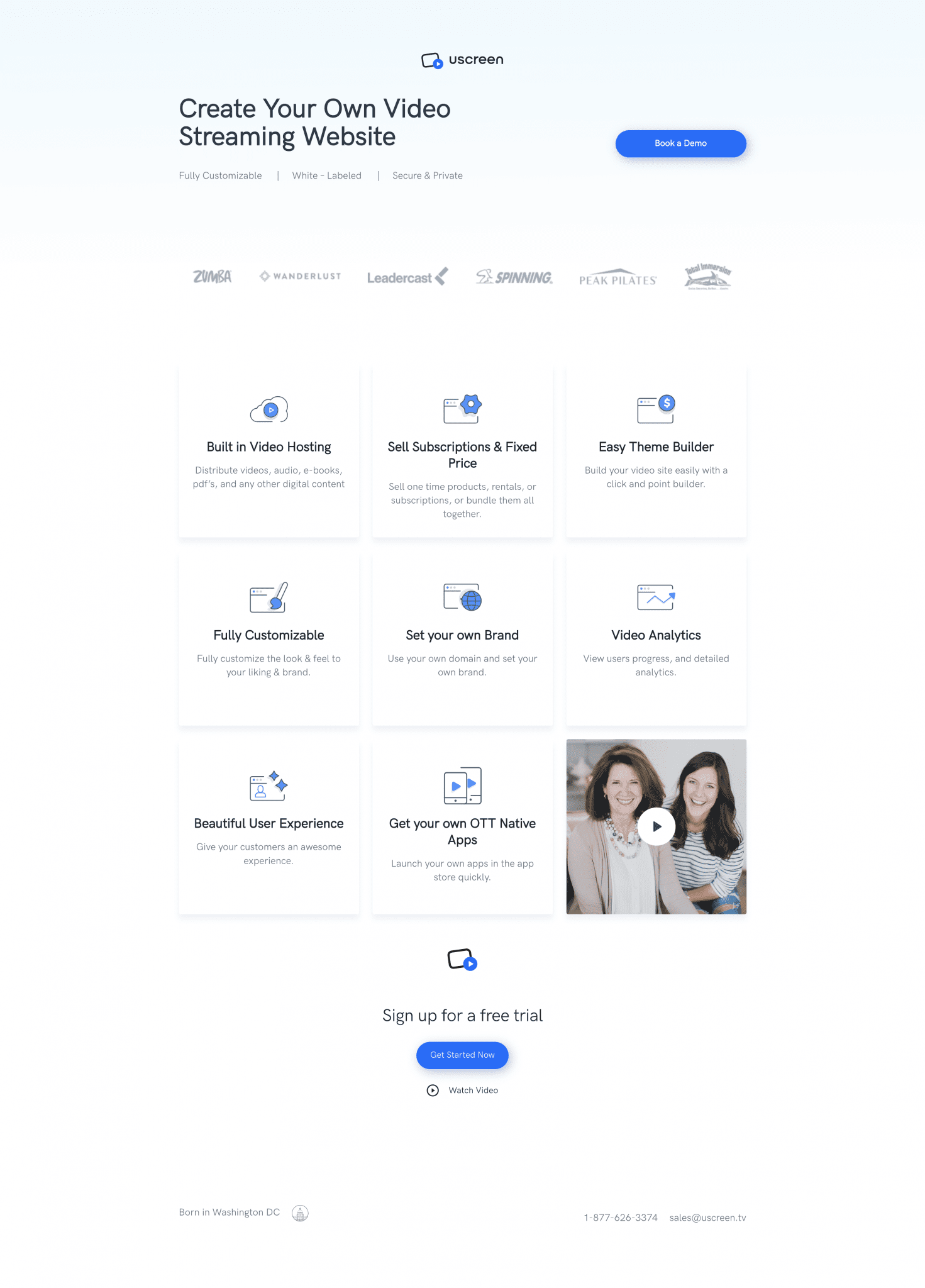
A landing page can feature a number of details and still be effective. This page from Uscreen does a good job highlighting the product’s benefits. (Though, the trio of choices—book a demo, sign up for a free trial, and watch video—is likely to dilute conversions.)
5. Show something meaningful
Don’t add stuff to your landing page for the sake of art. Clutter your page and you clutter the mind of your visitor.
On the other hand, you probably don’t want your page to be 100 percent copy. Include a relevant image.
- If you’re offering downloadable content, offer a preview.
- Offering software or demo? Again, a preview should be good.
- Offering a consultation? Put a friendly face on the page.
- Registering people for an event? Show the venue. Or the speaker. Or a cool shot from the last event.
I haven’t hit on every conceivable offer. Consider yours and rally up an idea to give your landing page some visual interest. If possible, show the reward.
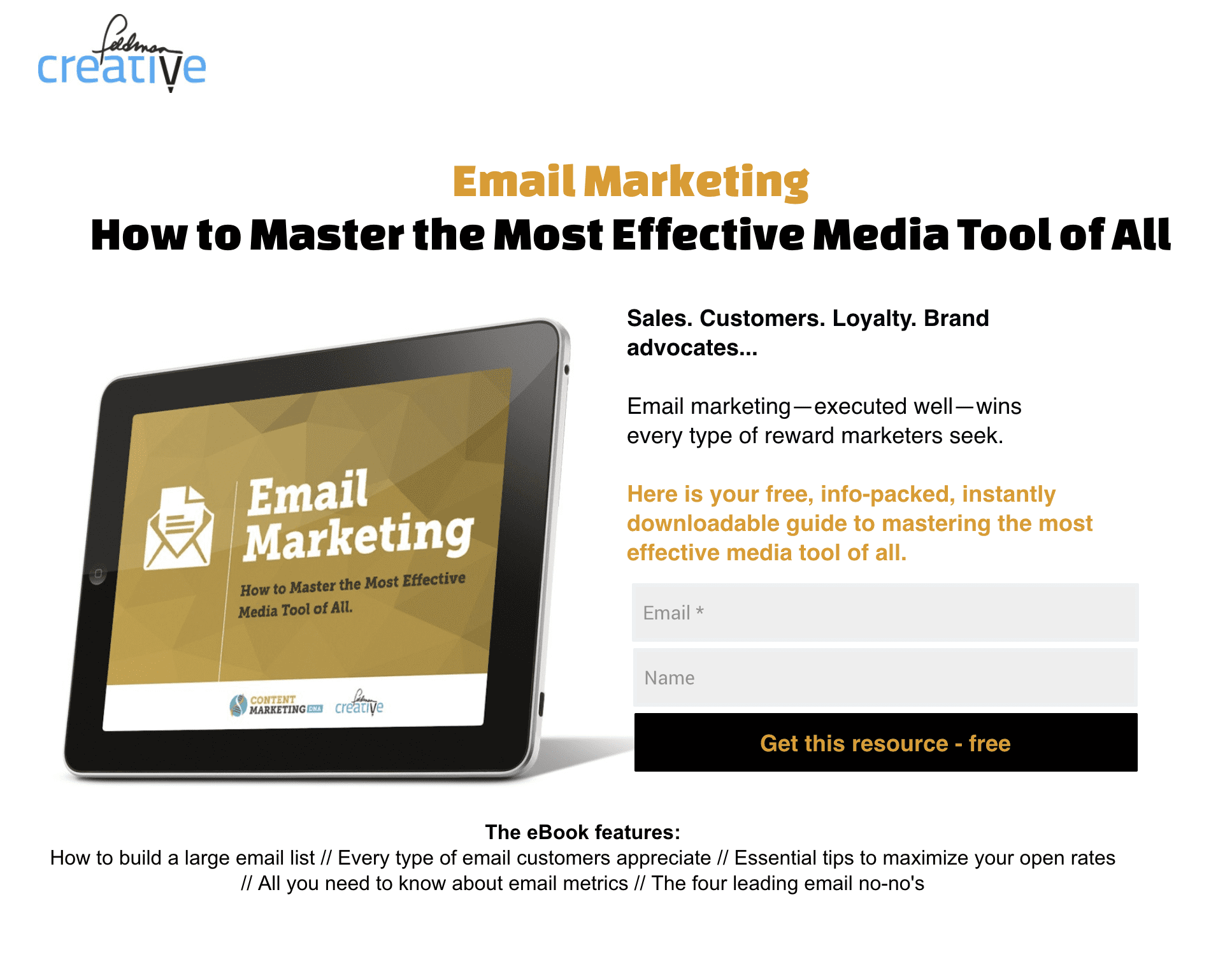
I just created this landing page for my new website. Like most of my landing pages, it offers a free ebook, so I show and describe the free content. Simple, right?
6. Add trust-builders
Put yourself in the mind of your landing page visitor…. “Should I read, watch, listen to, try or buy this?” “Is it worth my time or money?”
Anything you can do to infuse your page with elements that foster trust and build credibility could be helpful. Consider including one or more various forms of social proof:
- Testimonials
- Reviews
- Customer logos
- Media mentions (“As seen on”)
- Verification or trust seals
- Accolades
- Security badges
- Guarantees
- Numbers, e.g. downloads, satisfied customers, shares, etc.
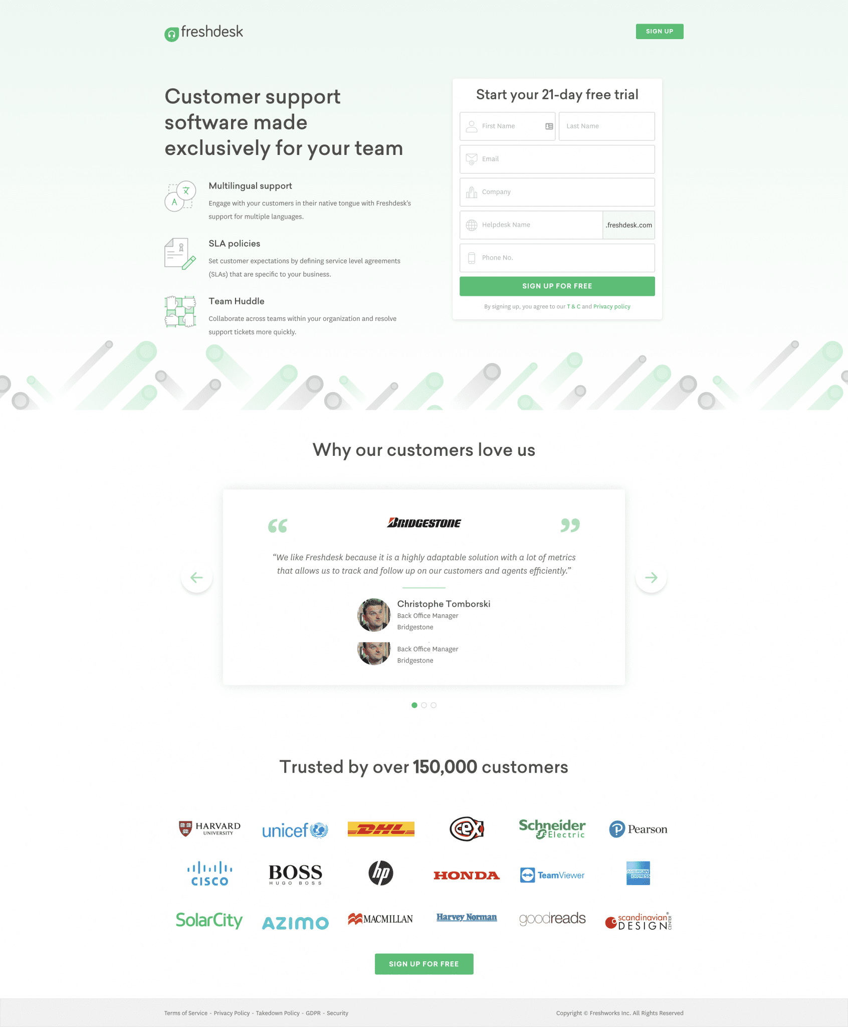
Awesome use of social proof here. Bravo Freshdesk.
7. Make small asks
Simple principle: the less you ask for the greater response you’ll get. Apply this thinking to your form:
- If you want more leads, include less fields on your form. In many cases, a simple email address is all you need.
- If you must qualify respondents, zoom-in on the data points that matter most and make it easy on them with check boxes, pull-down menus, etc.
- This principle will also apply to the amount of effort, time or money your landing page requests. If your goal is to build your email list, make small asks.
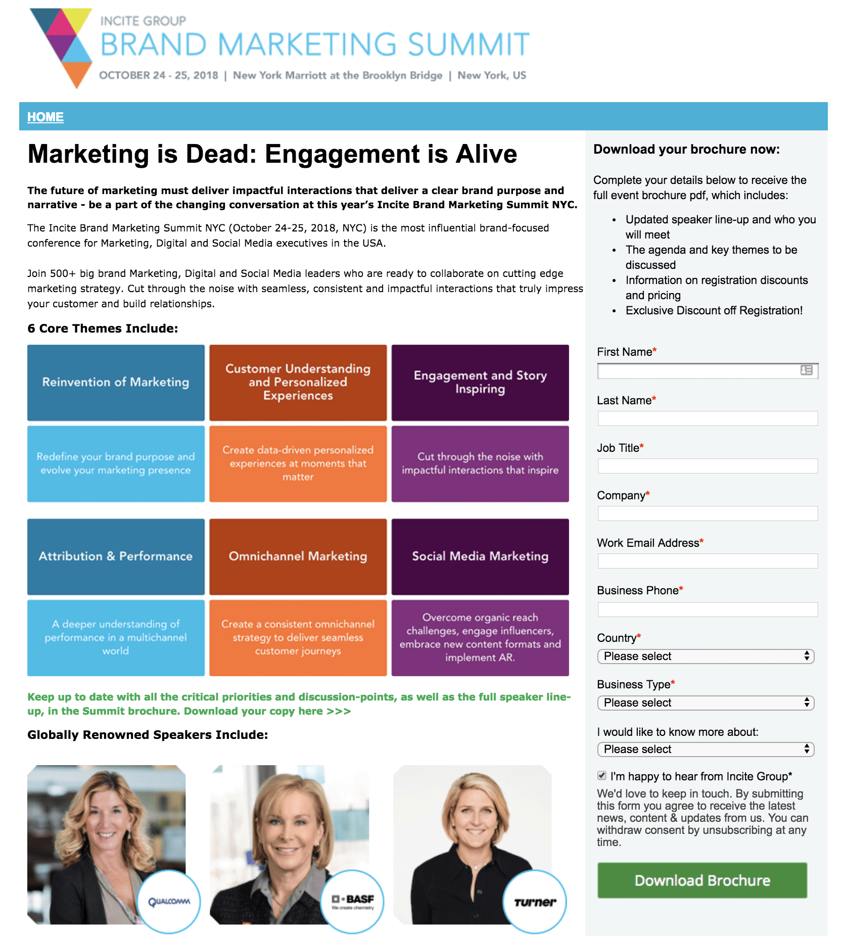
Uh, seriously, will you also need to know my blood type to fork over that amazing event brochure? The reader has to scroll just to find the button on this messy landing page, which provides an example of how to do the opposite of most of the advice in this article.
8. Test and refine your landing page
Optimize the conversion rate of your landing pages by running A/B tests. With A/B testing, you simply compare a control page (“A”) against a variation (“B”) that includes a significant difference of some sort.
After a period of time, or number of visits, review the results and pull the plug on the lower-performer. You can proceed with the winner or further improve conversion by conducting additional tests.
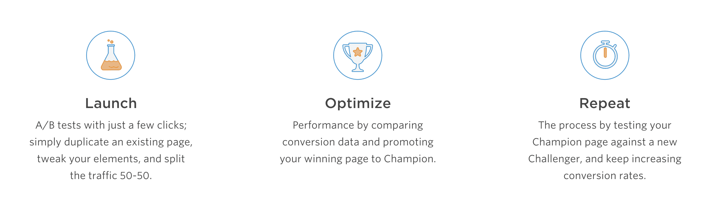
A/B testing for landing pages is not complicated. The experts at Unbounce say, “Launch, optimize and repeat.”
I recommend using A/B tests for elements such as:
- Headline
- On-page copy
- Call-to-action copy
- Images and video
- Form length and style
You might also consider testing:
- Your offer
- Button design
- Page design
- Social proof
Go forth and convert
The step between earning a click and generating a lead is the all-important landing page. Create high converting landing pages by applying the ideas I’ve presented here.
However, don’t assume the process is perfectly repeatable. A winning landing page for one offer may fail for another, so create and experiment relentlessly.