These days, mobile marketing landing pages are a must for any business. Mobile search bypassed desktop search in importance some time ago. Plus, mobile is now a key channel, not just for research, but for purchasing.
The conversion rates for mobile lead generation landing pages often lag behind those for desktop landing pages, however. This means it’s essential to think smart when considering how to create a mobile landing page. In this guide, we share some mobile landing page examples and best practices to help you in this endeavor.
What is a Mobile Landing Page?
A mobile landing page is a web page created as a destination for mobile-device users. Visitors land on the page after tapping or clicking a link in an ad campaign or mobile marketing campaign.
Like other landing pages, the mobile ad landing pages that convert best encourage website visitors to take a single, specific action, expressed in the call-to-action (CTA).
The best mobile landing pages are specific to mobile devices, rather than a stripped-down version of a desktop campaign. Creating specific landing pages for mobile-device users is the only way to guarantee a stellar mobile experience.
If you don’t, then 57% of visitors will fail to recommend your business, and 62% will shop elsewhere if they have a bad experience.
Best Mobile Landing Page Examples
Before we get into how to make a mobile landing page that converts, let these examples of great mobile landing pages inspire you.
1. SophosLabs: Keep it Short and Clear
To kick off our list of responsive landing page examples, here’s one from SophosLabs for a cybersecurity report. Here’s what works well:

- The headline identifies what visitors will get, and is supported by a subhead
- The copy is short and hints at benefits for those getting the report
- The CTA is easily visible, with a contrasting color button
- There is additional information further down the page for those who need it
One improvement would be an additional CTA in the middle of the page (there’s one at the end).
2. Mouseflow: Standout Social Proof
Mouseflow has a mobile ad landing page that really works. Here’s what Mouseflow did right:

- All the key information fits on a single, compact screen
- The initial copy is super short, and addresses key concerns for its visitors
- The page includes social proof – the number of customers
- The CTA offers a freebie, and is on a contrasting color button
- There’s a video for those who need more information. Since video is popular with mobile users, this is a smart move
The rest of the landing page presents additional information. It is long, but most mobile users can get what they need up front, so the page works well.
3. Taboola: Form First
Here’s another good example of a mobile landing page. It’s for Taboola’s Fashion & Beauty Benchmark report.
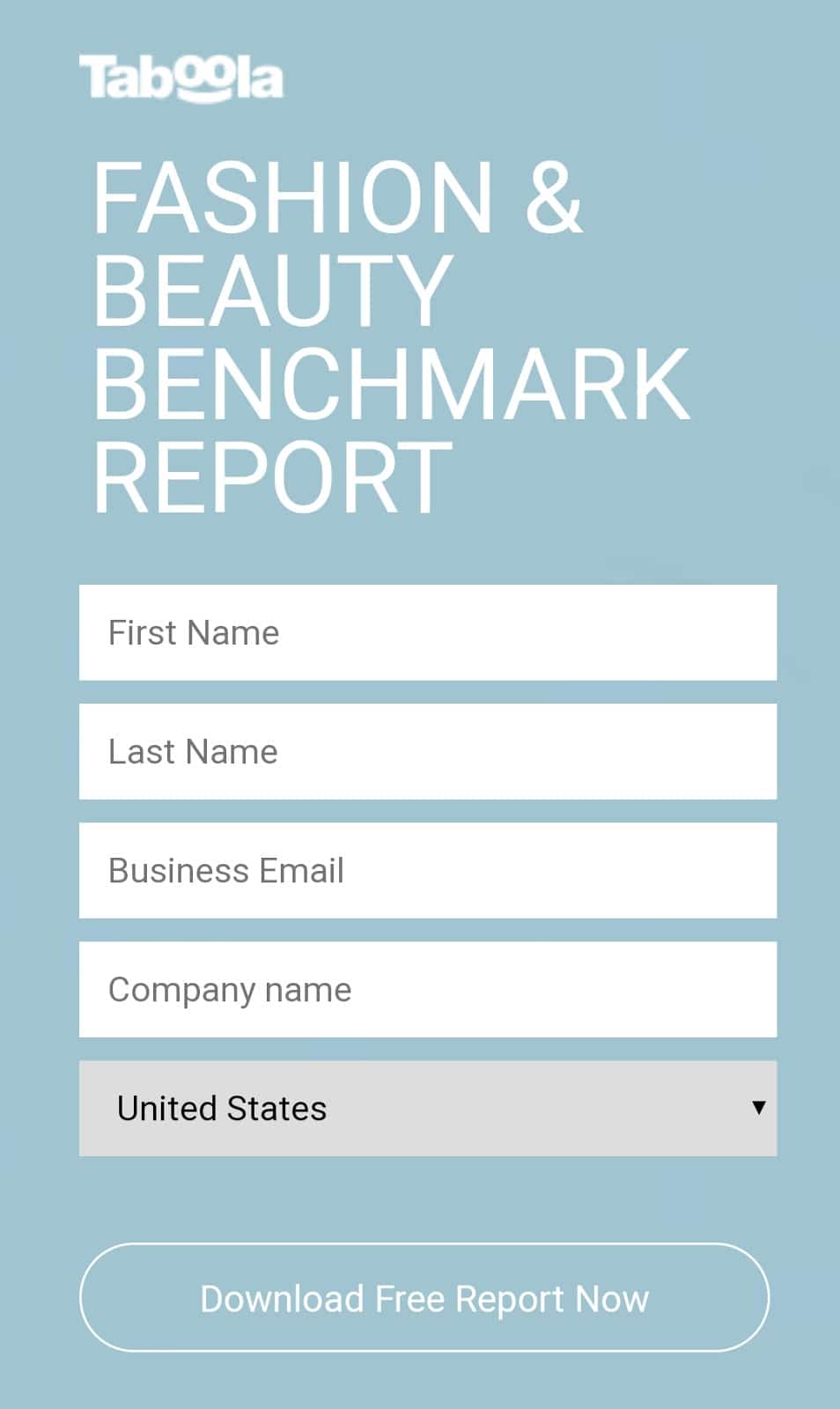
Some of the best features of this landing page are:
- The CTA is immediately visible on the first screen, and appears multiple times on the page
- Mobile visitors can sign up immediately, as the form is the first thing they see
- The copy is short, to the point, and easy to browse

4. Apple TV+: On-Brand and Simple
This Apple landing page was promoted on Twitter. Here’s what I liked about it:
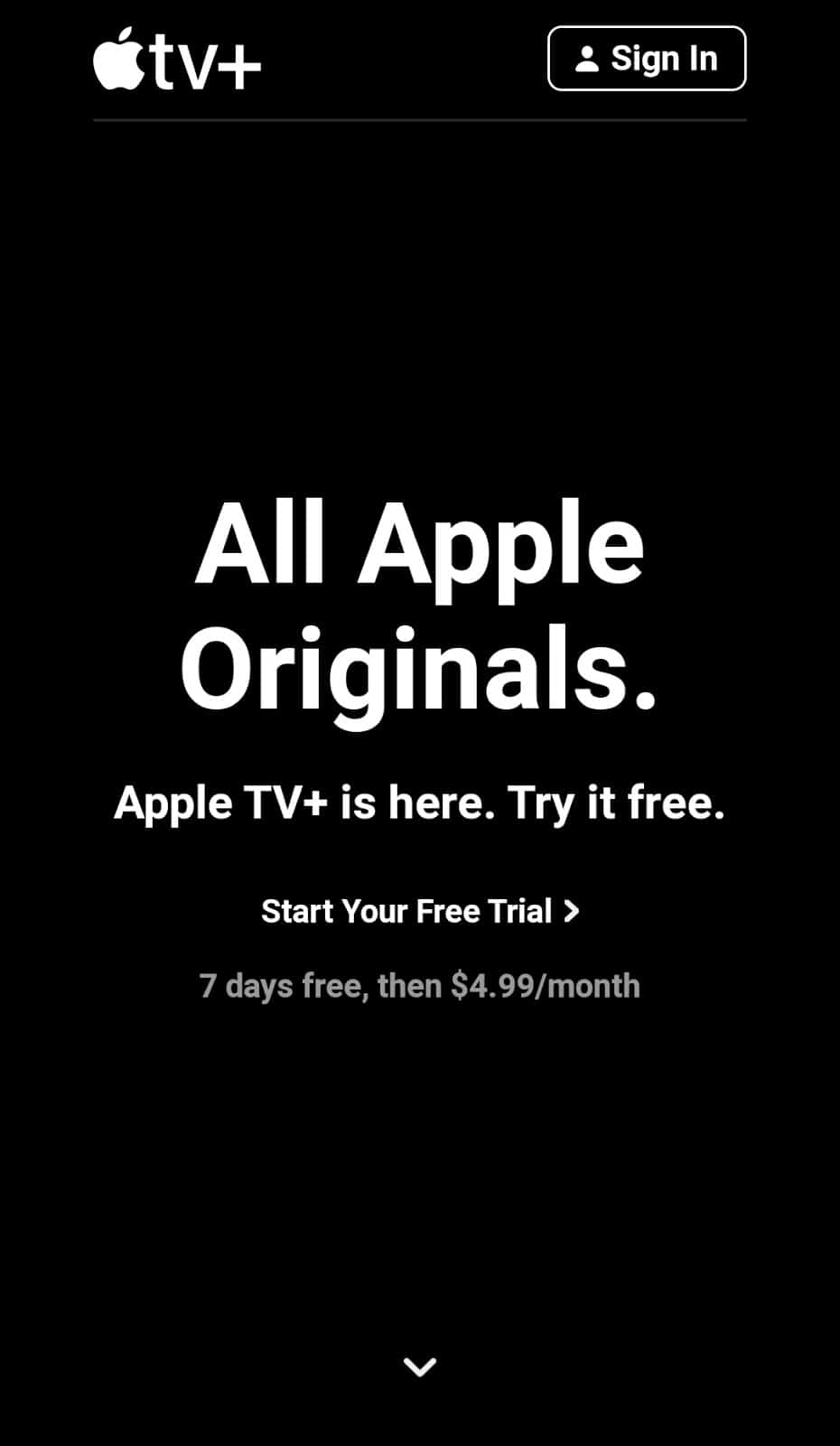
- The simple black and white color scheme is on-brand and makes the copy stand out
- The offer is clear and the CTA is visible on the first screen, though it is a text link
- When visitors swipe down, the service’s flagship TV shows appear, along with CTA buttons and repeated offers
The only thing I’d change would be to have a tappable button in the first section of the mobile responsive landing page.
5. ContentTech: Be Straightforward With Benefits
This mobile landing page is for a content marketing conference. It was in the advertiser’s Twitter feed. Here’s what works:

- The benefit of the conference is clear
- There’s an immediate CTA to register
- When you scroll down you get more information, plus another CTA button
- There’s a countdown at the bottom of the page, making signing up feel more urgent
While the landing page is long for mobile users, it’s easy to register immediately if that’s your goal. Plus, it’s useful to have more information for those who need further convincing.
6. NeoU: What’s in it for a User
This mobile landing page was sent via e-mail. Here’s what works about it:

- It features a striking image that also clearly conveys the purpose of the product
- It concisely explains what a user gets by signing up
- There’s one clear, focused CTA that draws the user’s attention
This landing page packs a beautiful design and comprehensive details into a mobile-friendly page.
7. FabFitFun: Pricing up Front
This mobile landing page was also sent via e-mail. Here’s why it works:

- It’s aesthetically pleasing, with a full-range of products featured to give the user a sense of what a box may contain
- It contains clear pricing information, as well as how many boxes per year a user gets by subscribing
- Its CTA is enticing because it includes the word “customizing” rather than just “start now” or “sign up”. There is also an additional CTA at the top to “join”.
Although this mobile landing page is busy, it highlights the important details (pricing, delivery frequency, etc.) and showcases products in a thematic way for Spring.
How to Create a High Converting Mobile Landing Page – Best Practices
Ready to create your own landing page for mobile users? Here are some tips to help you produce high converting mobile landing pages.
1. Prioritize Page Speed
Speed is everything for mobile-device users. If your mobile landing page user interface (UI) is slow and clunky, you’ll lose your audience before they can convert. Google’s research shows that when page-load time increases from one to three seconds, the chance of visitors bouncing increases 32%.
So, one of the best mobile landing page optimization tips is to speed up your site and landing page. A single column, responsive layout, with optimized graphics (not too many) is a good start. Use Google’s Test My Site tool to see how fast your page loads and get recommendations for improvement.
2. Make the CTA Clear
As you’ve seen, mobile-device users don’t hang around waiting for information. The best converting mobile landing pages have a clear and visible CTA. Make sure it contrasts with the page background, and has large, easy to tap buttons. And, of course, what visitors see after tapping the CTA should also load quickly.
One more tip: consider having your CTA floating or sticky, so it stays visible even if people scroll.
3. Shorten Your Copy
With the short mobile attention span, it’s wise to get to the point. Take the copy you’ve used for your desktop campaigns and make it even shorter. You’ll need:
- Shorter headlines, because fewer characters show on the screen
- Really short paragraphs, to avoid having an off putting wall of text
- Bullet points, but with shorter copy than on the desktop
In addition, ensure that the most important content shows above the fold, right at the top of your mobile landing page.
4. Add a Click-to-Call Button
Although smartphones are mini-computers, they’re still phones. Adding a click-to-call button is a smart move, especially if you have a complex product, service or offer. Interested mobile users can contact you immediately, making it more likely they’ll convert.
5. Streamline Your Lead Capture Forms
Whether you’re simply using a mobile landing page, or the page includes a pop-up form, you must capture leads for future marketing. Avoid trying to collect your visitors’ whole life story the first time they interact with you. Instead, keep your forms simple (first name and email will do), and get more information as their interactions with you increase. Making another offer further down the line, for example, gives you the chance to collect more information.
While these mobile landing page best practices work for many, don’t forget to test them with your own audience, to see what works best for your business.
Conclusion
As you’ve seen from the mobile landing page examples shared here, there are multiple ways to create a high-converting mobile landing page. Remember to keep copy short, and to include a CTA button. If you’re using a sign-up form, make sure your mobile visitors can sign up right away, and consider reducing the number of form fields. And, as with other landing pages, ensure that even short copy addresses what’s in it for your mobile visitors.
Now you’re all set to create a mobile landing page that generates leads and sales.
Learn more about how to drive traffic to your mobile landing pages with Taboola.