If you’re looking for a quick way to improve your real estate marketing, start creating fantastic real estate landing pages.
In today’s climate, real estate marketing is a challenge—we want to provide resources to that inspire marketers to think outside the box.
Landing pages in general help generate leads and sales from your social media, content discovery and native advertising campaigns. In this guide, we share tips on creating landing pages, and focus on real estate landing page ideas that will help your business grow.
What are Real Estate Landing Pages?
Real estate landing pages are website pages that show information about your real estate business and the sale or rental property listings you have available. They are a targeted traffic destination, where visitors land—hence the name—after following a link in an advertising or marketing campaign. The best real estate landing pages have a single purpose, so you can have multiple landing pages depending on your marketing goals.
Landing pages are a key real estate lead generation tool with a key purpose: to entice visitors to provide their contact information so you can get in touch with them for marketing and sales.
Most landing pages offer an incentive or freebie in exchange for a visitor’s name, email, phone number or address. You might ask visitors, for example, to sign up for a home valuation, subscribe to your newsletter, or download a buyer’s guide. We look at tips for real estate landing page design in the next section.
The 5 Best Real Estate Landing Pages Examples and Design Ideas
Wondering how to design a landing page? Here are some great real estate landing page design ideas to inspire you.
1. Berkshire Hathaway
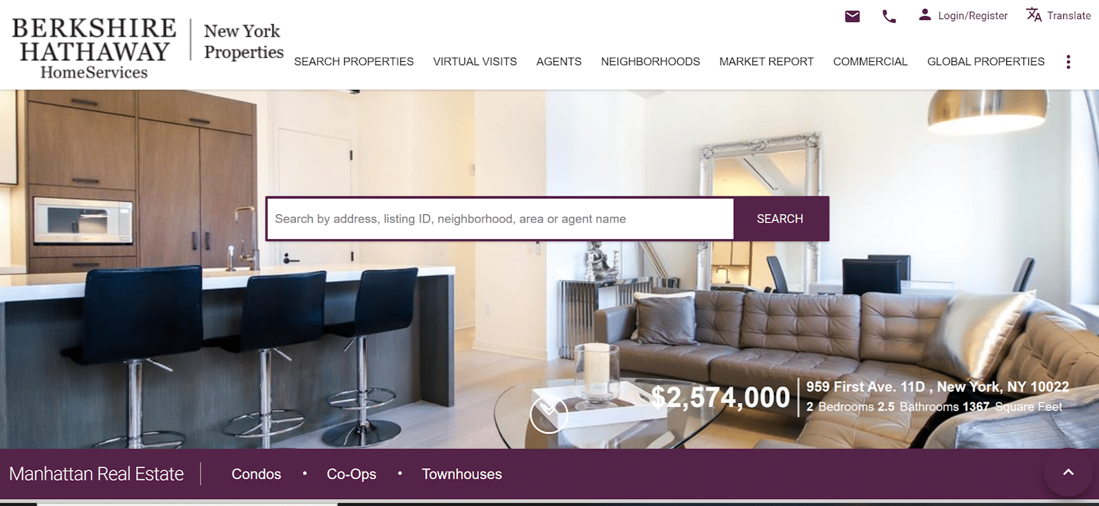
The background image on this Berkshire Hathaway landing page sells the lifestyle that visitors are looking for.
The on-screen text highlights the location and budget, and there’s a simple search bar to encourage people to look for a property that suits them.
2. Poulsen Group Real Estate

Poulsen Group takes a different approach. This landing page highlights the search terms, and shows how many listings are available, with thumbnail images to illustrate some of them.
This real estate landing page has a simple form with just three fields, and the CTA button stands out from the rest of the page, making it visible and enticing.
3. Regent’s Crescent

Regent’s Crescent’s real estate landing page highlights understated luxury with a black and gold color scheme.
There’s a background video, showing people enjoying one of the agent’s properties. The copy also underscores the luxury approach, and there are two CTAs. This landing page design draws visitors deeper into the site, as the Enter button stands out more.
4. Redfin
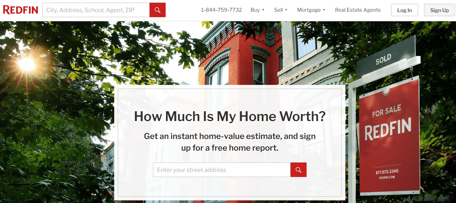
Some of the most effective residential and commercial real estate landing pages are simple, like this one from Redfin.
The headline asks the question that many visitors ask, and the subhead makes the offer of an estimate and home report.
The simple form just asks for an address, which helps the agent to target the visitor with location appropriate information. The background image reinforces the idea of finding an attractive home.
5. HomeLight
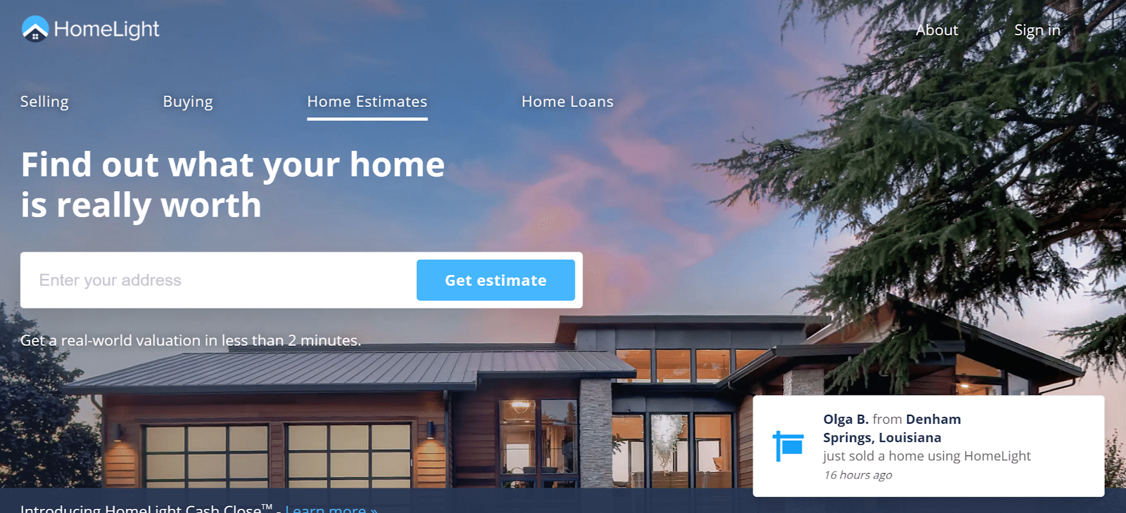
HomeLight makes a similar offer to Redfin, but arguably has a more effective – and benefit-driven – CTA.
As well as the background imagery, there’s social proof in the bottom right corner, showing people who have bought and sold homes, an effective way to show visitors they’re in good hands.
The 7 Tips to Create Best Real Estate Landing Pages
Here are some tips on creating high converting landing pages for your real estate website.
1. Make Your Value Clear in the Headline
When thinking about how to write content for landing pages, a good place to start is with the headline. It’s the first thing people see when they land on your page, if it’s not compelling, they’ll go elsewhere.
Ideally, the headline will relate to the campaign or link your visitors have followed, so it reassures them that they’re in the right place. It should also demonstrate the value of staying on the page. Short, benefit-driven headlines are a good starting point.
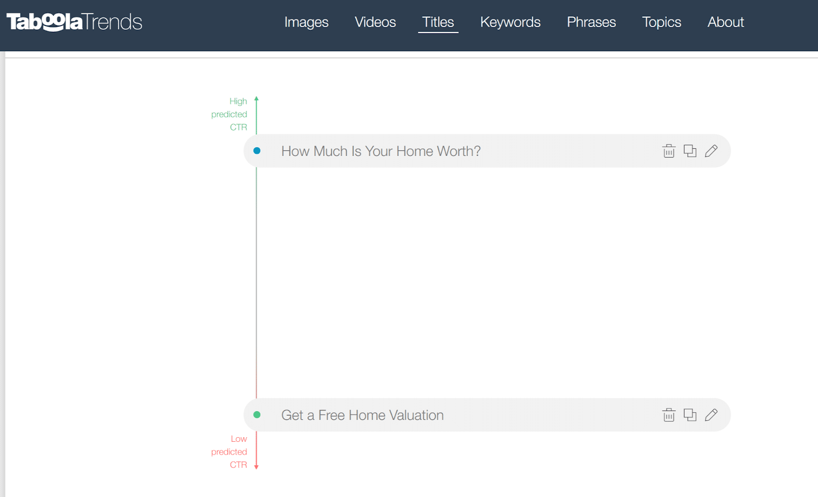
Learn more about writing headlines in Taboola’s guides to writing engaging headlines and writing headlines for native ad campaigns. You can also experiment with Taboola’s Title Analyzer to find the most clickable headlines for your real estate landing pages.
2. Have a Compelling Call to Action
The call-to-action (CTA) is one of the most important parts of any landing page. It is where you tell visitors what you want them to do. It’s usually on a button that stands out in color and design from the rest of the landing page.
Effective CTAs can have as few as two words, but every word counts. The best CTAs:
- Show benefits for the visitor
- Are related to what you promised (such as a valuation or offer)
- Use action words
Typical CTAs for a real estate landing page read: “Get Offer,” “Get a Home Valuation,” “Find Your Home’s Value,” or something similar. Where possible, avoid using “Submit” as your CTA button text. Use language that speaks directly to your customer instead. Here are some more tips on CTA writing.
3. Use Clear Images
People pay attention to images. The images on real estate landing pages are a major factor in selling the dream and lifestyle your visitors are looking for.
Ideally, images will relate to where people are looking and what you’re offering. You’ll have different landing pages and imagery depending on whether your visitors are looking for homes in the country or the city, for example.
Use Taboola Trends to find the most effective images for your landing pages. Check out the Home and Lifestyle categories to see what appeals most to visitors.

4. Focus on What Matters to Visitors
When creating a landing page, real estate agents should focus on what’s most important to their visitors. Copy is often kept short, so this could mean:
- Asking a question about the likely value of their home
- Showing that you understand issues, such as needing more space or a better location
- Offering help with finding or selling a home
- Providing helpful information, via a buyer’s guide, for example
This makes all the difference when enticing visitors to hand over their emails. Speaking of which…
5. Keep Your Forms Short
No matter what kind of landing page you design, one thing always holds true: the shorter the form, the more likely people are to fill it in. As a real estate agent, you’re going to need a name, an email address, a phone number, and a postal address. But you don’t have to collect all this information at once.
If you’re offering a valuation, for example, you can ask people to give you their email address, then email them to get the rest of the information you need. Or, you can pop up a form asking for more information, when people fill in their email.
When we get to the examples, you’ll see that the best real estate landing page designs vary in how they handle information collection. It’s best to A/B test your landing pages to see what works best for your target market.
6. Build Trust
Building trust is another essential factor in creating a winning landing page. Help visitors trust you by including social proof, such as:
- Testimonials
- Reviews
- How long you’ve been in the business
- How many homes you’ve sold
You can also include proof that your business is real, by using your business name, photo, and contact details. If visitors trust you, they’re more likely to act on your landing page.
7. Keep Your Design Uncluttered
The best real estate landing pages make it a no-brainer for visitors to take action. One way to do this is to minimize alternatives.
Remove elements that appear on other website pages, such as header and footer navigation, sidebars, and external links. Anything included on the landing page must serve the goal of encouraging visitors to connect with you.
In Conclusion
Real estate landing pages are an important lead generation tool for agents. They’re an excellent way to communicate with visitors, show your value, and get them to connect with you. And, they make great destinations for your ads and promotions.