If your brand sells products directly from landing pages, you’re continually looking to improve conversion rates. Especially in today’s climate, regularly experimenting with new approaches to your product landing pages’ content and design is key.
First, let’s recognize the obvious, a landing page for products must:
- Be well-written to inspire the visitor to take action
- Be compelling well-designed to make taking that action easy
There is no definitive formula, however, for creating the perfect product landing page. If you want to review the essentials, there’s an excellent landing page overview.
To see how online marketers are tackling the challenge, this article’s chock full of product landing page examples, and my take on why they’re bound to convert.
What are Single Product Landing Pages?
Single product landing pages are pages that (maybe obviously) showcase a single product, while others, host more than one.
Nearly all product landing pages aim to move the prospect closer to making a purchase — or taking some form of action — but, different types of landing pages support different marketing objectives.
Landing pages not built for a single product host more than one product. For example…
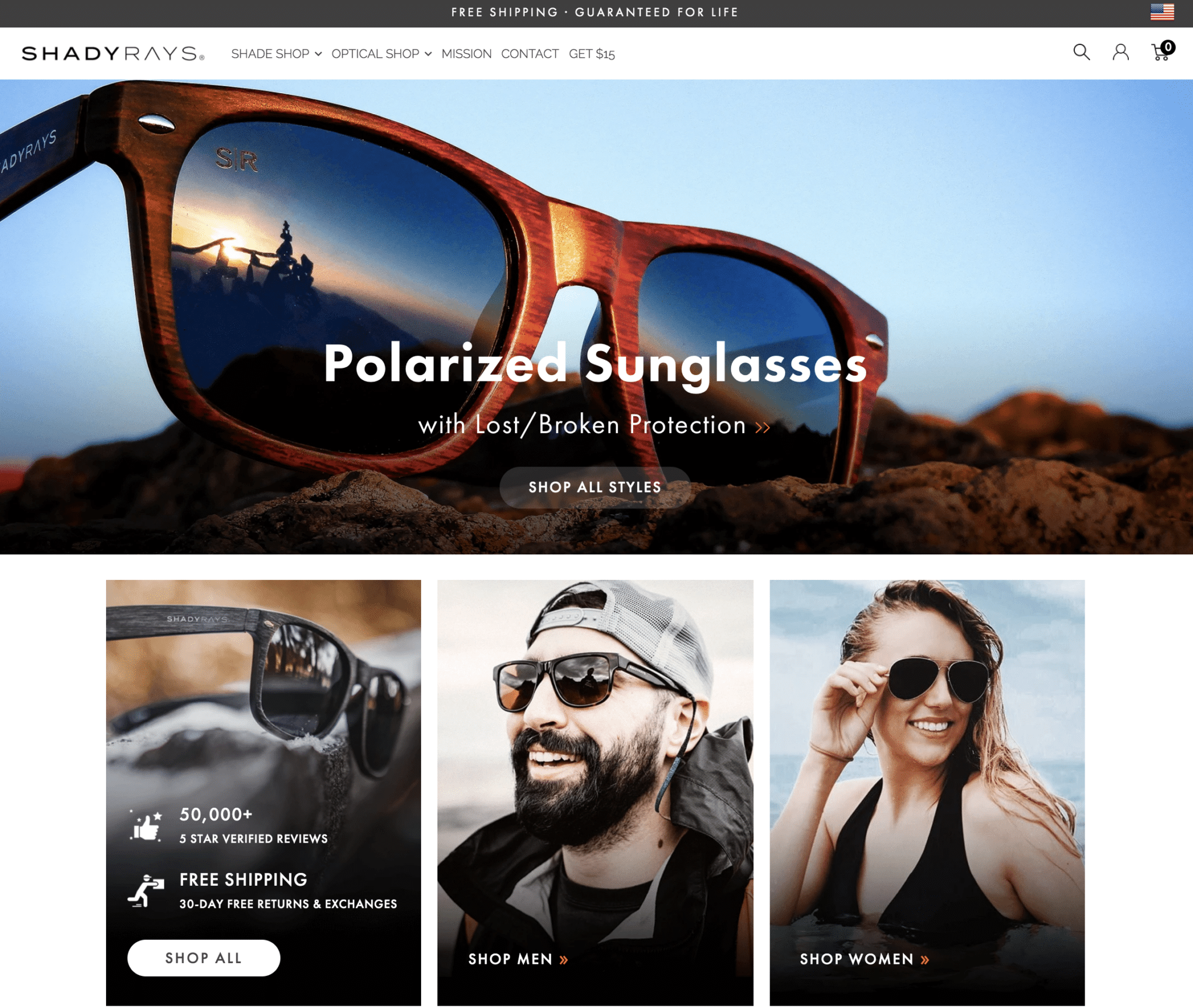
A retargeting ad brought me to this landing page from ShadyRays. It’s tidy and well-designed, but it isn’t focused on a single pair of shades. Its goal is to help me get started with the process of shopping the entire website.
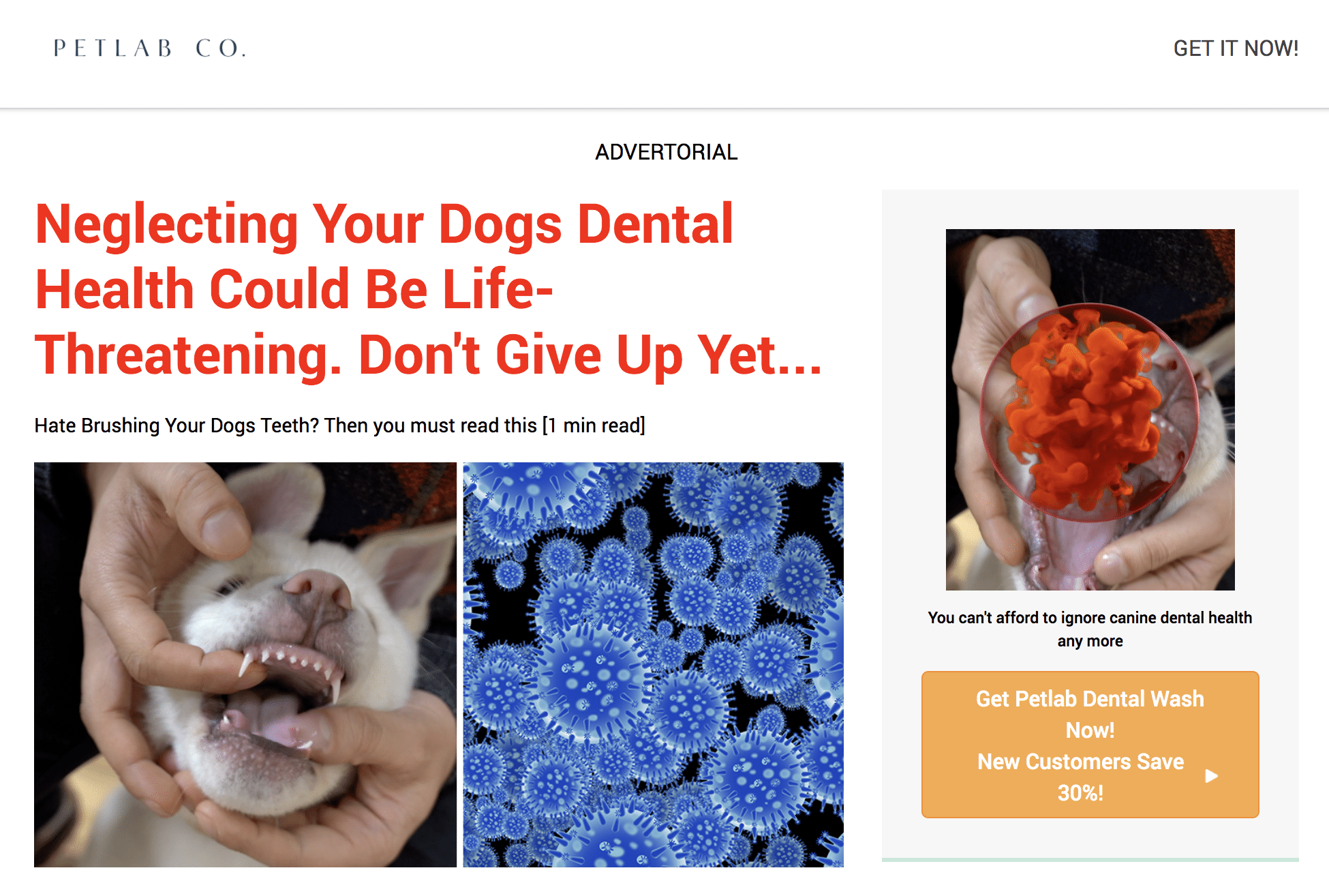
A ‘discovery’ ad in a Taboola feed brought me to this advertorial-style landing page, which focuses on a single product, Petlab Dental Wash.
In the showcase that follows, we focus mostly on single product landing pages like this one.
Effective Single Product Landing Pages Examples
1. Petco
E-commerce companies, or the online branches of retail chains such as Petco, generate traffic from many different sources for multiple products. This scenario calls for publishing individual product landing pages for specific products and populating each page with details to help the buyer make an informed decision.
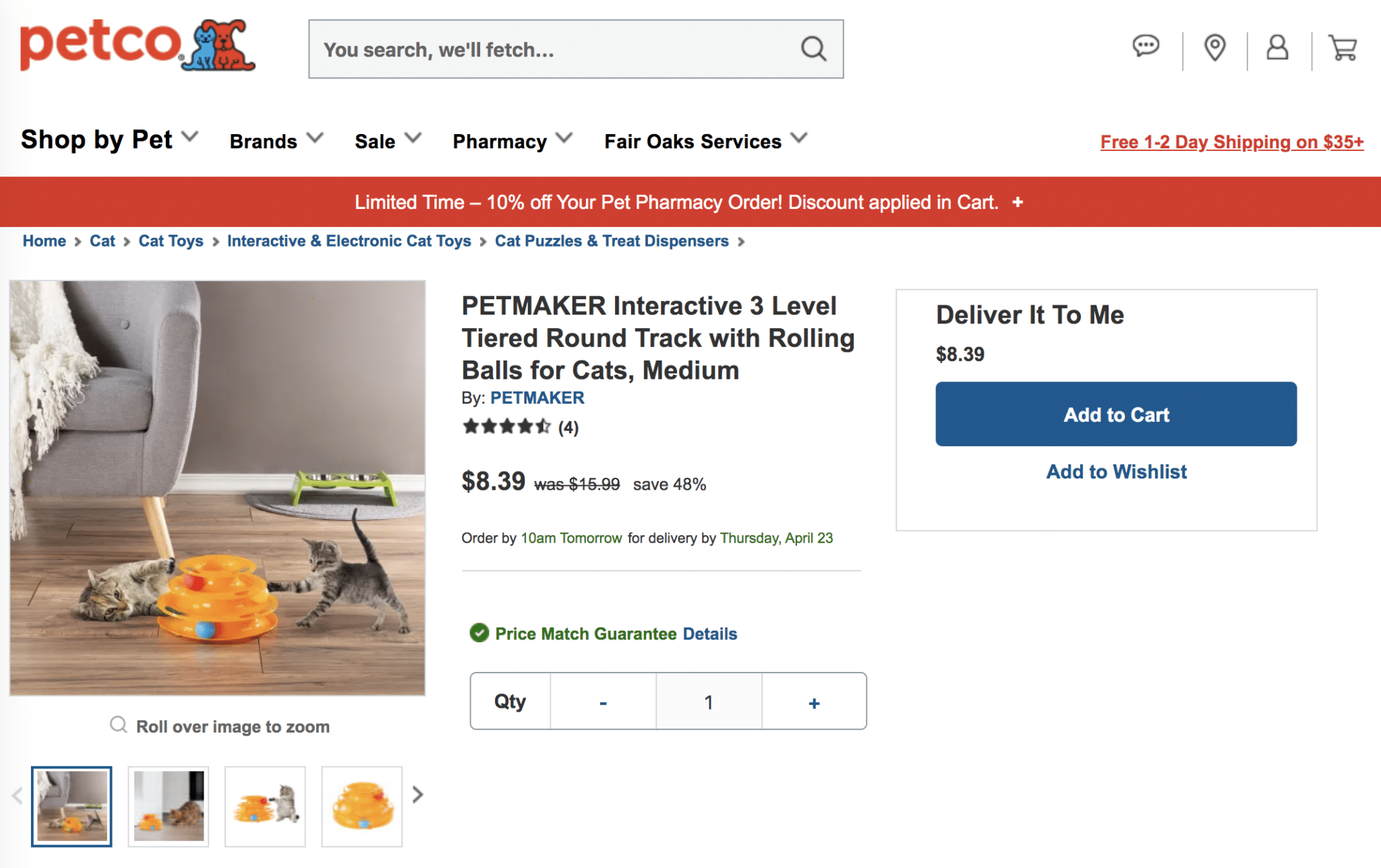
Atop its product landing pages, Petco wisely presents images (with zoom capabilities), an aggregate of customer ratings, the price, and shipping details. Not pictured are additional elements, such as a detailed product description, customer reviews, a forum of Q&As, and links to related products.
2. Firstleaf.club
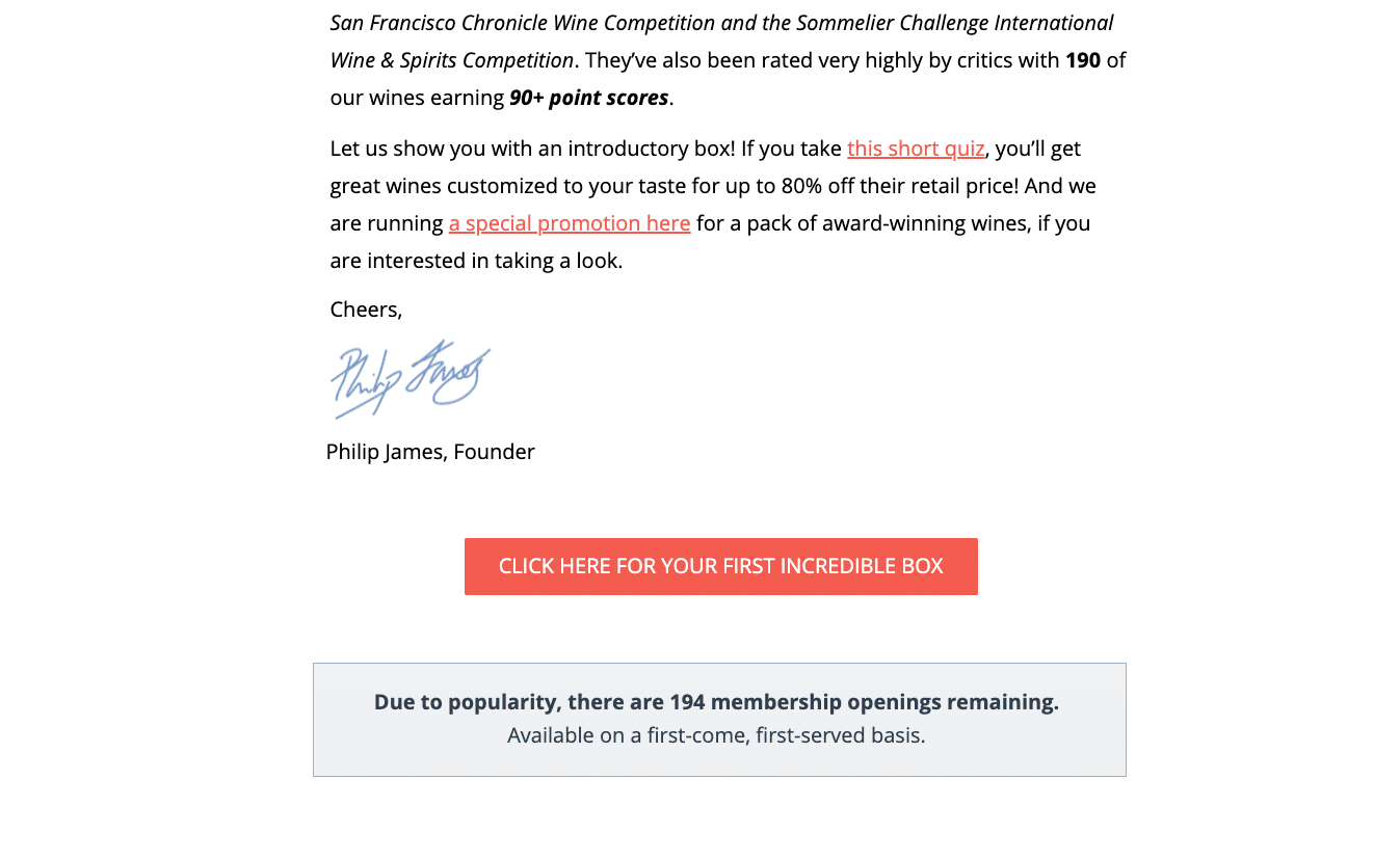
A digital ad campaign to enlist new members to Firstleaf’s online wine club features a simple and elegant letter from the company’s founder.
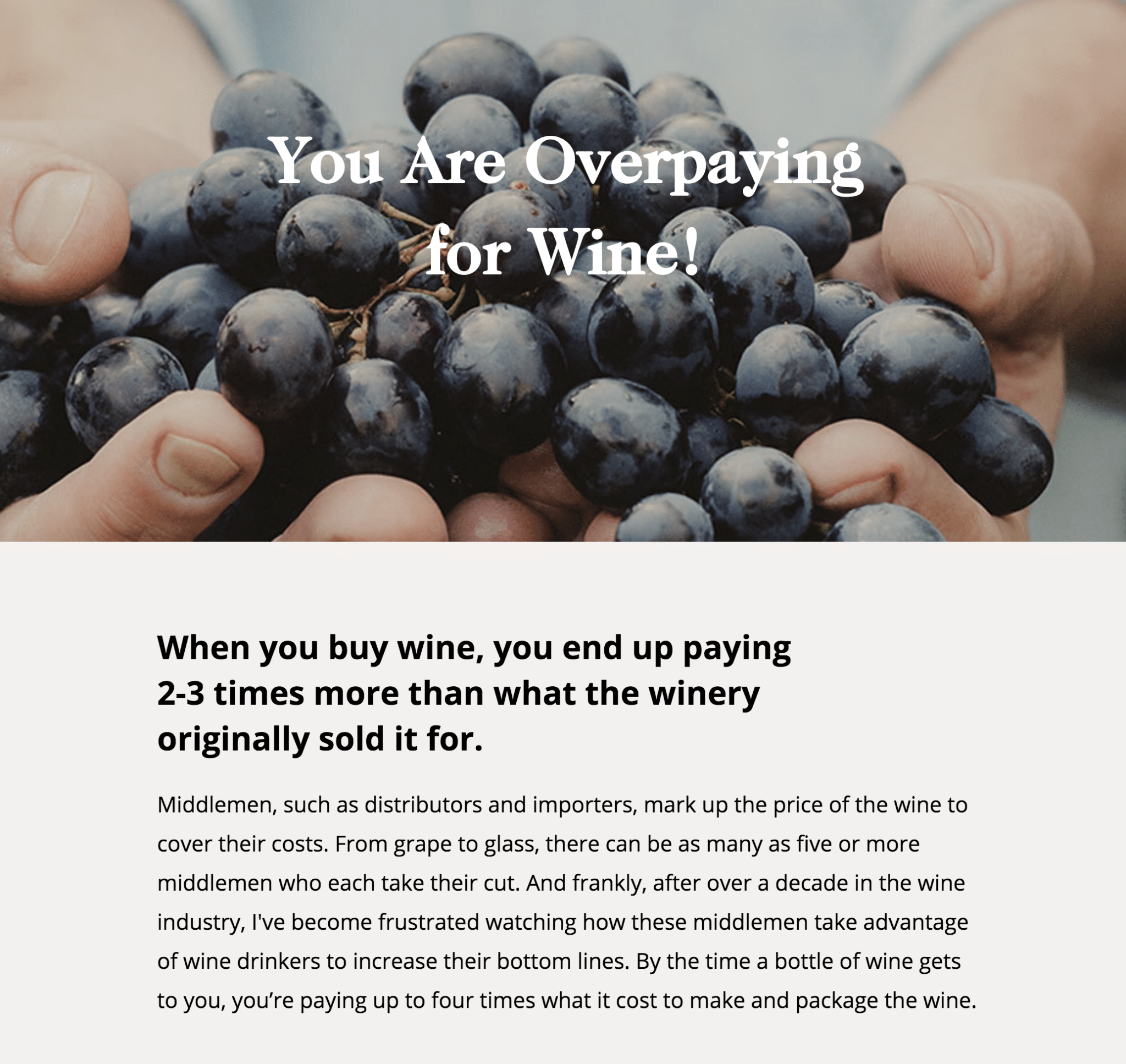
The first thing you see is a hero shot with a simple and arresting headline: You Are Overpaying for Wine! Nice hook. I’m in. Note the sub-headline that follows. It builds on the story effectively and sets up a subsequent section of copy that oozes authenticity and empathy.
This landing page earns additional points for including a relevant endorsement from a leading industry publication further down the page, a 100% satisfaction guarantee, a promotion to get started, and a very strong call-to-action (CTA) that reads, “CLICK HERE FOR YOUR FIRST INCREDIBLE BOX.”
3. Wild Alaskan Company
Here’s a simple and strong landing page for another regular subscription-style product.
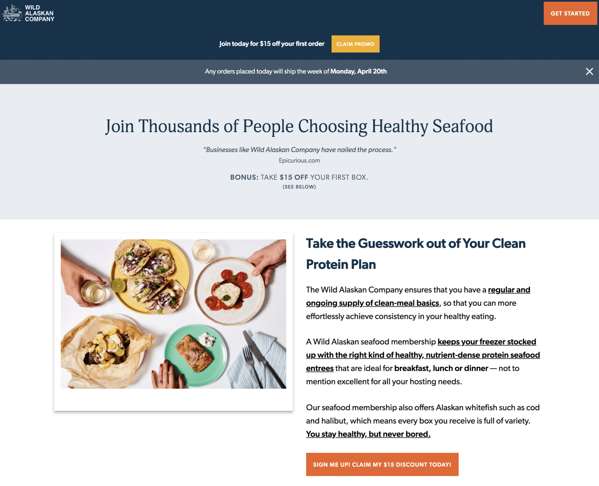
At the top of this landing page alone, you find a promotional offer, an endorsement, a compelling image, and above all, a great headline. The Join Thousands… approach deliberately features a persuasion tactic known as social proof.
Social proof — a proven tactic for landing page conversion — is a practice that aims to inspire action by following the masses.
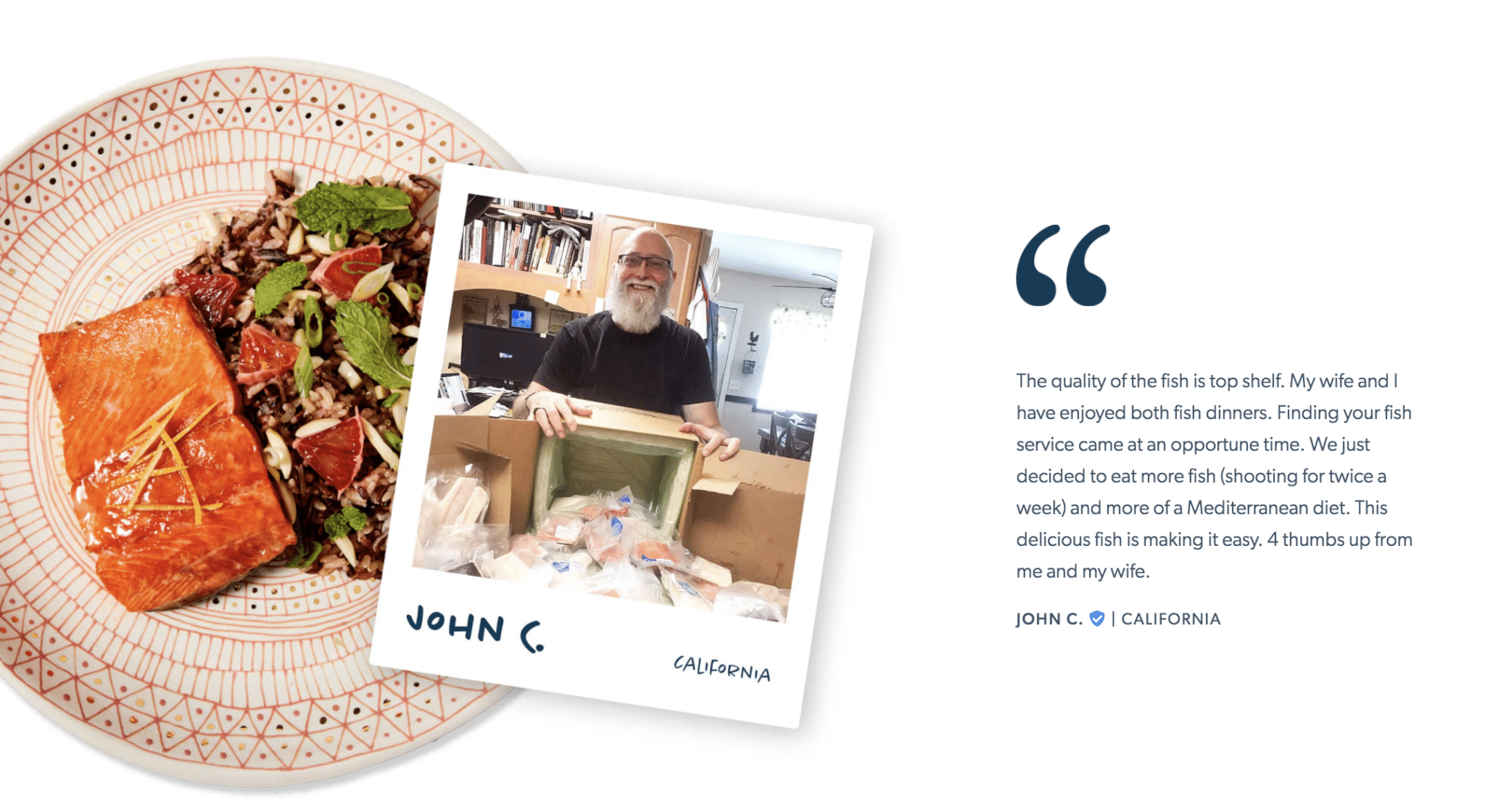
Among the many elements that help the Wild Alaskan Company tell a persuasive story on its product landing page are a series of attractively designed testimonials from real customers, featuring a tasty combination of professional and amateur photography.
4. DeFolio
While this example of a single product landing page hints at an advertorial approach, it falls nicely in line with the popular content marketing approach, the blog post.
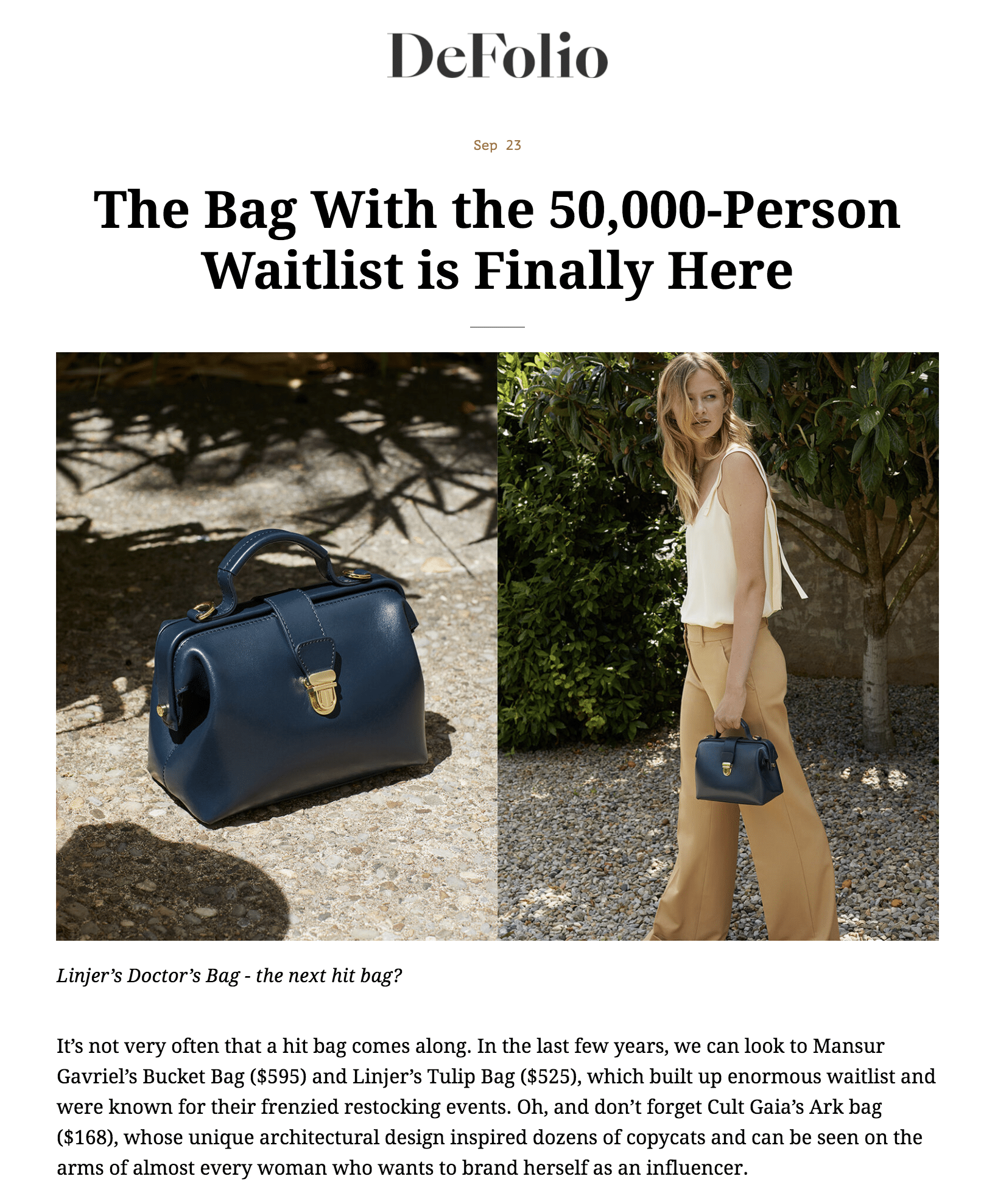
It looks like a blog post. It reads like a blog post, in this case, a fashion article. It is essentially a blog post. DeFolio does a nice job with a single column, fuss-free page with ample white space.
The page features elegant photography and tells a short story about how its ‘hit bag’ came to prominence.
Kudos to the headline, as well. I’ve seen the ‘waitlist’ concept before, and you probably have too, which suggests it’s an effective one. Or at least it’s worth trying (provided it’s true).
5. Leadpages
Forgive the meta-dynamic happening here, but I thought I’d do a search for “landing page creator” and look at examples of landing pages offered atop the search engine result’s page.
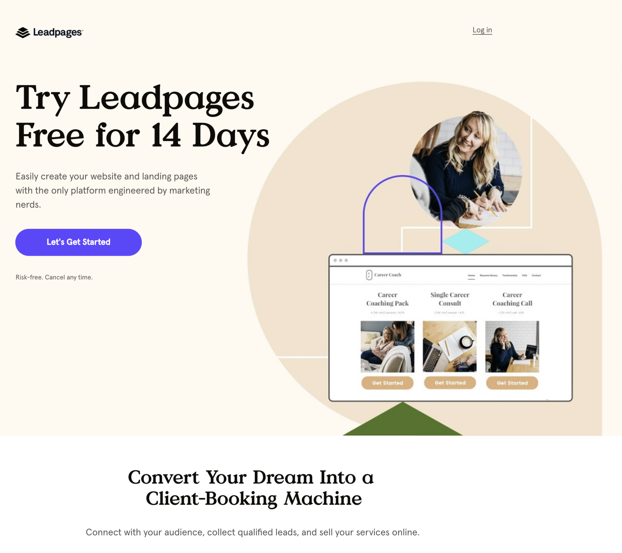
Leadpages makes it impossible to miss its free trial offer, a common tactic employed by SaaS providers. Zoom-in to read the fun copy and notice the excellent CTA button featuring a contrasting color, active language, and a nice use of negative space to call attention to the button.
The remainder of the page resembles a homepage or product page, including extensive features and benefits, reviews, a brief explainer video, FAQs, and more. It’s fair game to build a longer story on your landing page, but wisely, Leadpages reiterates its free offer at various scroll depths throughout the page.
It’s also worth mentioning the page features the term “landing pages” seven times. It’s clearly optimized to perform well with search, for its paid ad, and perhaps, organic search as well.
6. Eargo
Some products don’t lend themselves to an instant trial or perfectly fit the model for buying off the page. In such cases, great product landing pages often offer a free consultation as the next step in the buying journey.

While Eargo hearing aids sell online and ship to your door, the company recognizes that conversions improve when a potential buyer talks directly with a licensed professional, hence the BOOK FREE CONSULTATION offer.
Bonus points on this landing page for the use of awards (as evidenced by a number of certification badges); ‘as seen in’ media badges; great design from top to bottom; and, stellar writing, such as, “We engineered out all of the hassles.”

The Eargo landing page also features an inviting contact form, preceded by the introduction of one of the company’s personal hearing professionals, a doctor of audiology.
7. Gerber Life Insurance
Life insurance is a product, and another example of a product for which most consumers have a number of questions. I commend Gerber Life for how it addresses this challenge with its interactive landing page.
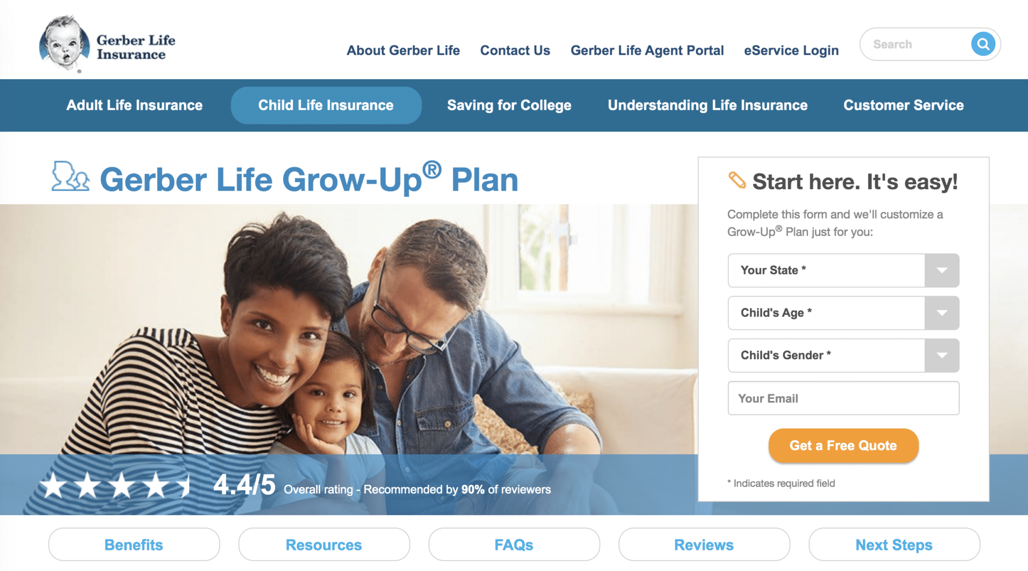
Gerber recognizes your first question will be, “What will my policy cost?” It’s answer: “Start here. It’s easy.” By using a pull-down menu and answering three basic questions, you get a free quote.
Another way Gerber answers your questions is by composing an extensive page, with specific sections: Benefits, Resources, FAQs, Reviews, Next Steps. Each instantly accessed with jump-links located beneath the free quote form.
8. Wayfair
Yet another approach to the product (or products) landing page is the members-only approach, which, as you see below, calls for entering an email address to continue the shopping journey.
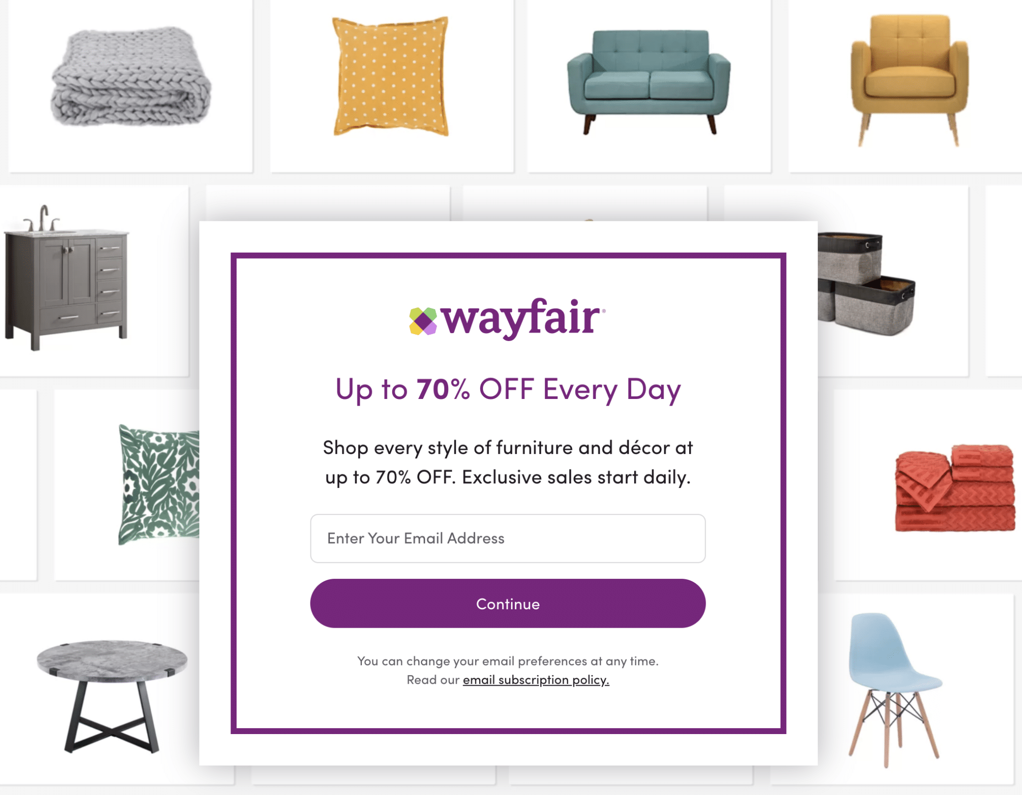
I was curious to know if Wayfair insists you provide an email address to buy on its site, so I visited its homepage. I found a pop-up form requesting my email, however, the option to skip it was there.
Not so with the landing page served above, which I came upon after clicking a native ad in a news feed. Although, the tactic of requiring an opt-in is sure to deflect some buyers, I applaud how gracefully Wayfair treats its form-based landing page.
It’s hard not to like the 70%-off pitch and it’s compelling to see the type of products I’ll find there. Also, I appreciate the fact that I can join by simply providing an email address (as opposed to a more time-consuming rigmarole you often find with other membership-based companies).
Conclusion
Product landing pages share the goal of making a sale, yet they are crafted in different ways to address unique challenges. Remember to:
- Design an attractive page and write compelling copy to address your prospect’s wants and needs.
- Organize your pages from most important to least important and make your CTA easy to find and action-oriented.
- Take cues from the examples above and test variations of your landing pages to maximize conversions.
And, finally, realize that Taboola is a powerful platform to drive traffic to your landing pages.