It’s easy to pat yourself on the back when your landing page goes live. It’s been a monumental effort to pull together the right content, design and marketing automation to get the page up and running.
‘Live’ is just the first milestone, however. Next you must closely monitor its performance, and continue to optimize for more and higher quality conversions on the page itself.
When they work, landing pages form an instrumental part of most marketing and advertising campaigns, but how do you know if your landing page is working as hard as it possibly can to achieve your goals?
The way to get them working as hard as you can is through A/B testing.
In this guide, you’ll learn how to test a landing page, how to squeeze more conversions from your landing pages, and walk away with examples and tools to guide you.
What is A/B testing?
A/B testing is a key conversion optimization method in which you compare the performance of two landing pages — typically landing page ‘A’ and landing page ‘B’ — to see which page drives the higher amount of conversions.
You might be testing for any type of conversion. Maybe you’re looking to drive newsletter sign-ups, convince potential consumers to download a piece of content, or hoping they’ll make a purchase. Through A/B testing, you’re hoping to increase your conversion rate, or the number of people who complete a desired action as a percentage of the number of people who see a landing page.
A good landing page test compares two slightly different versions of the same page (where one single element changes) to see which version has the higher conversion rate.
There are two types of tests commonly used to increase conversion rates:
- A/B testing – Commonly used to test two different types of landing pages against one another. These pages typically differentiate themselves with a single element. You can’t be sure exactly what causes an improvement, however, if you test more than one element.
- Multivariate testing – Multivariate testing compares a higher number of variables, meaning several elements are changed at a time. Multivariate testing is best used to assess the impact of a major design change, rather than a single element. You use this when changing the overall look of a landing page, for example, then use A/B testing to fine tune individual elements.
Why should you use a landing page A/B test?
A/B testing is fundamental to landing page optimization. There are several things you might want to improve with a landing page test, all of which ultimately will lead you to the goal of improving your conversion rate.
Most commonly, marketers look to learn one of the following insights from an A/B test:
- How to increase conversion rate – What design or copy changes drive more people to fill out the form — whatever that form is?
- How to increase sales – What design or copy changes drive more people to eventually make a purchase?
- How to increase engagement with content – Get your landing pages right and you increase visitors’ engagement with your brand, as well as your conversion rate. Even if they’re not ready to click, visitors might decide to check out the rest of your site, or follow your social-media profiles, giving you a chance to connect with them later.
- What elements really drive the audience – What makes your audience tick? Is it certain topics? Content types? Copy tone? Or something else?
One of the great things about performing tests on your landing pages is that it’s relatively risk free. If you test an option and it doesn’t work, you can stop showing visitors that version of the page and try something new. And, you get as much customer insight from what doesn’t work as from what does.
How to Do A/B Testing in Marketing
The first step to A/B testing is having two different versions of your landing page, but there are so many elements, it’s hard to isolate exactly what to change and test first.
As a rule, the best landing page tests focus on the elements that directly affect conversions.
Here are some landing page test ideas to get you started:
- The offer – what are you offering your visitors? You can experiment with different lead magnets, for example, to see which one works best for your audience.
- The headline – does it grab your visitors’ attention? Does changing a word, the size, or the placement make a difference to conversions?
- The copy – are you using the right words or phrases to keep your visitors engaged? Start with the subheading, then work your way through features, benefits, and more.
- The CTA – are people clicking on your call-to-action (CTA)? What happens if you change the way you address visitors, or the wording? And what about the button color and its placement?
- Your sign-up form – shorter forms are usually more effective, but balance length against the information you need. Does adding or removing a form field help or hurt conversions?
- Using images and video – these can engage or distract, they can support your CTA or detract from it.
- The layout – the overall placement of items on a page can affect their effectiveness.
Ultimately, you’ll test them both by splitting a live, paid campaign down the middle, on a search, social or discovery site such as Taboola.
Here’s what the process looks like in detail from start to finish:
- Gather data on how visitors interact with your landing page. Use web analytics from Google Analytics or a similar tool to discover what visitors do after they land on your page. Use this tool to measure the conversion rate too.
- Form a hypothesis about what’s affecting conversions on your landing page, what you need to change, and what effect you think it will have. Here’s an example: We think that removing a form field from the sign-up form will result in more visitors completing the form. It’s important to include a way to measure this, for example: We’ll know this has worked when we achieve 200 more sign-ups in the next month.
- Change the element you have identified as the likely cause of the conversion issue. Remember, in an A/B test you only change a single element.
- Run your test for long enough to get reliable, statistically significant results. That’s the only way you’ll know whether your landing page test has succeeded. Divide the traffic to your landing pages, so 50% of visitors see the original version (the control) and the other 50% see the changed version (the variant).
- Assess the results and take action. If the variant has improved conversions, implement it. If not, return to the hypothesis stage and try something else. If there’s a significant increase in performance for one variant versus the other, use that page as a basis for your next test, changing another element as you move forward.
Repeat this process as many times as you need, until you get a landing page that meets your conversion goals. Let’s look at some A/B testing examples with some of these elements.
A/B Testing Examples for Landing Pages
Here are some examples of landing page A/B tests to inspire you:
1. Copy Length
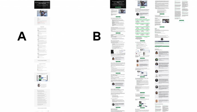
When thinking about how to write content for landing pages, consider copy length. Data36 ran a landing page test for an online course.

The copy on version A was 1,500 words. The copy on version B was 4,000 words. At the end of a three-week test, there were 96% more people on the waiting list for the course, and option B outperformed option A by 99%.
This shows there are no hard and fast rules governing landing page copywriting.
2. Images
When considering how to design a landing page, it’s tempting to include images to attract attention. While images work great on product landing pages, different images have different results.

ConstructConnect saw conversions increase by 35% by changing the background image on its landing page.
3. Videos
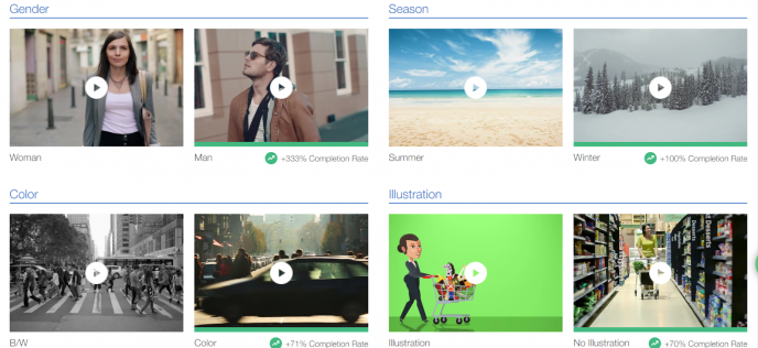
If you want to assess how effective video is on a landing page, start by looking at video trends for your location and market. Taboola Trends can help you identify the video format that’s likely to perform best, even before you embed it on a landing page.

4. Copy
When it comes to how to write content for landing pages, there’s no single right answer. You can change several aspects of landing page copy, from headlines to features and benefits.
One surprising result came from the bank Earnest, which found that adding the words “we value your privacy” to its landing page increased conversions by 5%.
5. Social Proof
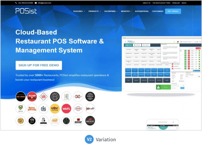
Social proof helps build trust and aids conversions. VWO found that adding customer logos, and tweaking the on-page copy resulted in a 5% lift in conversions for its customer Posist.

6. CTA
When it comes to how to design a landing page, the CTA is the most important element to consider. Hubspot customer Bellingham Electric upgraded its CTA button design to a more modern look and slightly tweaked the button text. After rolling this out on many pages, the company saw click through rate (CTR) increases of between 20% and 47%.

7. 3D Interactivity
Even a small tweak can make a big difference to a product landing page. This MobileMarketing case study shows how TSUM experimented with using 3D images instead of static images on its product landing pages. The results were phenomenal. Customers spent more time on pages with the 3D images, and were more engaged. Plus, the company saw a 40% lift in conversions on those pages, compared to product pages without the 3D experience.

Landing Page Testing Tools
Ready to get started with landing page A/B tests? Aside from Taboola, here are some other landing page testing tools (free and paid) that you can use:
Landing page testing tools also help you understand your audience better. As you change elements on your landing page and see results, you’ll gain insight into what works best for your target market. This helps with future landing pages, because you are basing your work on data, rather than guesswork. It also helps with your content strategy, as you learn what matters to your visitors.
- Optimizely
- VWO (which offers free statistical significance and duration calculators for your A/B tests)
- Convert
- Crazy Egg
- Hotjar
- Unbounce
Conclusion
Now you know the importance and benefits of landing page testing, and how to do it effectively. Use the tips and examples in this guide to help you to improve your landing pages for better lead generation and more sales.