It is a known fact that businesses publishing more than 40 landing pages generate 12 times more leads than those with only 1-5 landing pages. But simply publishing pages doesn’t increase your chance of conversion. You must also make them relevant to the pre-click stage (search or display ad, email campaign, etc.)
When you connect your ads with relevant post-click landing pages you ensure that the visitor knows they’ve landed at the correct place — increasing the likelihood of conversions.
By completing the post-click sequence with dedicated pages, instead of busy homepages or cluttered product pages, you make your ad clicks more worthwhile since you’ve already paid for the ad click. What also improves the possibility of conversions is knowing which type of landing pages to create for specific campaigns.
The 8 primary types of landing pages
There are 8 main types of landing pages you can create:
- Splash landing pages
- Squeeze landing pages
- Lead capture landing pages
- Sales landing pages
- Thank you landing pages
- Unsubscribe landing pages
- Referral landing pages
- 404 landing pages
Each type performs a specific function and can be used in a particular place in your marketing funnel.
1. Splash landing pages
Unlike the rest of the pages where the user lands on the page after clicking an ad, users see a splash page when you have a specific goal to fulfill. Asking the user about their language preference, verifying their age, or making an announcement are popular choices for slash plages.
A typical splash page includes very little copy, a background image, and the message you want to convey. Here is how Budweiser uses a splash page to confirm the legal age of the user:
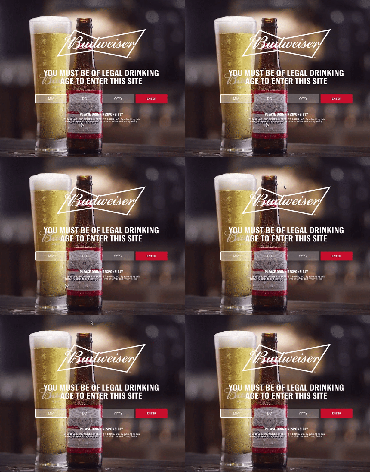
Since splash pages often precede a website page they can be used at any stage of the marketing funnel.
Contrary to other landing pages, splash pages are not meant for lead generation or get visitors to click-through to a form. They are simply used for announcements and to get visitors to select how they want to view your website.
2. Squeeze landing pages
Squeeze pages are best used at the top of the marketing funnel to collect users’ email addresses in exchange for a free offer. This page is a short-form page that usually only requests a visitor’s email address so they can enter your marketing funnel.
What’s the Difference Between a Landing Page and a Squeeze Page?
Squeeze pages are a type of landing page, but with only one goal. Typically, that’s collecting an email address. Squeeze pages are often shorter, simpler, and contain less images than other types of landing pages. Other types of landing pages provide more education, more images, and are typically greater in length.
Since squeeze pages are light on content, they are mostly designed as pop-ups to capture user attention and feature the following elements:
- A persuasive headline that informs the visitor about the value of the free offer.
- Minimal copy providing some detail on the offer.
- A short form that asks for the visitor’s email address (and in some cases their name).
- A CTA button that tells the user what to expect next.
- A clearly discernible exit or X button that allows visitors to close the squeeze page without submitting their information.
- A privacy policy link that lets people see how the company will share their information, if at all.
GQ’s squeeze page offers their newsletter in exchange for the user’s email address:
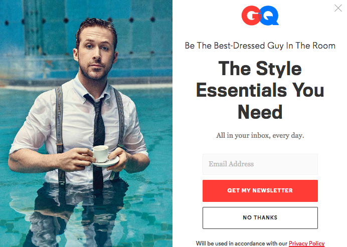
Squeeze pages help you create the most valuable tool for nurturing leads and turning them into new customers — an email list.
3. Lead capture landing pages
Lead capture pages are the most widely used among this list throughout the marketing funnel because they are longer than a squeeze page, but not necessarily as long as a sales page (discussed next). For that reason, and because of their versatility, lead capture pages are commonly used by marketers in the middle funnel stages. What sets lead capture pages apart from others is its ability to collect leads via a form.
To create optimized lead capture pages, it’s important to maintain a good balance between the ‘ask’ and ‘reward’ on the page. The ask includes the lead capture form and the reward is the offer you’re promoting to collect the leads. Make sure that the reward justifies the ask as well.
For example, a page offering the top ten digital marketing trends for 2019 shouldn’t contain a long form. In contrast, a product demo should include more fields so your sales and demand gen team can qualify the leads more accurately.
The number of form fields also depends on the user’s position in the funnel. At the top, lead capture pages shouldn’t have forms with extensive fields. However, once you have basic user information, and the user has entered the marketing funnel, you can then use longer lead capture forms on middle of the funnel pages to determine whether the user is actually interested in your product/service.
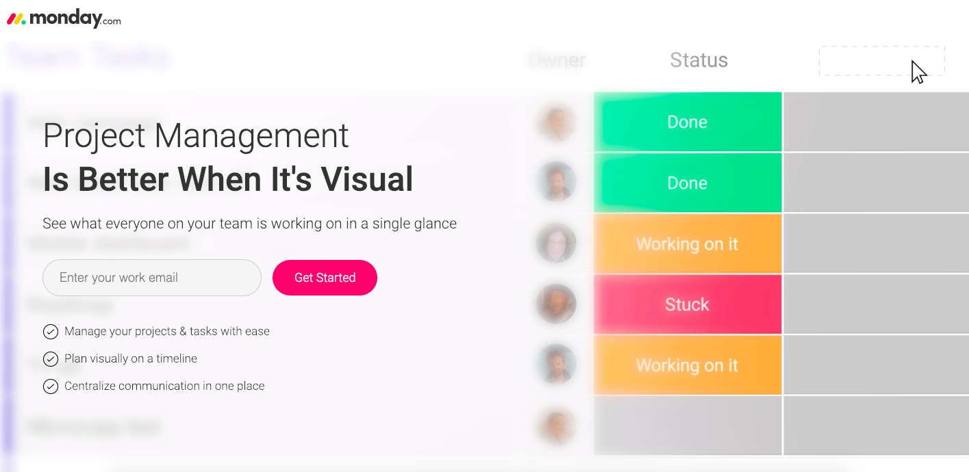
Monday.com just asks for the user’s email address to get started with their project management solution:
Whereas Quip uses a longer lead capture form on their demo landing page:
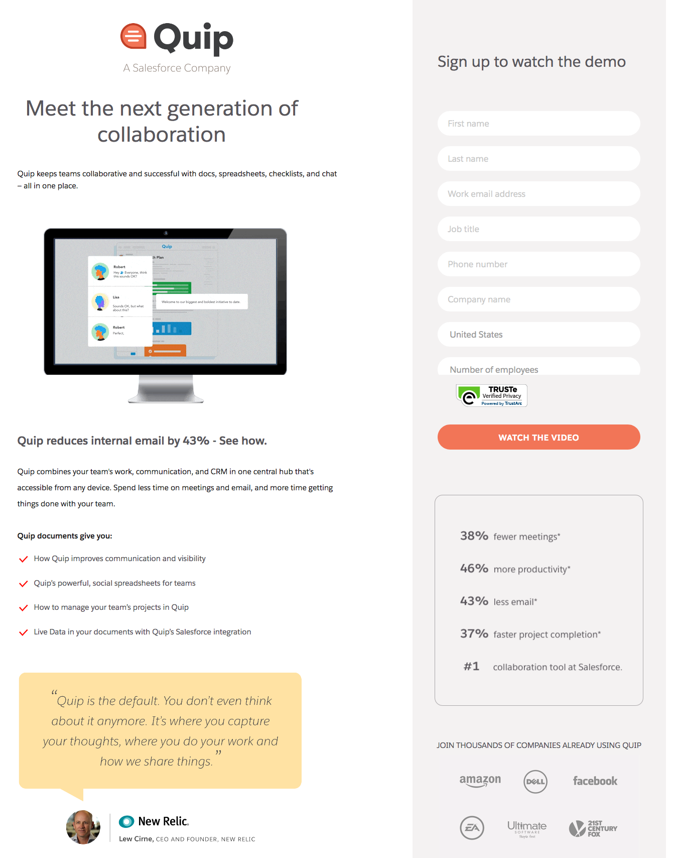
Lead capture pages allow you to collect vital information about your potential customers, which helps you create relevant marketing messages they prefer and respond to. To create optimized lead capture pages always be wary about the length of the lead capture form. Only ask for information that’s absolutely necessary for a particular offer.
In the end, optimizing lead capture forms ensures there is no friction hindering the conversion process.
4. Sales landing pages
Sales pages are typically used at the bottom of the funnel and are often the toughest to design because they have to persuade people to buy. That’s because convincing someone to pay for an offer is a bigger ask than simply asking for their email address.
Sales pages can be short or long depending on your product or service and the amount of information it requires to explain the value to users. Generally, the more expensive or complicated your product or service is, the longer the page design (vice versa). Regardless of the page’s length, it should contain a detailed pitch of your product so you can persuade visitors to become customers by clicking the CTA button.
That said, sales pages are usually longer than the other types of landing pages since they require more information to persuade visitors to buy the product.
The Renegade diet sales page is a long-form sales page that features information what the program can do for users, includes an FAQ section, an about section, customer testimonials, a guarantee seal, and of course an add to cart CTA button:
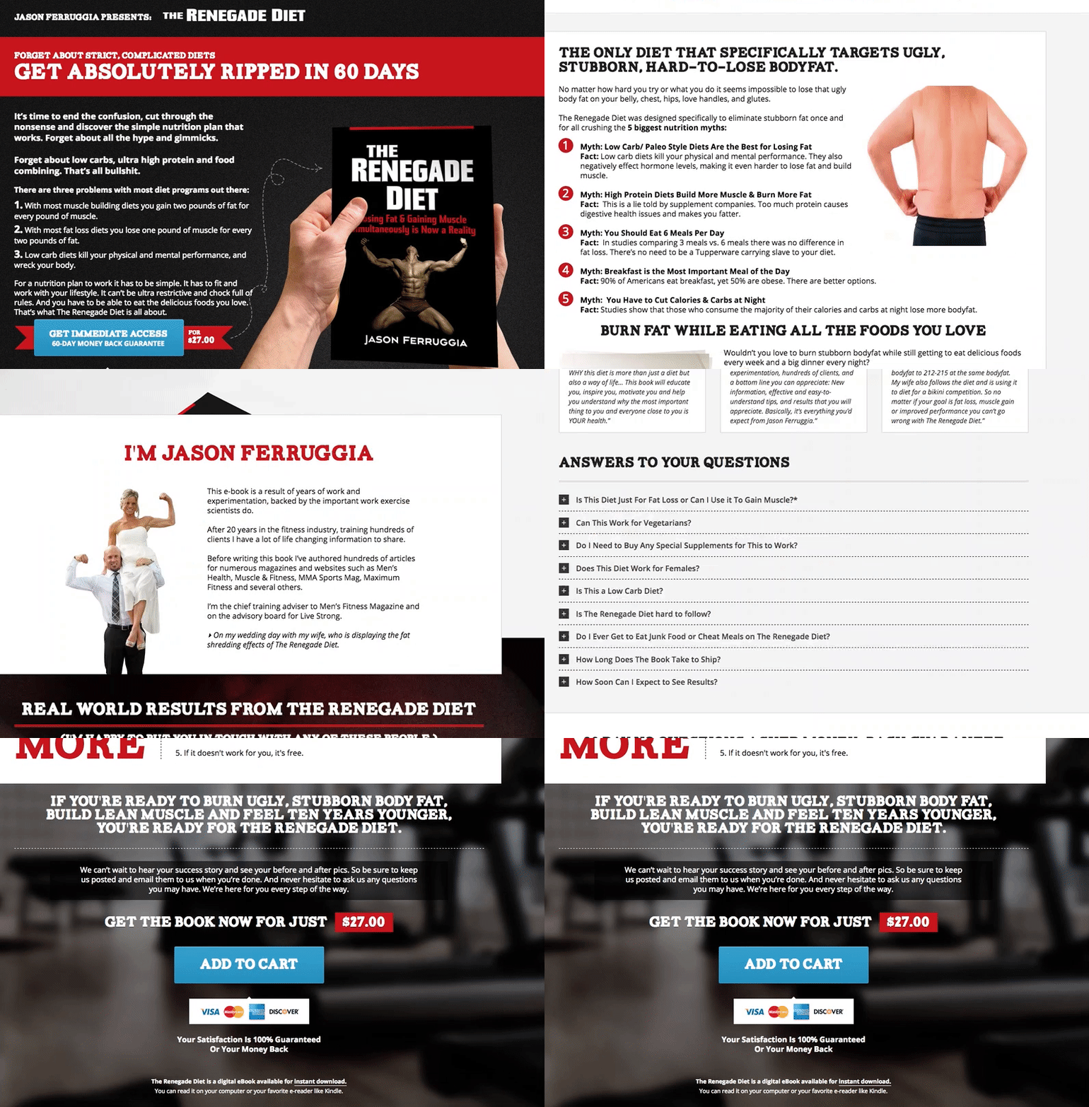
To create a sales page that visitors convert on, be sure to add landing page elements that are optimized for your audience segment and provide the necessary details for your offer.
5. Thank you landing pages
Consider thank you pages your lead-nurturing best friend. This is the page where someone is redirected after they’ve filled out a form, entered in their information, or made a purchase. Your thank you page has the opportunity to either move a lead further down the funnel, or set you up for a repeat customer.
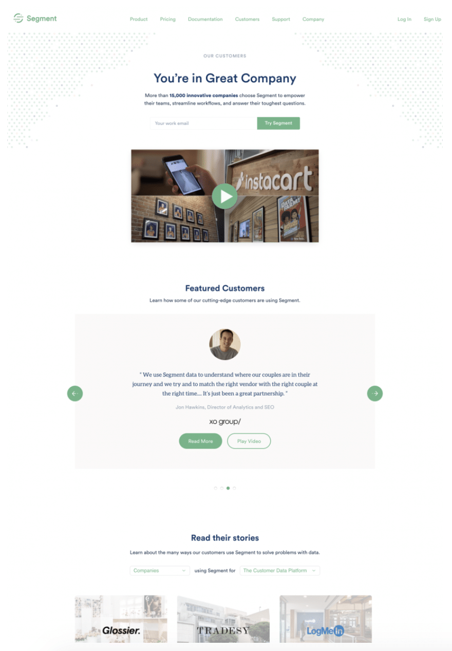
There are several ways to do this, including recommending content for your lead to consume, listing other products of services offered, or as Segment does, you can take an opportunity to share social proof and reassure a lead why signing up or making a purchase was the right decision.
6. Unsubscribe landing pages
The unsubscribe page presents a unique chance for a win back. This page is wide open to infuse personality, more granular options to prevent a general unsubscribe, and more.
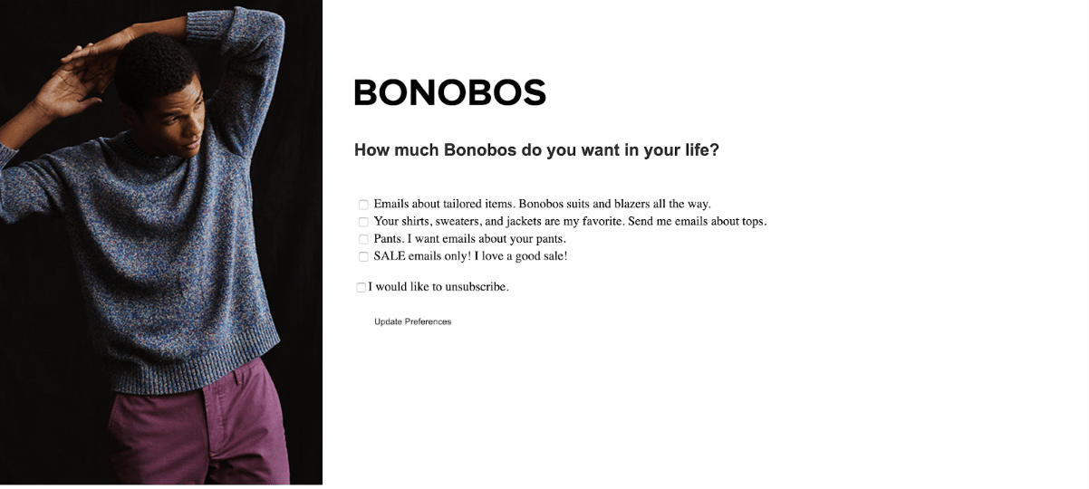
When done right, unsubscribe pages can turn an unsubscriber into a loyal customer. See here how Bonobos uses their unsubscribe page to check in and give a chance to customize email preferences. They also cleverly include a rotating photograph featuring their clothing to give customers one last chance to see what they might be missing if they opt out of email communication.
7. Referral landing pages
Having customers or clients loyal enough to recommend you to their friends is a big win, but where exactly you send those friends once the referral or recommendation is made can help take your win to the next level.
A good referral landing page confirms all of the praises a potential customer’s friend has sung about you, and makes them feel confident that they’ll like you enough to purchase, too.
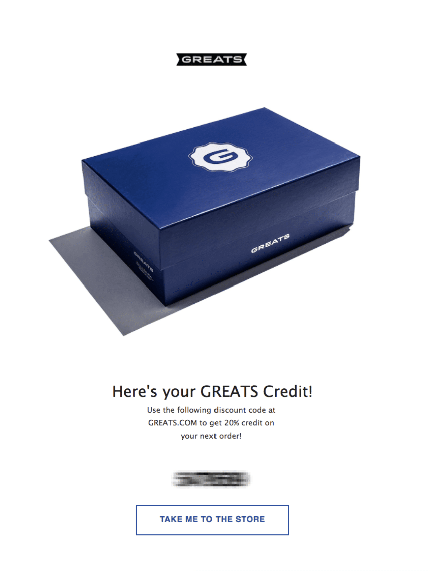
GREATS does this excellently, with a simple layout, a clear CTA, and the fun visual element of a shoebox waiting to be opened.
8. 404 landing pages
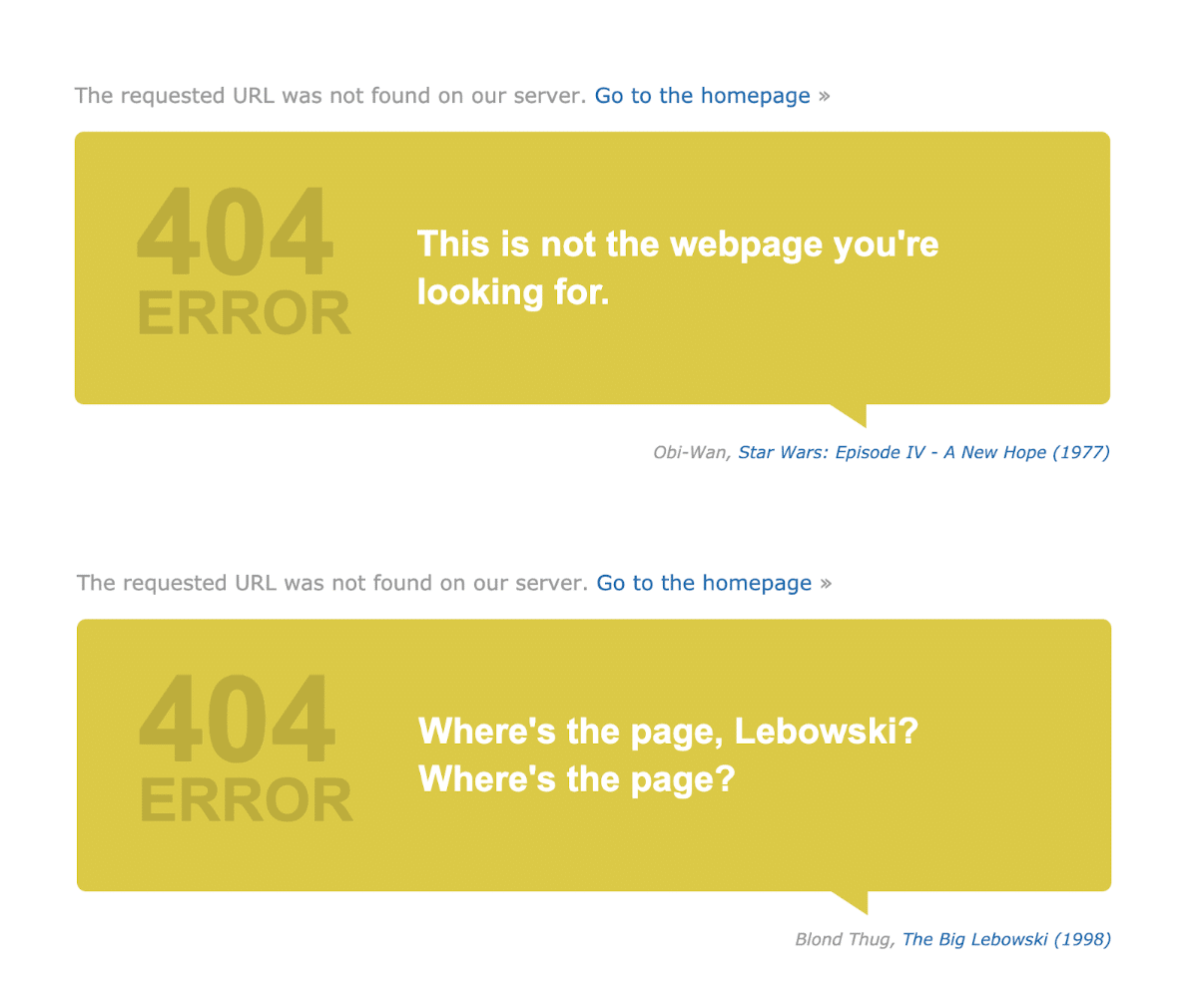
Okay, you might be thinking ‘isn’t a 404 page just an error page?’, and you’d be correct, but it’s also a page rich with opportunity to take a potential customer from lost to loyal.
A strong 404 page is not only on-brand, but is actually a place to put brand voice on display. This can be done through humor, an interactive element, or even just by simply being helpful and human.
One example of a brand with 404 page personality is IMDB. Featuring a rotating cast of quotes different every time you hit refresh, IMDB lets you know you’ve come to the wrong place, links to their homepage, and manages to stay totally on-brand by transforming a famous movie quote into a quote about a 404 error. Oh, and they don’t miss the opportunity to link to that movie’s IMDB page, either.
Choose the right type of landing page to increase campaign conversions
Using optimized post-click landing pages in your ad campaigns makes you better equipped to convert prospects. Plus, the type of offer you promote and where the user is in the funnel helps you select the page type and how to design it.
When users arrive at the right type of landing page after the ad click, the chances of them converting is not only a possibility but a reality.
Further Reading
About the author
Tyson Quick is the Founder and CEO of Instapage, the leader in post-click optimization. He founded Instapage in 2012 after seeing how performance and growth marketers were losing money in underperforming advertising campaigns. Since then, his vision has been to create a suite of post-click optimization products that maximize returns through advertising personalization.