No matter the size of the business, there’s really nothing more important to a publisher than how people feel when consuming content on their site.
We know you want to WOW your users first, and monetize them second.
But we also know that content creation is a business, and you need to turn a profit.
It’s at the moment of this realization that we all climb on the revenue versus user experience see-saw, spending immense amounts of time and effort balancing just how many advertisements and calls-to-action we put in front of website visitors to stay profitable, while also making sure they’re not annoyed by those efforts.
The see-saw tips back and forth endlessly, constantly looking for the perfect balance for every website visitor.
But…this analogy assumes that every ad experience is one that negatively affects the user experience. If users aren’t annoyed by your attempts to monetize them, and they keep coming back to consume your content, then this is the best of both worlds.
We teamed up with Nielsen to find out whether or not this is true, and to try to define the best placement and moment to show website visitors ads without negatively affecting the user experience.
The study
At Taboola, we specialize in the experience users have at the bottom of the article, so we set out to test that same experience. In order to find out how website visitors felt scrolling through the feed environment, we rounded up a bunch of them to perform an in-person study.
Specifically, we took a very detailed look at their eye movements to understand two things:
- How much attention were they paying to those ads?
- How emotional did they feel when looking at them?
We chose these two parameters because where attention is high and website visitors are emotionally responsive, they’re engagement with the publisher site is highest.
We had 60 participants in the United States interact with content in different environments–one with an article and a Taboola Feed at the bottom of the article and one page with an article and nothing at the bottom, to compare.
BrainVu’s technology worked its magic and identified different biomarkers—any bodily indicator that can be measured (in this case, eye movements)—to measure their attentiveness and emotions while scrolling on mobile devices.
Basically, we used science to see how these participants felt in the infinite feed environment.
Before we get started, let’s define attention.
Back it up to the biomarkers. Attention is measured by four things:
- Change in focus. Did their eyes move away from the screen or content?
- Dispersion of focus. Were they looking at a variety of things on the page, or just the ad?
- Gaze density. Were they zoned out when viewing the ad, or really paying attention?
- Cognitive load. Was their brain hard at work, or were they feeling easy-breezy?
Alright, here’s the short of it:
Participants were 20% more attentive when presented with a continuous scroll feed at the end of the article than compared to pages without content recommendations at the bottom of the article.
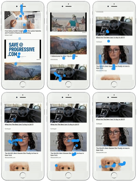
Here’s exactly what that looked like in real-time:

This is when people paid the most attention.
We concluded that people are interested in the feed environment because they’re used to it–because it’s so similar to the environment they’re experiencing on social media sites.
Not only are they used to it, we know that they spend more time on feeds and that they consume more content in that type of environment.
In a feed environment, people are in a mindset that encourages them to keep consuming content.
Now, let’s define emotion.
Back to those biomarkers, measured with micro-movements in the eyes. Emotional response is:
- Alertness. How ‘watchful’ were participants?
- Stress. How tense were their eye movements?
- Cognitive load. Again, how hard were they thinking?
And of course, emotion can be positive or negative, depending on the content. Sad content will make you feel sad, like those about the health-risks of certain foods. Happy content will make you feel happy, like those about decorative ideas for your home.
Any emotion can be effective at engaging a publisher’s audience, whether positive or negative, depending on your content. Here, we’re measuring the intensity of that emotion.
This is when people had the highest emotional response.
Here’s what we found:
Participants generated a 17% higher emotional response to the feed than to any kind of finite end of article experience.
This is probably due to the fact that people are excited to see what’s coming next in their feed, and because they’re ready to explore. A feed stocked with content curated for them leads to more interest and more clicks.
In a feed environment, people are in a mindset that keeps them engaged and ready to explore.
The bottom line: website visitors are engaged with organic and sponsored content in ‘The Moment of Next’
Based on this study we did in partnership with Nielsen, we’re confident that website visitors are in what we call the ‘Moment of Next’ at the bottom of an article, in a feed environment.
We’re also confident that this is when they’re most ready to click on more content, whether it’s organic or sponsored, and that monetizing in this moment will lead to a more positive user experience than when someone is in the middle of reading an article, or prior to/while they’re watching a video.
In fact, we already know it’s working.
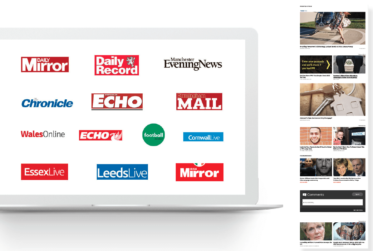
Reach PLC, a major UK publisher group increased revenue by 65%, and increased traffic flowing through all of their owned publications by 30% after implementing Taboola Feed.

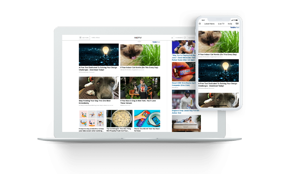
And NDTV, one of India’s largest publications increased RPM by 47% and organic click-through-rate by 113%.

The continuously scrolling feed environment is one where publishers can and will do better to engage their website visitors, all while balancing the see-saw between user experience and monetization.