Last November, we published our first set of tips for publishers on how to optimize their mobile monetization efforts. Today, more than half of the traffic on Taboola’s network comes from mobile devices, and this is a reflection of the broader trend rippling throughout the digital media industry.
As new data and best practices emerge from the Taboola platform, we wanted to provide an updated set of best practices around how publishers can best monetize their mobile websites, while also improving the user experience for readers.
Mobile-responsive website design is the norm.
Leading web traffic data firm Alexa has found that 89 percent of the web’s top 100 sites employ a responsive template design. Given the proliferation of new device and screen sizes available to users, a static website is no longer sufficient to serve all audiences. Responsive design is the rule, not the exception, for high-traffic websites. Those that fail to adopt such strategies risk losing user trust and suffering from higher bounce rates.
Optimize your content for mobile consumption.
In addition to using responsive web design, publishers should ensure that the content itself caters to mobile audiences. Larger headlines and font sizes, bigger buttons, list-style content and vibrant colors are all tactics that serve to better capture users’ attention once they arrive on-site. Optimization tools such as Taboola Newsroom can enable publishers to further perfect their content strategies by A/B testing creative elements and different page placements.
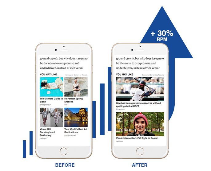
Use the full width: Vertically-streamlined layouts increase performance by more than 30%.
After a rigorous round of testing, Taboola found that vertically-aligned recommendations (with one content item in each row) outperforms the 2-row/2-column grid by more than 30 percent. Larger thumbnails take advantage of the full width of the smartphone screen, making them more aligned with the mobile user experience and optimized for touch interaction.
Bigger is not (always) better: Mobile-optimized thumbnails catch users’ attention and encourage scrolling.
Initially, our team suspected that bigger thumbnails would consistently boost engagement, but we realized there was a limit to this trend. Optimal thumbnail sizes are big enough to capture the attention of readers (boosting click-through rates), while also presenting more than one recommendation on the screen to encourage scrolling.
Expand to 8 rows to maximize your potential monetization.
Once users reach our below-article recommendations, they are already steeped in “content consumption” mode and open to discovering something new. Presenting users with more recommendations increases the likelihood that they will find something relevant to their current mindset, driving better monetization for publishers. Our data shows that eight rows are optimal for mobile engagement, matching users with more stories they may like, while avoiding the possibility of recommendation “overload.” Switching from four to eight recommendations has led to a 25 percent boost in performance for our publisher partners.
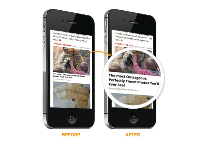
Increase CTRs by formatting titles with 3-5 words in each line.
Taboola tested numerous font sizes and weights to uncover the combination that drove maximum engagement among mobile audiences. Their results found that bolded, 18px fonts deliver optimal results for recommendations on smartphones. The wider thumbnail, and larger font, ensures 3-5 words per line, a best practice we suggest that all mobile publishers follow.
 Engage visitors further up the page with mid-article recommendations.
Industry research has found that 83 percent of people use their phones while waiting in line, and 50 percent are multi-tasking as they thumb through mobile content. Furthermore, mobile users are 10-20 percent more likely to bounce after arriving at a piece of content than desktop users. These findings show that people have a different state of mind when consuming content on-the-go than they do on desktops at home or in the office. Mid-article recommendation units can engage these transitory visitors before they leave the page, boosting monetization for publishers.
Make every pixel count (especially on smaller screens).
Given the limited screen real estate on smartphones, publishers must be even more strategic about what they display on the page. Taboola provides full transparency around the placement of our recommendations using a metric called “visibility rate” (reported through our analytics dashboard Backstage). If your visibility rate per placement is below 35 percent, better positioning and/or additional recommendations are crucial to improving monetization.
Interested in learning more about how Taboola can boost your mobile monetization? Check out our webinar page and contact one of our optimization experts today.