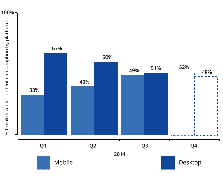
In the past year, we have seen content consumption on smartphone increase by 43 percent across Taboola’s network. In the next months we anticipate a further increase in mobile consumption, and a passing of the 50 percent mark.
The world is going (or has gone) mobile, which is why we decided to share some of our best practices from across our network to make sure you are set up to monetize your mobile traffic effectively.
Mobile-responsive website design is the norm.
Of the top-hundred sites ranked by Alexa, 89 percent have adopted a responsive website design. Responsive design has become the rule, not the exception for high-traffic websites. Users report increased trust and likeliness to spend time on-site with adaptability to mobile.
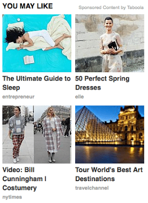
Use the full width. Vertical content recommendation layout increases performance by more than 30 percent compared to a grid layout.
Taboola’s Research and Development Team found that presenting vertically aligned content recommendations with 1 recommendation in each row outperformed the 2 rows x 2 columns grid layout. The larger thumbnails take advantage of the full width of the smartphone screen and optimize for touch interaction.

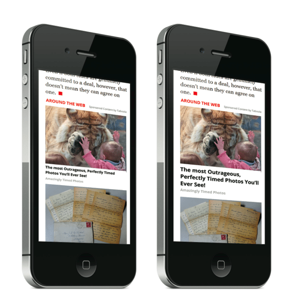
Bigger is not better, we prefer just right. Mobile-optimized thumbnails catch users’ attention yet encourages scrolling.
Initially we thought the bigger the better, but found a thumbnail just big enough to capture the attention of readers would drive high CTR (click-through rate), while presenting more than one recommendation on the screen. This encourages scrolling and continued consumption of content.
Font sized to fit 3-5 words in a title line results in higher CTR.
We tested numerous font sizes and weights to discover that 18px bold font delivers optimal results for content recommendation units on mobile devices. The wider thumbnail and larger font ensures 3-5 words per line.
Capture visitors further up the page.
Eighty three percent of people use their phones while waiting for something and 50 percent do so while multi-tasking. This means people have a different state of mind when they consume content on the go than they do when using their desktops. The chance of mobile users bouncing off a page of content is 10-20 percent higher, which is why you should place content recommendations further up the page.
Make every pixel count.
Limited screen real estate means every pixel must count. We measure placement visibility in Backstage – Taboola’s analytics dashboard, with a metric called visibility rate. If your visibility rate per placement is below 35 percent, then you could probably monetize better by improving positioning on the page and/or adding recommendations.
Optimize your own content for mobile consumption.
If you want your monetization to work, you need to ensure you own content and page layout works too. Here are some examples of what we think makes up great mobile content: focus on headlines, come up with listicles, use big fonts that are easy to read and colors that pop up. And, always be testing! (We can help with that too – click here to read about Taboola Newsroom).