Providing people with quality content is a great way to build trust and awareness with potential customers, but for many marketers who use the Taboola platform, the real value comes when they can persuade the reader to take their relationship to the next level.
Indeed, it’s nice to have someone associate your brand with a funny video or a list of helpful business tips, but it’s much better if your content page also leads them to purchase a product, sign up for a free trial, or give you their email address for further communication.
In order to get readers to take these next steps, it’s not enough for marketers to merely be engaging, entertaining, and informative within the body of the article — they also need to make sure their calls to action (CTAs) are clear and compelling enough to drive the desired results. Here are our five steps to crafting the perfect CTA for your content discovery campaign:
Make sure you actually need a CTA.
People who find your content via a discovery campaign are particularly sensitive to overzealous sales pitches. Since they haven’t directly sought out your brand, they likely know little about your company and its products.
Because those readers are steeped in content consumption mode, they’re unlikely to be ready to make a purchase decision. While content discovery provides a uniquely captive audience for your product pitch, you need to make sure you don’t scare them off by being too aggressive.
Depending on your product and its target audience, you might even find that you don’t need an explicit CTA at all. For instance, one Taboola client in the financial services industry found that its highest-converting piece of content was a piece of earned media in a major newspaper that mentioned the company in a positive light — even though the story did not link out to the company’s website.
Because the firm’s target audience was made up of young, internet-savvy consumers, they had no problem searching for the company after finishing the article, and finding its services that way.
While younger internet users tend to resist content that is too salesy, older consumers tend to be less comfortable navigating the web and are thus much more receptive to long sales pitches and large, explicit CTAs.
Sometimes, these more engaged users will even be okay with seeing multiple CTAs throughout the text. In all cases, it’s up to you to consider your audience’s specific needs in order to determine which approach will best lead them down the funnel.
The bottom of the page is the best place for your CTA.
If you do choose to include a CTA, it’s best to place it in the bottom third of the page. Because people arrive at your content without knowledge of your product, it’s important that you explain its benefits before you try to get them to take action. People who arrive via Taboola’s content recommendations — which typically sit beneath the article — have also already shown that they are comfortable engaging with the bottom of the page.
Additionally, once people finish reading an article, their instinct is usually not to scroll back up to the top of the page or to check out what’s in the right rail. Rather, they are more likely to leave the page unless you present them with an enticing offer or recommendation that gives them the option to navigate further.
While it’s not necessarily a bad idea to include a CTA in your right rail, it’s important to make sure you supplement it with one at the bottom of the page. This way, you’re not relying solely on locations where people are unlikely to look after they finish reading.
Make sure you clearly state what you want the reader to do and why you want them to do it.
In order for your CTA to drive business results, it needs to be closely tied to the key performance indicators (KPIs) you are trying to improve. After all, if you’re aiming to drive sales directly from your content, asking someone merely to visit your company homepage might not be enough to do the trick.
Further, your CTA needs to make crystal clear what your reader should do and what they will get out of doing what you’ve asked of them. You can’t just say, “Buy now!” unless you’ve preceded it with a clear description of what people are buying and why they’ll be getting their money’s worth.
As an example, take a look at the CTA that sits at the bottom of one of Taboola’s blog posts:

The italicized text offers people the opportunity to download a specific piece of information and explicitly states that doing so will teach them more about content discovery.
You’ll also notice that beneath the CTA are other stories on the Taboola blog. This is what’s called a “secondary KPI,” which gives people a chance to make the most of readers who decline the initial CTA. In this case, if the reader chooses not to travel down the funnel by downloading a whitepaper, they might at least choose to stay on the website to consume another piece of content.
Use integrated form fields, buttons, and social media integration to make things as easy as possible for your reader.
Completing your desired action should be both fast and seamless for your reader. For instance, if you’re asking someone to sign up for a newsletter, you can include the email form-field right on the content page, allowing them to simply type in their email address and hit enter — without requiring them to navigate to a separate page (see an example below). You can also save people the hassle of filling out a time-consuming online form by allowing them to sign up for your service using their Facebook, Twitter, or Google logins.

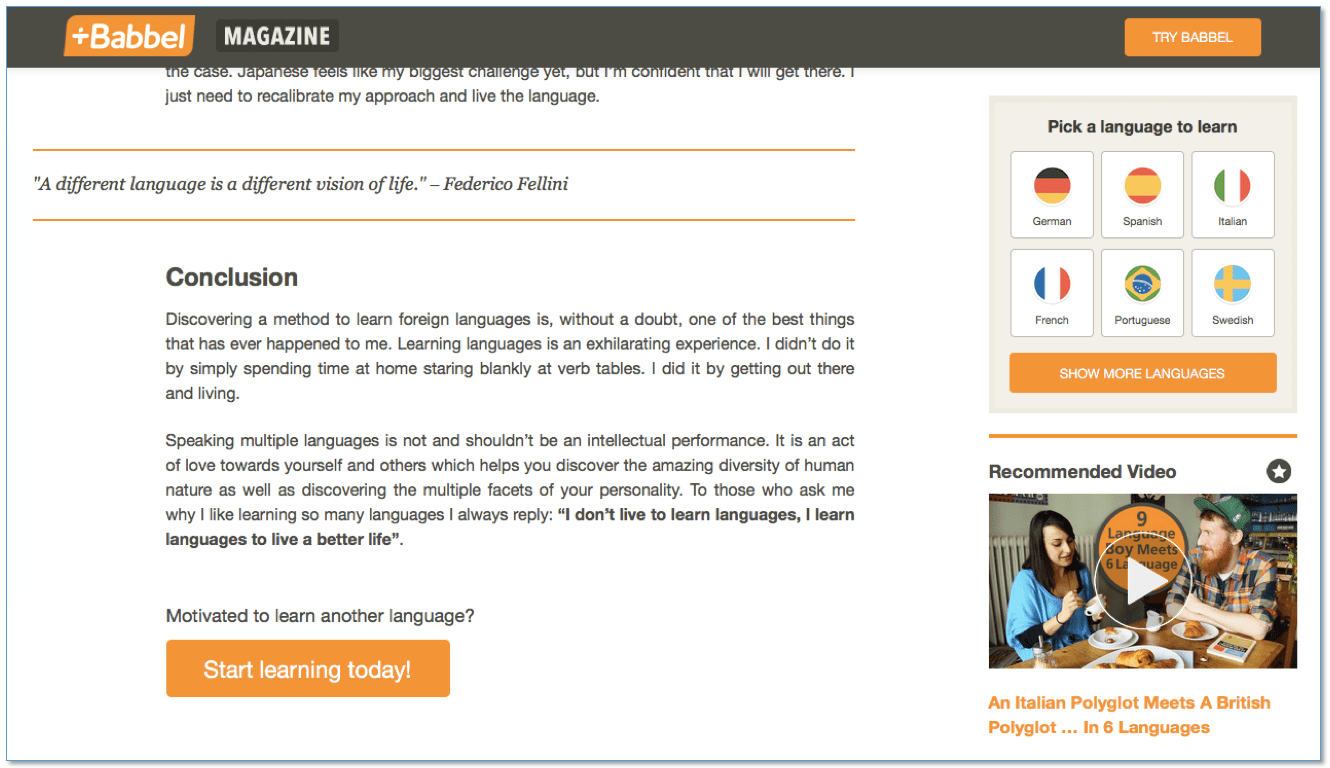
If your desired action requires readers to navigate to a separate web page, there are two good ways to get them there. One is to go for a softer sell by including a hyperlink in an italicized sentence of text, as Taboola did in the example included above. Another is to implement a more eye-catching CTA by putting text on a button similar to the “Start Learning Today!” example below from online language learning software Babbel. If you do use a button, just make sure there’s text beforehand explaining the benefits of what you’re trying to get people to sign up for.

Mobile users demand an especially easy experience, but they’re willing to listen to a more in-depth pitch.
Navigating on mobile devices can be difficult — people’s fingers are big, the buttons are small, and the screen space always comes at a premium. In order to compensate for these hurdles, marketers need to take extra special care that their CTAs are easy to follow and only require as many swipes and taps as are absolutely necessary.
However, because the smaller screen size offers fewer distractions, readers are willing to consider a longer, more in-depth sales pitch. As a result, you can try placing additional CTA buttons higher up on the page.
The last thing to keep in mind is that while you can make plenty of educated guesses about the CTAs that will work best with your content, you should never assume you know for sure how your audience will react. As a matter of fact, even highly skilled, veteran marketers occasionally see their CTAs fall flat.
In order to insulate yourself from this unpredictability, it’s crucial for marketers to A/B test a number of different CTAs in order to see which creative formats deliver the best results. Only then will you be able to know for sure that your content is successfully turning the right number of readers into customers and repeat visitors.