If you want to win more business, you need lead generation strategies in your marketing toolbox.
What is Lead Generation?
Lead generation involves attracting the attention of prospects, or leads, interested in using your products or services. The goal is to convert that interest into action, to encourage those prospects to engage with you, and to eventually become customers. One of the best ways to do this is with a lead generation landing page.
Read on to learn more about lead generation landing pages, and to see examples of some of the very best lead capture landing pages.
38 Case Studies From Brands That Have Succeeded With Taboola
What are Lead Generation Landing Pages?
Lead generation landing pages are standalone web pages where website visitors land in response to an advertising or marketing campaign. Unlike homepages, or other website pages, lead magnet landing pages focus on enticing visitors to complete a specific goal (or convert), by clicking on the call-to-action (CTA). Learn more about high converting landing pages in Taboola’s guide.
Here are some effective landing page lead generation examples. To help you to craft your own landing page to generate leads for your business, we look at what works and what doesn’t.
1. Unbounce and Active Campaign
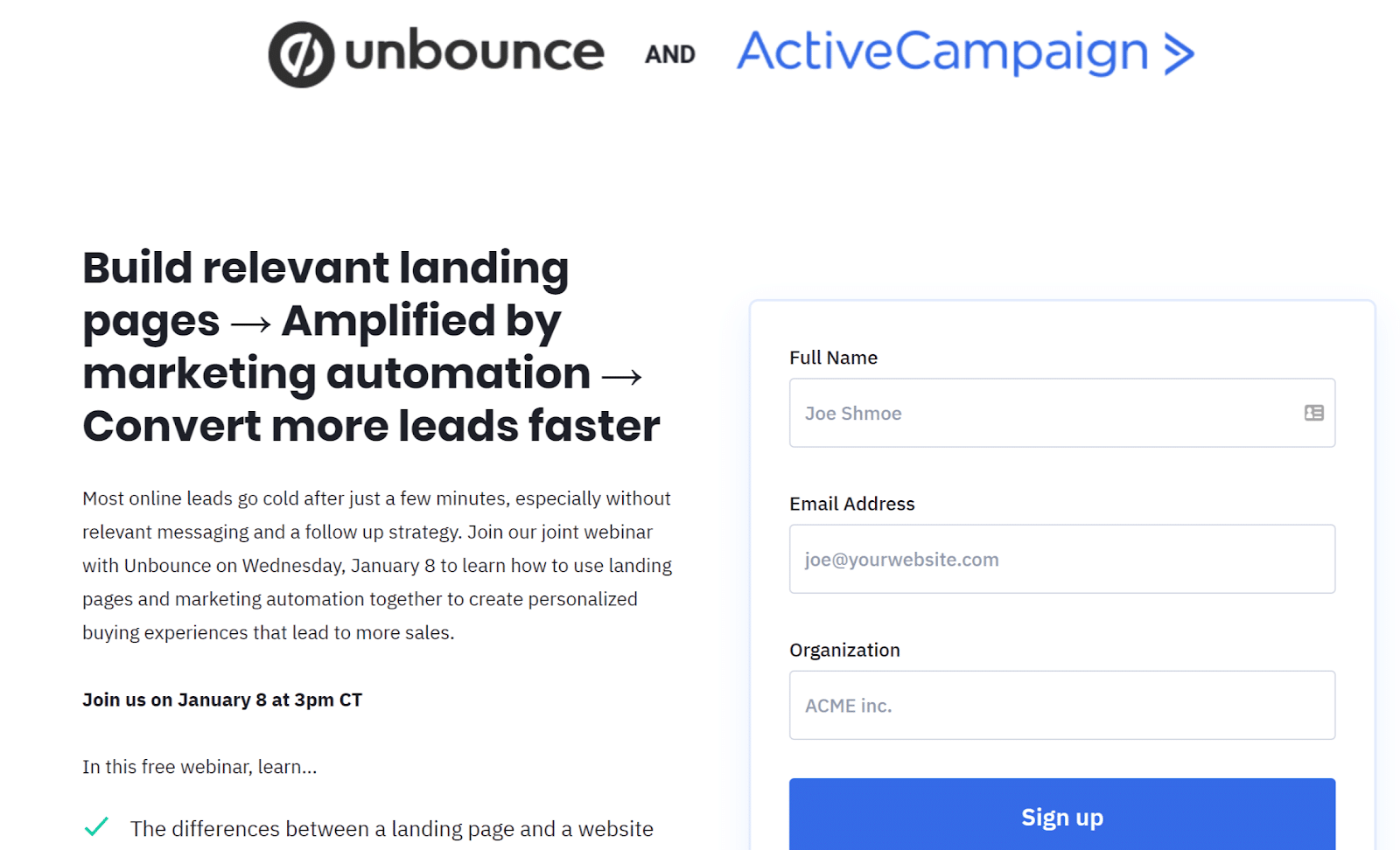
This campaign promotes a joint webinar between lead generation landing page builder Unbounce and Active Campaign.
What works:
- The benefits to visitors are right at the top of the page in a large, highly visible headline
- You can see most of the details of the offer without scrolling, so there’s no risk of losing your audience
- The lead form for this landing page is right at the top and it collects only the basic information needed, making it more likely that visitors will complete it
- There’s a useful short list of what participants will learn
What to improve:
- While the brand names may be enough of a draw, it would be useful to know the people who are running the webinar. Some presenter photos would make it more appealing
2. ConvertKit
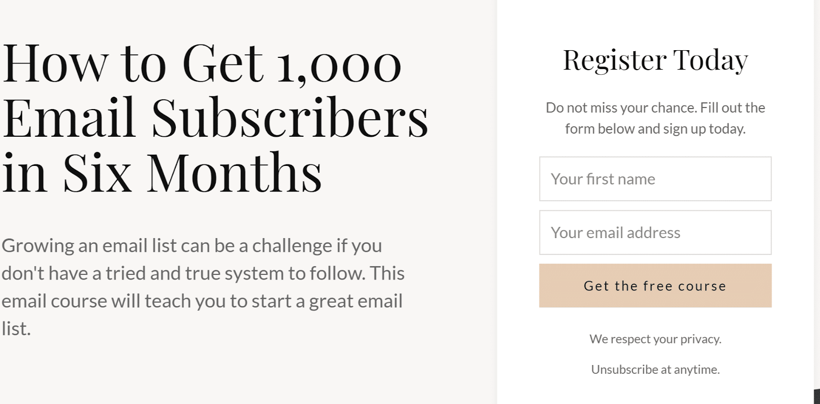
Our second lead generation landing page example is from ConvertKit, promoting a free email course.
What works:
- The headline is big and bold, and includes the benefit of getting more subscribers
- The copy is short and focused
- The CTA button tells people exactly what they get when they sign up, encouraging action
- The email form is short, so it’s more likely visitors will fill it in
What to improve:
- There’s not much to criticize with this ConvertKit landing page, but perhaps some of the information on course content from below the fold could be included on the main part of the page
3. Taboola

If you want to see lead gen landing page templates in action, here’s one from Taboola that we’ve used for other offers. This one promotes the food benchmark report.
What works:
- The big hero section is eye-catching
- The image is cleverly positioned to bracket the sign-up form and draw attention to it
- The CTA tells you what you get
- There’s social proof about the data Taboola uses when you scroll down the page
What to improve:
- Though the CTA text is on point, the button could stand out more against the background
4. Social Media Today

The next in our roundup of the best lead generation landing pages is a simple landing page from Social Media Today, which aims to get more newsletter signups.
What works:
- It’s clear what action it wants readers to take, as the headline mirrors the call to action
- The large image catches the eye and gives an immediate snapshot of what subscribers will get
- The bullet point list quickly highlights what’s covered in the newsletter
- The sign-up form has a single line for email, making it more likely people will fill it in
- For those who need more info, there are more benefits and a testimonial further down the page
What to improve:
- If you don’t know who’s given the testimonial, it doesn’t work as social proof
- It would be useful to collect the person’s name for immediate personalization of emails
5. Mozilla
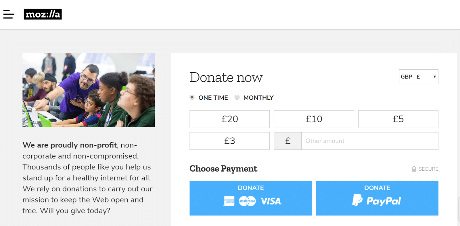
Mozilla, maker of the Firefox browser, has a simple donations landing page.
What works:
- The image shows Mozilla staff at work with a variety of people – almost every potential donor can see themselves reflected there
- The message is clear and to the point
- There’s a huge donation box, allowing people to choose their preferred option
What to improve:
- The image could be a LOT bigger and clearer
- There’s no supplementary information for those who need more convincing
6. Ramit Sethi
Marketer and influencer Ramit Sethi has created a lead generation landing page on his WordPress site to get people to buy his book.

What works:
- The big box shows social proof in terms of copies sold and bestseller status
- The large cover image shows visitors what they’re getting
- The video makes the page more interactive and engaging
- Other page copy addresses the reader directly
- The free first chapter is appealing, as is the whole page visually

What to improve
- There’s nothing wrong with this landing page; it gets everything right
Conclusion
The lead generation landing page templates and examples shared here show the variety of approaches you can take when creating landing pages. Short landing pages requesting minimal information work well for many, but don’t be afraid to create a longer lead generation landing page using an HTML template.
Remember to highlight benefits and not just features, and to speak directly to readers’ pain points. Then you’re all set to create high-converting, lead generation landing pages of your own.
Learn more about how to drive traffic to your lead generation landing pages with Taboola.