Your clients need to scale their reach beyond search and social. They’re looking for an affordable approach.
They’re looking to build awareness and collect leads. So the conversation becomes about exploring the vast possibilities of running sponsored content ads.
The question then becomes:
What types of content should your agency produce to promote on a wide-reaching content discovery network like Taboola?
It’s a great question for which there are a number of good answers. So in today’s post we’ll examine many of your options.
How to Create Genuine Native Content
Advertorial
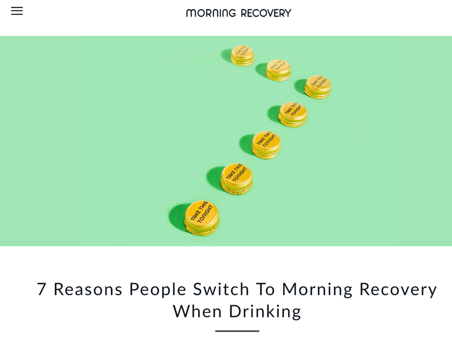
In this campaign, Morning Recovery’s landing page comes from a section of its website labeled “Journal.” The content’s essentially a brief advertorial, listicle style. In addition to listing the reasons people “are switching to MR,” the landing page features:
- A “Learn more” button that invokes a sales page
- A “Get Started” button that invokes the same sales page
- A infographic treatment of the product’s features
- One last link to the homepage
- A discount offer for subscribing to the newsletter (in the footer)
Takeaways and potential lessons learned from this example:
- A listicle approach such as “7 Reasons…” presented as an article makes for a smart advertorial approach to enhance credibility.
- Opportunities to place an order appropriately introduce a sales element, which is obviously the objective of the campaign.
Try it, buy it product page
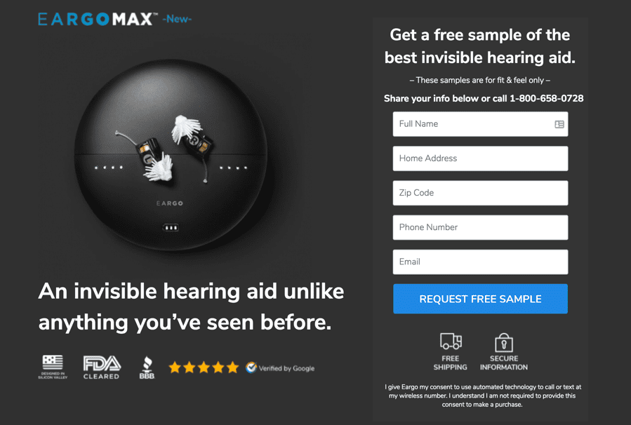
EargoMax presents an elegant product page beginning with a free sample offer and form. Elements also include:
- A brief FAQ (presented accordion style)
- A “certified reviews” badge and link
- Product features
- A interactive carousel (images advance)
- “Verified” by Google
- Us vs. them price comparison
- 45-day risk-free trial
- Payment options
- Media badges
Takeaways and potential lessons learned from this example:
- A heavy dose of social proof (badges, seller verification, media logos) help support credibility for the brand.
- Payment options and the trial/guarantee help overcome potential objections.
Microsite—Buying guide
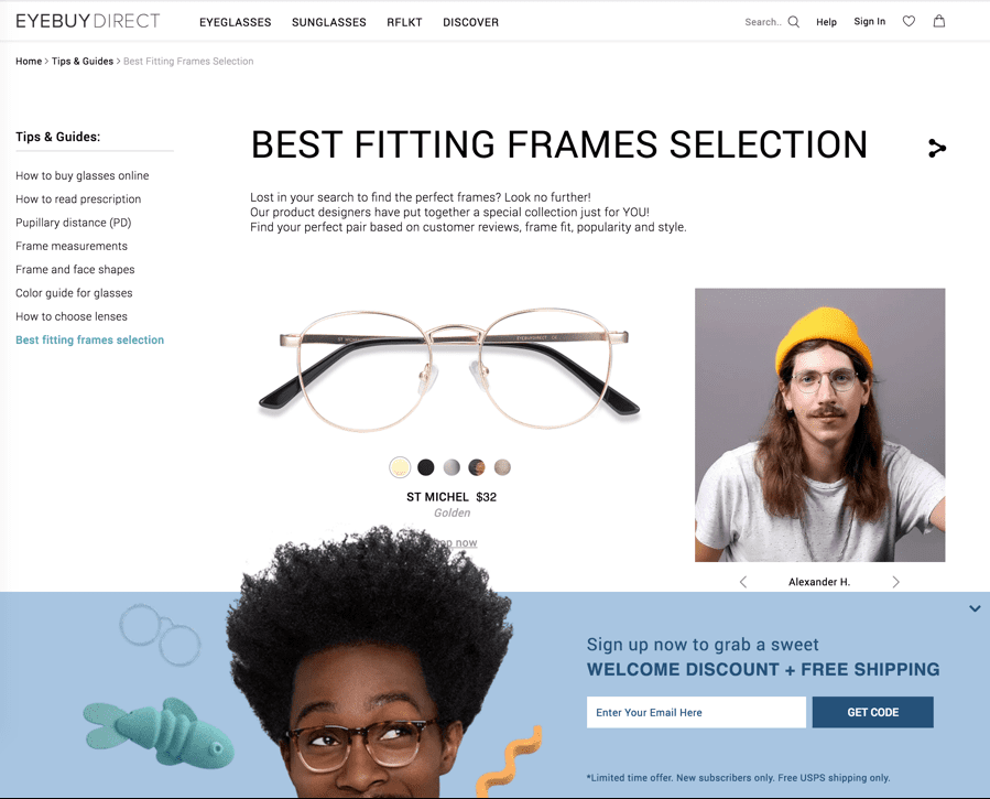
The URL of this promotion’s landing page suggests the page was custom-made for the campaign. Its substantial content, seemingly repurposed from some of the site’s existing assets, qualify as a microsite in my mind. It includes:
- A “special collection” based on customer reviews
- A great variety of user-generated content, with Twitter handles (a canine even models one pair of glasses)
- A color selector feature and prices
- A small sign-up form
- A special, limited time offer for new subscribers
- A sidebar offering substantial buying guide style content
Takeaways and potential lessons learned from this example:
- A custom microsite could provide the ideal mix of elements your clients may need to address customers at various stages of the buying cycle.
- Interactive elements can heighten engagement.
- User-generated content increases authenticity and trust.
Microsite—Vertical industry page
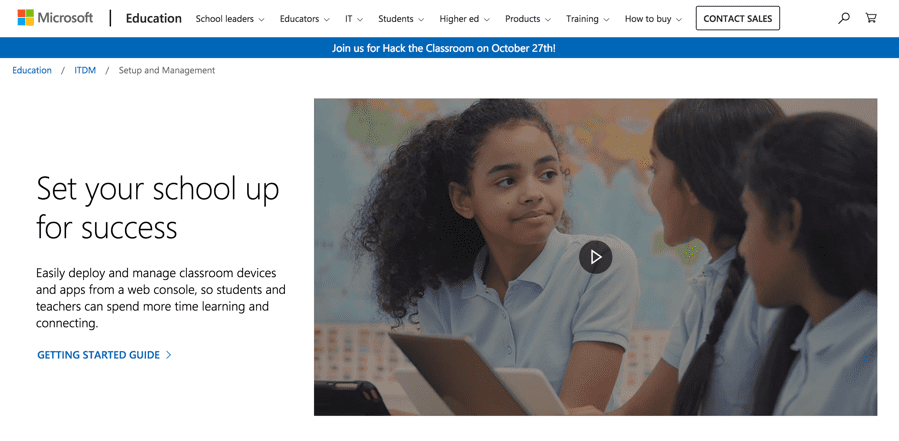
The “breadcrumb” navigation just beneath the logo and navigation bar suggests this is an existing web page. However, it’s specific to the subject of a Microsoft campaign targeting the education market. The robust page includes:
- An short, informative video showcasing customers
- A “getting started guide,” which is an overview article featuring an infographic and numerous links for deeper dives on specific subtopics
- Multiple “Learn more” buttons to support specific products within the hardware and software suite
- Links to make purchases
- A link to a “documentation and resources” hub
- A link to a product comparison guide
- A teaser for, and link to, a case study—plus an on-page video
- A link to “webcasts for IT professionals”
Takeaways and potential lessons learned from this example:
- Landing pages can be crafted to serve the needs of a specific market while containing robust links to direct potential buyers to the resources they find helpful.
- Videos can be a useful addition to your campaign’s landing page.
- Case studies are strong tools, especially for B2B campaigns.
Product page—infomercial style
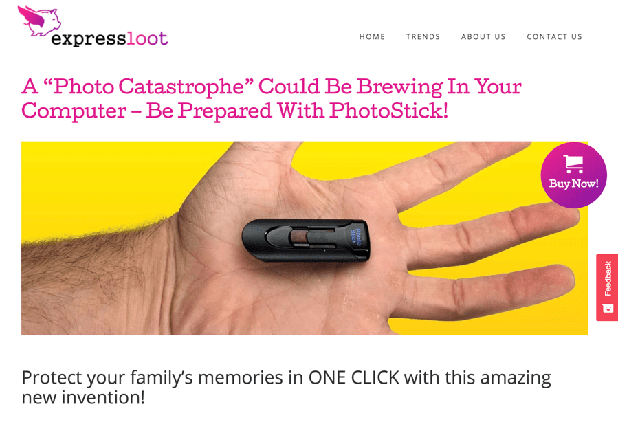
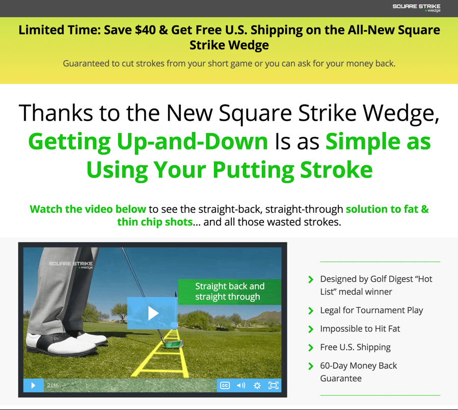
Sponsored ads often direct clickers to long-form (infomercial style) product pages.
The ads that led to the product pages above didn’t flirt with objectivity or suggest the editorial style content you’d expect to get from a blog post or eBook. They promised results—solutions to specific problems.
The PhotoStick page is a modest length infomercial style product page including:
- Several “Buy now” buttons
- A 3-step “how it works”
- A video
- User reviews
- A special offer
- A readers’ comment section
The much longer Square Strike Wedge page has all of the above and then some:
- An endorsement from a golf professional
- A “sticky” video (it remains onscreen as you scroll)
- Engineering diagrams to showcase the product’s design
- Detailed specifications
- FAQs
- A money back guarantee
A takeaway and potential lesson learned from these examples:
- You may want to test the “everything but the kitchen sink” approach as it works for a variety of brands
Product comparison
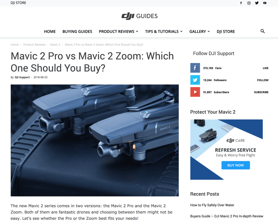
The website of DJI, makers of flying camera systems, offers an in-depth “guides” section. This promotion steers would-be shoppers to a blog-style product comparison page, which includes:
- Detailed features and specifications for two distinct drone models
- A comparison table
- Sample video from both models
- “Buy now” button
- Technical support links
- A link to a user community
- A sidebar with relevant blog posts, more guides, tips, gallery, tutorials and more
Takeaways and potential lessons learned from this example:
- Detailed comparisons can serve the buying needs of shoppers in the decision phase.
- Comparisons can be made amongst your brand’s catalog or include competitive offerings.
- A variety of supplemental content may help shoppers further research their needs and solution fit.
Catalog-style product page
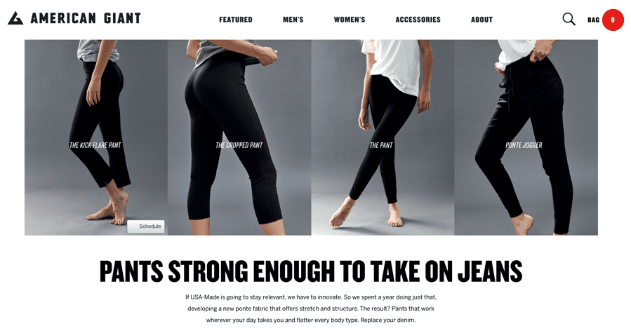
Though this promotion leads to a web page where shoppers can choose the direction they want to go, it’s meant to showcase a specific line for women. The catalog-style page includes:
- An entire collection of pants
- Links for each product that serve more traditional ecommerce product pages
A takeaway and potential lesson learned from this example:
- A series of thematically related products can be an effective topic for a sponsored content ad and landing page.
Blog post—How-to
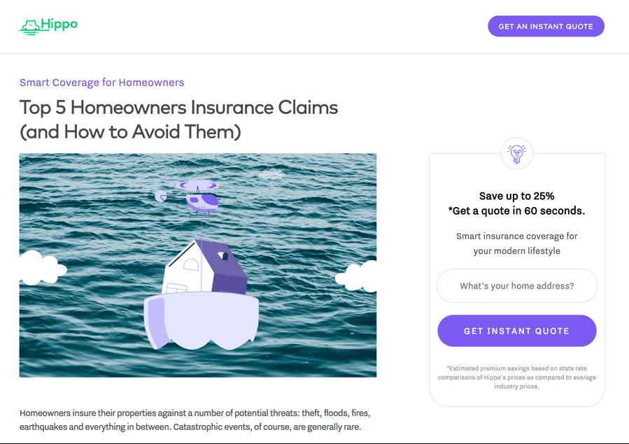
This is a simple, informative “how-to” list post, but has a strong lead generation element.
- Readers are offered an instant quote.
- The quote page actually conducts research and steps the reader through a home assessment questionnaire.
Takeaways and potential lessons learned from this example:
- How-to articles have tremendous pulling power.
- A “soft-sell” call-to-action (such as a free quote) serves the campaign well.
- Interactive elements help improve engagement with prospects.
Blog post—Need help with this?
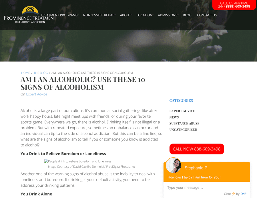
We have a sensitive subject here. This blog post style page includes:
- The run of the website
- A self assessment (warning signs)
- A “Call now” button
- Live chat
Takeaways and potential lessons learned from this example:
- Your ad and landing page can gently (or forcefully) help a prospect discover if they have a problem you can solve.
- While too many options can overwhelm readers, in some cases, multiple choices for taking the next step may be ideal for your campaign.
Blog post—Roundup article
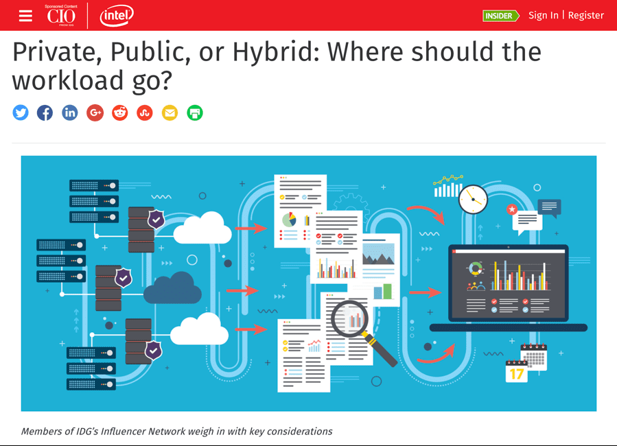
This blog post landing page is a roundup, that is, a series of expert opinions. The content was produced by Intel, but offered as sponsored content at CIO.com from IDG. And that’s about all there is to it.
Takeaways and potential lessons learned from this example:
- Large brands, such as Intel, with complex selling cycles may benefit from investing in standard top-of-the-funnel content to build awareness and/or showcase solutions.
- The ad and landing page is highly targeted.
- The co-sponsored approach serves to heighten trust.
Blog post—Ad feature
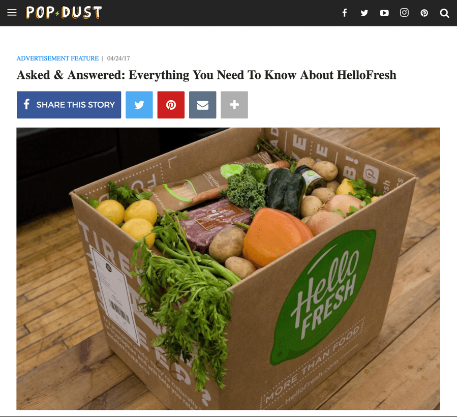
This campaign has a mixture of ideas:
- It’s actually an advertorial (note that it’s labeled “advertisement feature”) run on Pop Dust, an online entertainment publication.
- However, the above notion is subtle and the content reads like a product review post.
- The content is presented as an FAQ.
- Offers are featured twice, as text links rather than as buttons.
Takeaways and potential lessons learned from this example:
- Though the campaign isn’t objective, the brand is treated in third person format as if it were a review.
- Amateur photographs are presented, which also helps create a feeling of objectivity.
- The post’s question and answer format serves the reader well.
Earned media (press mentions)
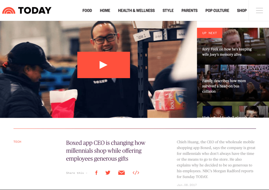
Earned media is, well, earned. You neither own it nor pay for it. In this approach, you pay to promote media you’ve earned through PR, outreach or maybe even good luck. This example comes from a campaign by Boxed, a wholesale mobile shopping app (or a “warehouse in your pocket.”)
- The company was featured on NBC’s Today show and chose to promote the 3-minute segment.
Takeaways and potential lessons learned from this example:
- Television coverage is ideal, however earned media may encompass digital, print and even radio.
- Consider this approach if your client succeeds in earning high profile press coverage in mainstream media—or a specialized medium relevant to your brand.
Video post
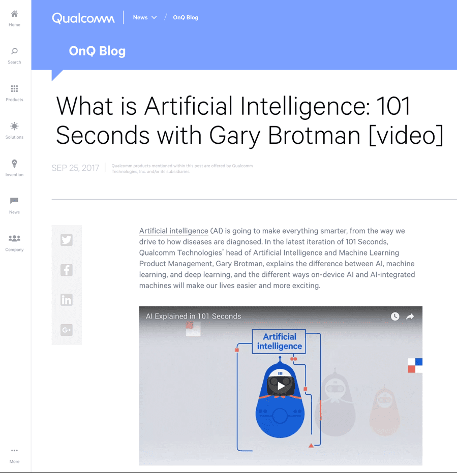
This one’s simply a video blog post, or vlog post. It appears Qualcomm has a series called “101 Seconds” where short video address relevant technology topics. That’s it, except:
- The first two words of the post offer a link to far more information about the company’s AI platform.
A takeaway and potential lesson learned from this example:
- Short videos are an enticing option for a variety of topics including introductions to complex topics such as this one.
Infomercial
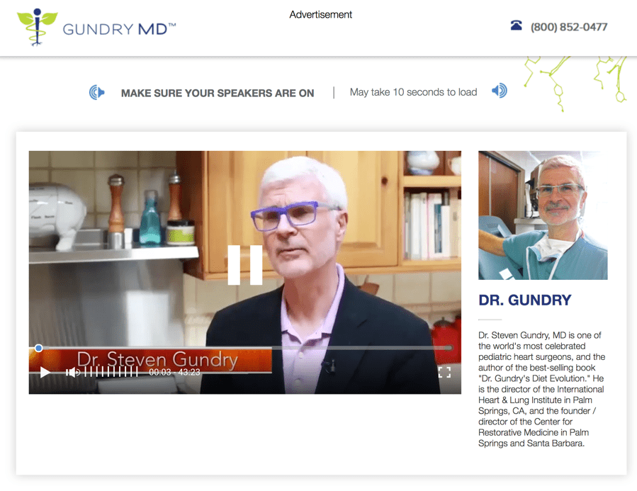
I gather this approach works because I’m seeing more of it all the time for a variety of products, especially in health.
- The approach essentially borrows from the television infomercial format.
- In the example above, Dr. Gundry is featured in a 43-minute video where he methodically dispels myths about nutrition and concludes by offering his product, Lectin Shield.
- Note the page is clearly marked “Advertisement.”
Takeaways and potential lessons learned from this example:
- Infomercials can be long or short, depending on the subject matter. Video length may be worth testing.
- The show-and-tell format can be persuasive.
- Featuring on-camera experts can help build a credible story.
eBook/Guide
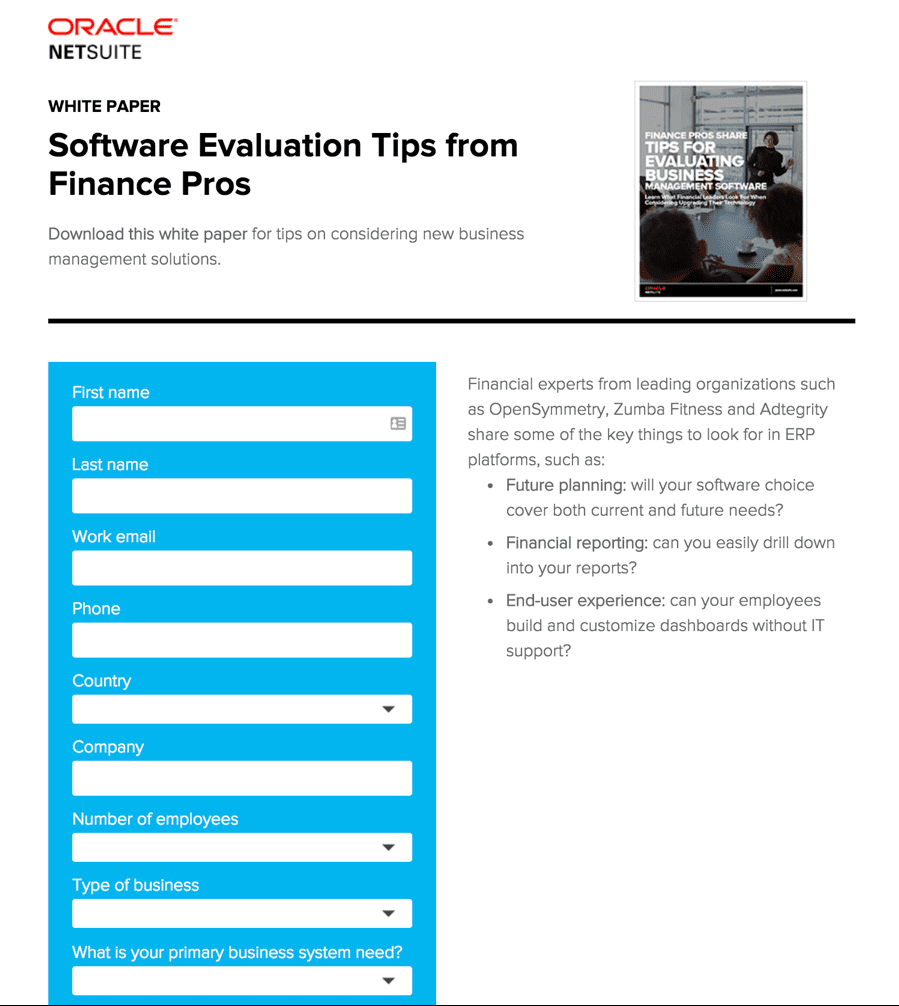
Both of the landing pages above deliver helpful guides as fulfillment.
The first, from Oracle/NetSuite is a no-muss, no-fuss approach.
- The sparse page showcases the white paper, summarizes how it’ll be useful, and requires respondents to complete a somewhat detailed form.
Takeaways and potential lessons learned from these examples:
- Helpful guides positioned as eBooks, white papers, cheat sheets, or what have you, can be highly magnetic offers for your clients’ ads.
- Consider how much information you need to collect to align with your sales leads objective. Less fields = higher response rates.
- The guide itself should be treated as the product. The brand is secondary.
Free trial offer
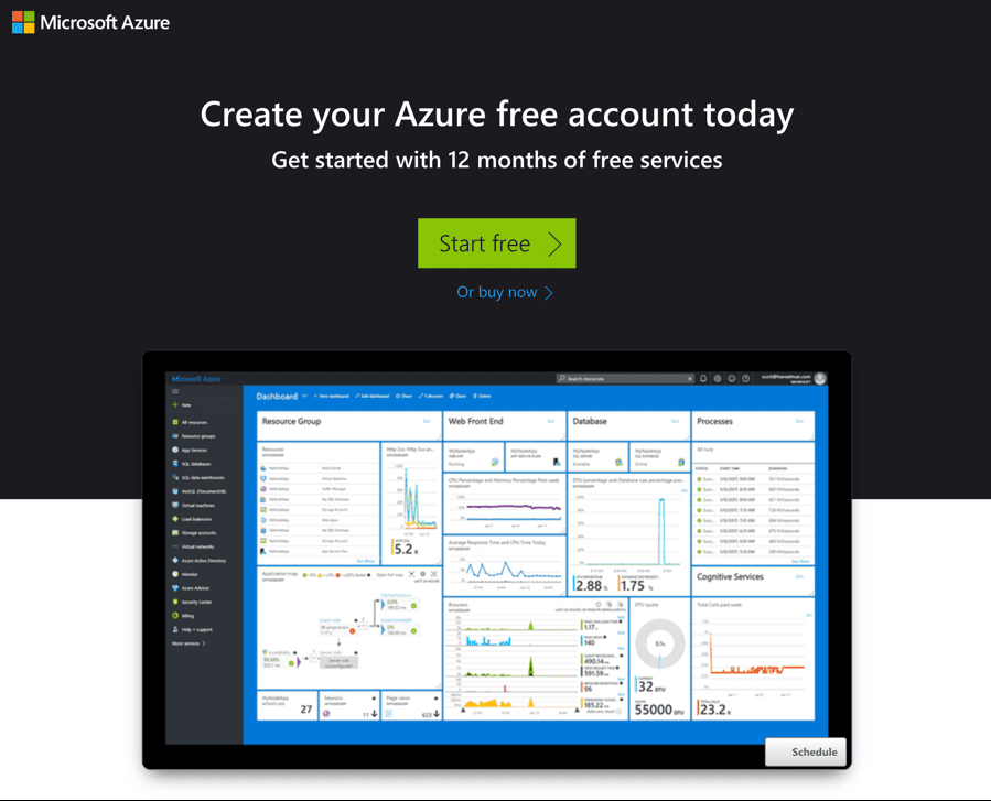
It’s hard not to like a free trial. This campaign, from Microsoft Azure, features:
- The option to buy or try (12 months of free service)
- Details about the offer presented as an FAQ
- An invitation to “Chat with” or “Call” sales.
Takeaways and potential lessons learned from this example:
- Free trial offers may be ideal for campaigns promoting a variety of SaaS offerings, subscription services or standard products.
- Create a page that answers the questions you suspect visitors will have and attempt to overcome common objections.
Freemium offer
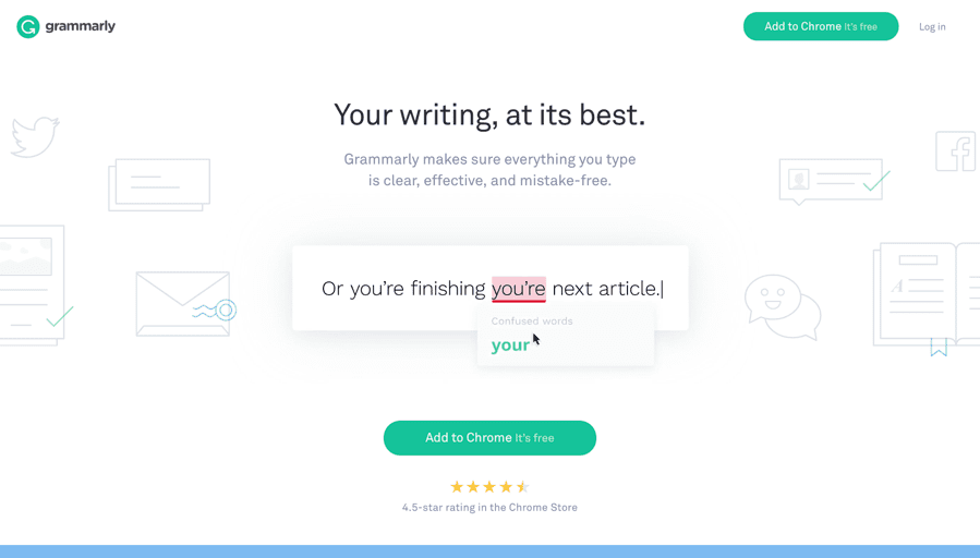
A “freemium” offers something of value that is upgradable for a fee. I didn’t show you an abbreviated version of this landing page. You’re seeing it all, but I’ll explain a few things:
- The page features an animation that cleverly tells a story while demonstrating how the product works.
- The button offers a freebie—a Chrome extension.
Takeaways and potential lessons learned from this example:
- Free is everyone’s favorite price. If you can offer a free version of your product and fancy the idea of building a prospect list by doing so, try it.
- As evidenced in this example, less is more. You probably don’t need to try hard to sell a free product, but you do want to earn opt-ins.
There’s no singular formula for sponsored content ads
Wow, you made it to conclusion of this lengthy show-and-tell post. I’m hoping you reached the conclusion sponsored content ads can lead clickers to a great variety of content types.
I’m hoping the 17 approaches I’ve presented gave you some ideas to consider for your clients’ campaigns.
And finally, I’m hoping, you’ll take an experiment approach. Try this and that and double down on the sponsored content ad campaigns that meet and exceed your clients’ objectives.