Mobile needs to be a core part of every publisher’s strategy. Across the entire Taboola network, publishers are seeing more than half their traffic from smartphones and tablets— up from an average of 25% at the beginning of last year.
While a responsive web design should be par for the course at this point, it is not enough of a strategy to ensure the satisfaction of your smartphone and tablet readers. Mobile traffic is fundamentally different from desktop traffic in that it is more likely to come from social media and to be accessing your site from a slower internet connection. As a result, these users exhibit different behaviors and have different needs that should be met if you are going to keep them engaged with your content.
Earlier this year, we shared a collection of 7 tips for optimizing your mobile monetization strategy. Today, we’re sharing 4 new optimization tactics you can use to improve your user experience, keep mobile visitors engaged, and ultimately further your on-site monetization efforts.
1. Keep your content short, sweet and straightforward.
On mobile, audiences often discover content while scrolling through social media feeds and email newsletters. Browsing content in-the-moment and often hopping between articles, these audiences have shorter attention spans than those who actively sought out your content via search or a direct visit to your home page.
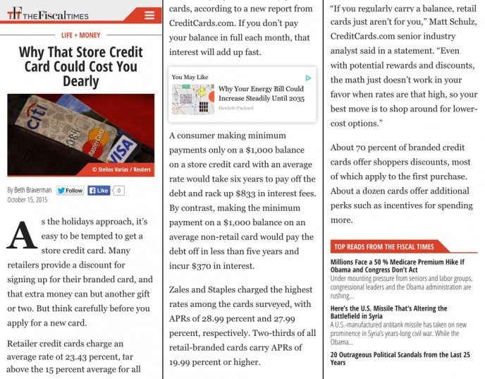
To ensure that readers stay focused, you need to present them with a streamlined experience that gets to the point quickly. While longer, photo-heavy listicles work well on desktop, publishers can improve their mobile engagement by condensing articles into a shorter layout, featuring perhaps a single photo or slideshow module, and no rich media between paragraphs.
For instance, this The Fiscal Times post about store credit cards is a perfect piece of mobile content. It has one photo at the top of the page, and then it quickly gets to the point and gives readers the story in just six short paragraphs.
2. Give audiences the option to engage with your content in the middle of an article.
In the event that a mobile user starts to lose interest in a story, it’s important to feature other content options on the page so that they either stay within your site or add to your bottom line by clicking on a sponsored link.
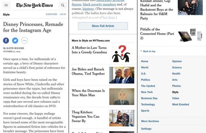
We suggest adding content recommendations mid-article or throughout the piece, engaging your readers with personalized items they might be interested in reading next. This way, visitors will have something else to grab their attention the moment they start thinking about going back to Facebook. Taboola’s recommendations are available in different sizes to fit your site’s particular UX constraints and optimization needs, and we can include a mix of organic and sponsored links to help you balance your traffic and revenue goals.
In addition, we’ve recently been developing a “read more” button similar to the ones you see on The New York Times’ mobile stories. This feature presents a shortened “preview” of the article that allows skimming readers to more readily decide whether they want to load the rest of the article. The user interface also brings below-article items — such as share tools and organic recirculation — into a more prominent position, improving engagement across items that often experience lower visibility.
3. Make the reading experience as fast as possible.
Most mobile internet connections are significantly slower than those on desktop devices, meaning you need to take action to decrease load times so that people will stay with you.
While you should certainly remove unnecessary images and design elements from your page, it’s important to remember that the technology running in the background can also cause big problems if you fail to monitor it properly. In order to prevent a third-party script from slowing your site to a crawl, you should work with your partners to ensure that everything is loading correctly. You can also use asynchronous scripting to allow your users to enjoy your content while scripts download in the background.
Another thing to look out for is big, interstitial ads that pop up when users first get to the page. If a mobile user comes from Facebook and has to wait 15 seconds to see your content, there’s a good chance they’ll find something else to do with their time. By the same token, you should avoid putting any sort of advertising at the top of the page so that people will get to the content they want to see immediately. These top-of-page ad units tend to perform poorly, anyway, since so many people click on them by accident.
By keeping things moving swiftly, you should have no problem delivering an experience that even the most fidgety user will enjoy.
4. Use a/b testing to create the perfect homepage.
Engagement optimization isn’t just something for the article page. Taboola customers who meet a certain traffic threshold can also use our Newsroom product (free of charge), a multi-variant A/B testing solution that helps publishers uncover the perfect headline and thumbnail image for each story, along with the best-performing positions within a homepage feed.
Taboola Newsroom allows you to select five different creative elements for every article and then test those assets on the homepage with real users. The winning combinations are then shown to everyone who visits your site, a formula that helped the women’s lifestyle publisher Refinery29 boost its click-through rate by an average of 45% per story. The site even used the results of its tests to inform its strategy on social media and other platforms.
By combining your own creativity with our data-based insights, you’ll have everything you need to create a captivating homepage experience for your audience.
—
Because the shift to mobile has happened so rapidly, many publishers are still developing the best practices that are most effective for them.
When creating your own mobile content guidelines, it’s important to make sure you consider your individual business model and the specific goals your company hopes to achieve. If driving social media traffic is most important to you, it might make sense to have more prominent share buttons on your page. But if your business strategy calls for more revenues from sponsored content recommendations, the same tactic might have a negative effect by pushing users back onto their favorite social media platform and away from your links.
As always, you need to have the flexibility to try new things and the measurement tools required to analyze how each new change ties back to your key performance indicators.
Interested in learning more about how Taboola can boost your mobile monetization? Check out our webinar page and contact one of our optimization experts today.

