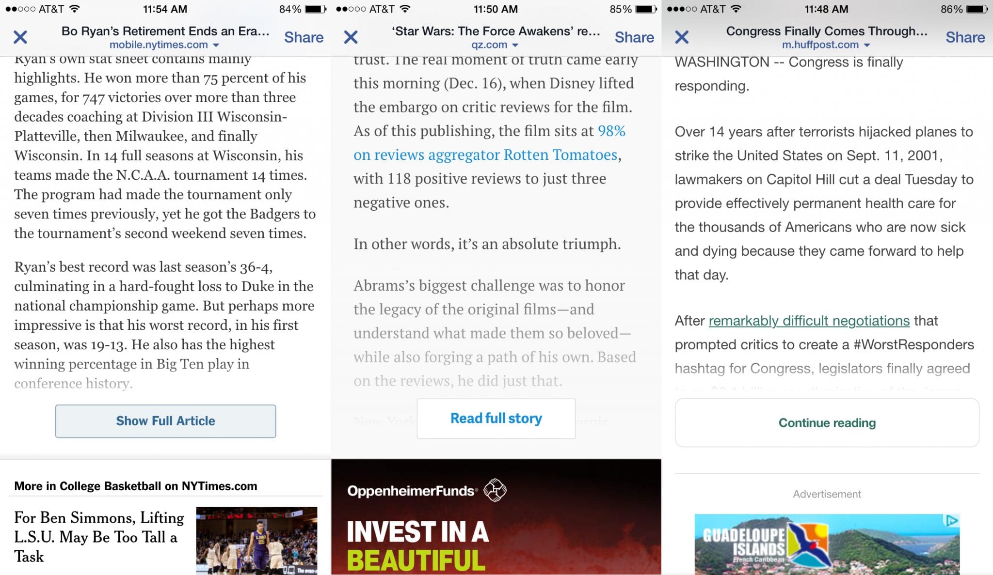
If you’ve recently read an article on your smartphone from the New York Times, Quartz or The Huffington Post, you may have encountered something like the below:

Given the difficulty of engaging and monetizing users on smaller screens, our team at Taboola is constantly working with publishers on thinking strategically about every pixel on the page — and these buttons can provide many benefits.
Data from Taboola’s network have found that 80 percent of Facebook-referred mobile users never see the bottom of the article. This problem persists across many kinds of mobile audiences, who often exhibit flighty types of behavior, skimming a paragraph or two before bouncing back to where they were before.
By truncating the page, “Read More” features increase the visibility of below-article modules, such as share tools, comments, content recommendations and other monetization units. The new page layout also improves the user experience for mobile audiences by allowing people to engage with as much of the article as they wish.
“Read More” Offered to Publishers at No Charge
Today, we’re excited to announce that Taboola has developed its own “Read More” feature that allows publishers to seamlessly add this button to their mobile experience and improve the visibility of their below-article modules. This capability is offered to all of Taboola’s partners, free-of-charge, with no additional back-end development work required.

Publishers can tailor their “Read More” experience to drive the goals that are most important to their business, whether those be engagement (e.g. number of shares, comments), recirculation (e.g. pages-per-visit, time-on-site) or monetization (e.g. revenue-per-visit). We’ve already seen great results from early tests on partners such as The Associated Press, with RPM boosts of 20-50% and meaningful increases in share tool engagement.
As mobile audiences continue to grow around the world, such subtle design changes can have a significant impact on key metrics for publishers. “Read More” is one of many ideas our product team is developing as we continue to think about new ways to engage users on smaller screens.
Get in touch with us today to add “Read More” to your mobile site, and stay tuned to the Taboola Blog for more product updates in the near future!