From too much text and irrelevant visuals to clashing colors, confusing layout and multiple call-to-action buttons, we’ve all stumbled upon some awful landing pages at some point.
What happens next is pretty obvious: you leave the website.
Poorly designed landing pages push prospects away. So, if your landing page has high traffic and low conversions, the problem probably lies in its design.
What can help this situation is using visuals strategically.
Apart from breaking the monotony of text, visuals have the power to evoke emotions, engage users and encourage action. In fact, people following directions with text and illustrations do 323% better than those following directions without illustrations.
But how do you go beyond beautification and use visuals meaningfully to facilitate conversions? Let’s take a look at some visual tactics to create landing pages that convert.
Explain Concepts
Let’s say you want to outline the benefits of a product or service, define a process or summarize complex points—one of the ways to communicate that information is through infographics.
Why are infographics so effective? That’s because they’re a perfect combination of visuals and text, helping readers understand and digest information with ease.
Unlike a text-heavy landing page, a well-designed infographic is more likely to appeal to website visitors and retain their attention, thereby driving conversions.
Here are the various ways you can use infographics on landing pages:
- Provide an overview of your product or service
- Explain a process
- Highlight data
- Compare and contrast options
- Give directions
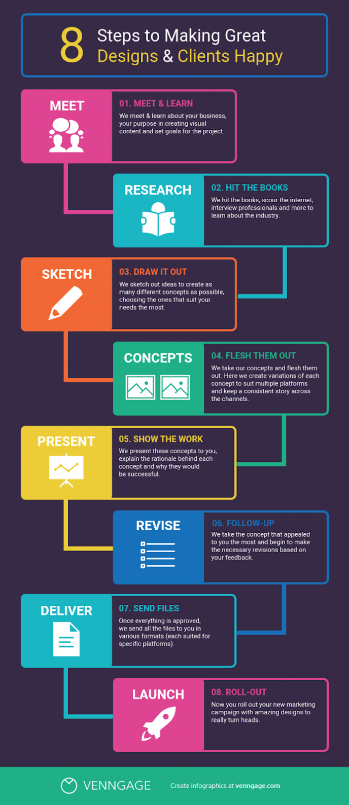
Here’s an example of a process infographic that can be a useful addition to a landing page. It uses icons and crisp text to illustrate the various steps of the design process.
Source: Venngage
Once you’ve established what you want to achieve through the infographic, you can outline and organize the key information while using icons and illustrations to reinforce the points.
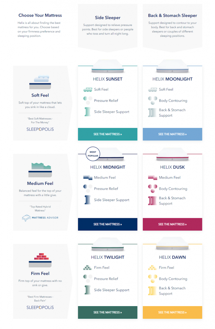
Take a look at this landing page example by Helix Sleep where they’ve created an infographic to compare their different mattress options and highlight their features, helping viewers make informed decisions.
Show Products In Use
If you’re a product company, you ought to showcase product imagery but it’s not as straightforward as it sounds.
A lot depends on how you use and position those product images. The image needs to complement your landing page story and add value to it. Users need to see what’s in it for them.
For instance, placing an image of the product is not enough. Instead, show the product in context or in use for people to get a better idea of its benefits.
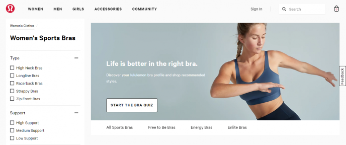
Here’s a good example by lulemon that shows their sports bra in action.
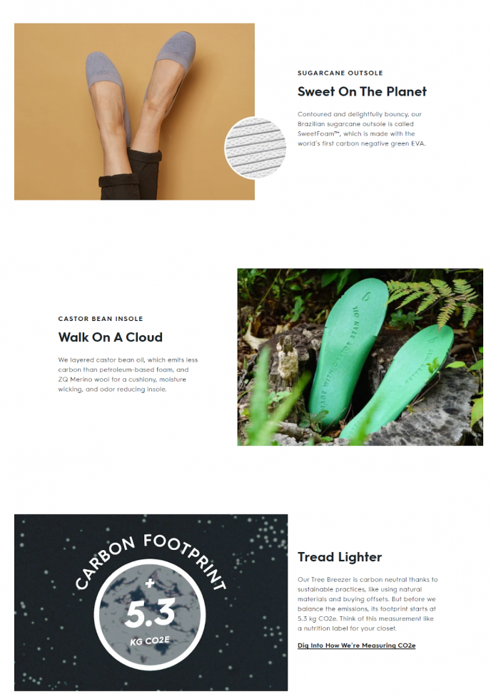
Apart from relevant lifestyle imagery, you can also use detailed high-resolution product images that highlight the features and benefits.
Take a look at Allbirds exploring every little detail of their product through precise imagery coupled with useful copy.
Regardless of the route you choose, make sure you stay away from the run-of-the-mill stock imagery. They add no value to the landing page, are not relatable and certainly not effective in driving conversions.
Demonstrate Tangible Benefits
If you’re a B2B company or selling a digital product, you’re most likely wondering where you stand in all of this?
You don’t have to resort to mundane imagery to put forth your point or worse add no visual element at all.
The key is to visualize your digital product and bring out the tangible benefits of the product or service you’re selling. Intrigue your audience with visual communication and let them get a sense of what they can expect from it.
Here’s a look at Slack’s ‘features’ page—they’ve done a good job of presenting their platform visually. On scrolling down, notice the way they’ve used icons to emphasize the platform’s features.
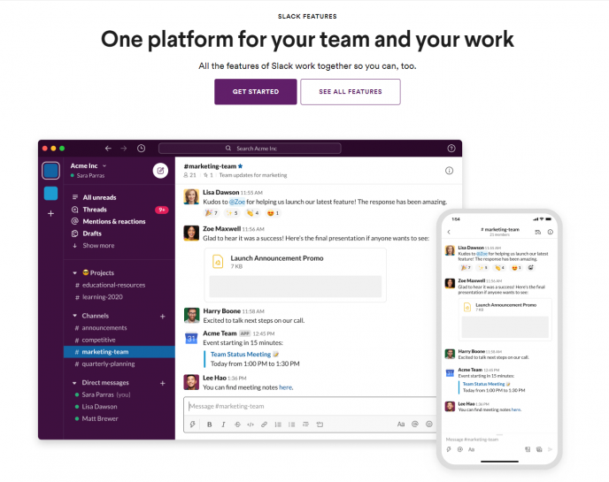
Similarly, if you’re creating a landing page for a digital product such as a white paper or eBook, insert an image of the product to show visitors what they’ll receive on filling the lead form. Alternatively, you can also use abstract or lifestyle imagery to complement the digital product.
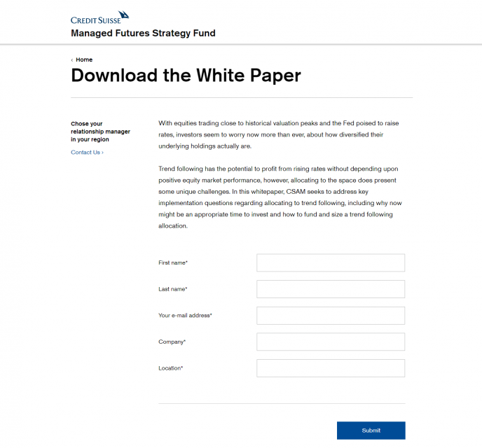
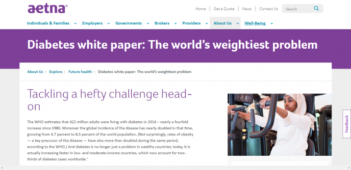
Take a look at these two examples of white paper landing pages. Credit Suisse’s page lacks visuals and does not manage to generate interest in the reader. On the other hand, Aetna’s is livelier and is likely to generate more leads.
Engage Users
You’ve managed to attract traffic to your landing page and that’s great but what happens if it fails to generate interest in website visitors and gets them to leave without a trace?
The focus of your website marketing tactics shouldn’t just be on getting traffic—it should be on how you can convert that traffic into conversions. This is why it’s important to create content that engages visitors and encourages them to take the desired action.
One of the most effective ways to engage users is by including interactive content on your landing page.
From interactive infographics and calculators to surveys, quizzes and videos—the power of interactivity is unparalleled because it offers a more immersive experience.
Not only do people end up spending more time on your website but it also translates into better quality leads and higher conversions.
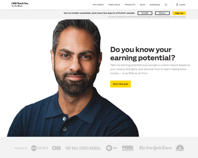
Here’s an example of Ramit Sethi’s website, I Will Teach You To Be Rich. The header banner features an earning potential quiz that gives quiz takers a custom report on the basis of their results.
Evoke Emotions
Let’s face it: emotions play an important role in decision-making. A smart way to drive conversions is by tapping into people’s emotions. The right use of visuals can do that for you.
Start with understanding who your target audience is and the pain point you’re addressing. Use visuals to demonstrate what you want them to feel. Let’s say you’re selling insurance—the imagery you use should be geared towards instilling a sense of safety and security.
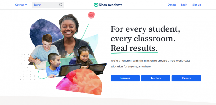
Khan Academy does this well. They’ve used real pictures of ‘happy’ students to illustrate their value proposition.
Offer Directional Cues
How many times have you come across cluttered landing pages and wondered where to look? Brands try to say so much and end up saying nothing at all. Now, that’s a red flag right there.
Remember: if there’s one thing you’re competing with, it’s people’s depleting attention spans and if you want to draw their attention to aspects that matter, you need to do two things:
- Keep the landing page simple and focus on driving a single call-to-action
- Use visual cues to guide the user’s gaze
Visual cues are used to direct the visitor’s attention to see what they need to see. It’s a great tactic to keep people engaged and incite action. It’s like saying, “Hey, here’s my product and this is what you need to do”—with visuals.
Here are the different kinds of visual cue tactics you can incorporate in your landing page:
- Arrows
- People or illustrations pointing towards the call-to-action button
- Eye gaze
- Contrasting colors
- White space
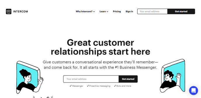
Here’s a good example of Intercom. They’ve strategically placed the call-to-action button between the two illustrations that are facing each other.
The Takeaway: Use Visuals to Boost Conversions
There’s no doubt about the fact that visuals breathe life into landing pages and offer a more engaging experience.
What’s important is knowing how to use them meaningfully on landing pages to communicate the core message effectively and facilitating conversions in the process.