Luckily, you can efficiently remedy the oversight. With just a couple of tweaks, your calls to action can start working for you rather than against you. Let’s examine eight ways to craft CTAs that are both natural and sales-oriented.
Focus on the Benefits
For starters, you should focus your CTAs around the benefits of the product, service, feature, or experience they are promoting.
There will be some CTAs that follow traditional verbiage, such as “add to cart,” “buy now,” and “sign up,” but your homepage and landing page CTAs need to read more benefit-oriented than what’s standard.
One of the basic mantras of marketing is the importance of user-centric copywriting. While you may want to show off your product and its features, telling the entire story from conception to production, your users most likely won’t seek out that information. Your consumer wants to know what your product or service is and how it will help them.
This is why CTAs need to emulate the same principle. They need to show a hesitant lead that clicking and converting will benefit them.
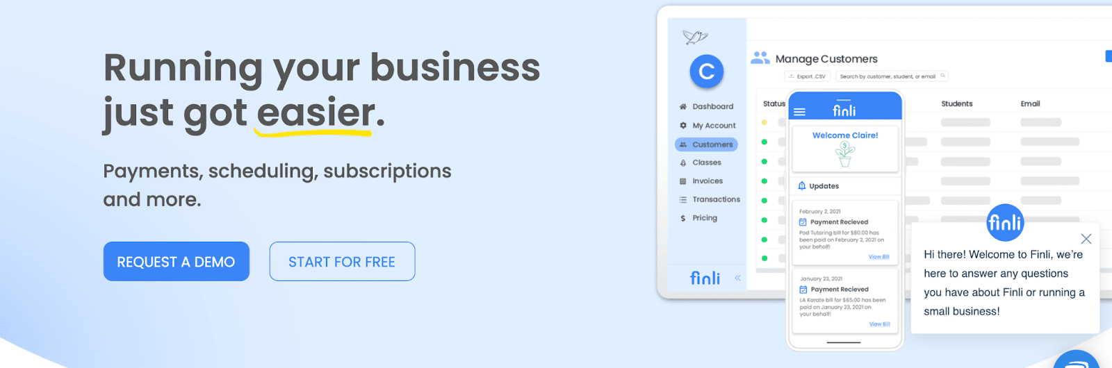
Here’s an example from Finli, which has a very neat CTA at the top of the page. “Running your business just got easier” speaks directly to every single business owner on the globe. They do, however, reduce that effect a bit with the “Request a demo” CTA, as the need for a demo slightly undermines the “just got easier” part. Good effort, though.
 (Source)
And Bonus Points for NOW Benefits
If your CTA highlights the benefits you can deliver now as opposed to some vague future benefits the customer will experience, you are on the right track to conversion.
Understandably, you may not be able to promise instant benefits. For example, you may be selling a protein shake, in which case promising instant results would be the wrong thing to do.
The trick with the “now” kind of CTA is to keep it 100% honest. If you can offer a 50% discount right this minute, highlight that fact. But don’t make any promises you can’t keep. Instead of invoking a sense of urgency, opt for another CTA tactic.
These kinds of calls to action work well for limited-time offers, where you are able to play off of visitor FOMO (fear of missing out). You can capitalize on FOMO using words like “limited availability,” “while stocks last,” “one-off,” and so on.
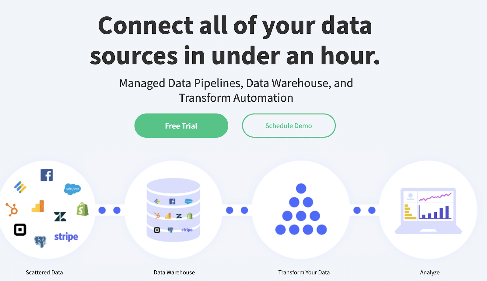
Here’s an example similar to the one above, this time from Mozart Data. They’ve drawn attention to their free trial but also provide the option of a free demo. Given that their solution is data-focused, this choice of benefits now or benefits later is a good one. After all, some of their users might want to tinker with it, while others might desire a guided tour.
 (Source)
Evoke Curiosity
Curiosity killed the cat, or so the saying goes. However, sprinkling a bit of curiosity throughout your marketing and adding it to your CTAs can be quite a clever tactic. Especially if your product is not an obvious one, and a customer is quite prepared to believe you can help them learn something new.
For starters, leads like to be enticed. They like to feel they’re getting an exciting and entertaining user experience. Anything that can make you stand out will serve the more general purpose of sticking in your visitors’ minds. So, a bit of a novel spin on the classic CTA can go quite a long way.
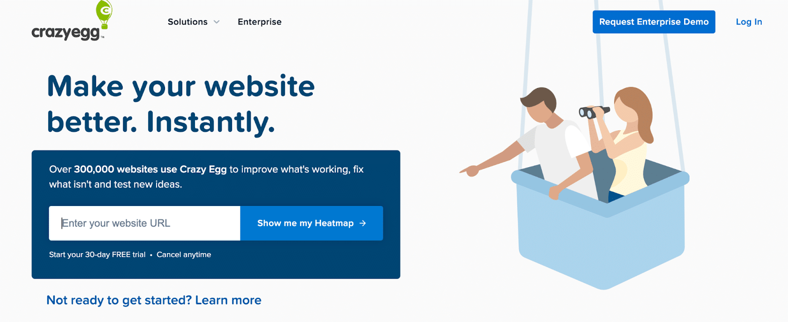
This kind of CTA works well on SaaS websites, especially if you offer an instantly accessible free demo or show users some insight they are not otherwise privy to. Case in point, here’s Crazy Egg with their “Show me my heatmap” CTA.
 (Source)
It’s simple, free, and it only takes a second, yet it plays on the visitor’s interest. What could their heatmap look like?
True, the CTA then takes you to sign up for a 30-day free trial, but the effect has been achieved. Most likely, a large percentage of visitors will sign up just to satisfy their curiosity. On the other hand, there might be some resentment involved as well at this blatant lead-capturing tactic.
Acknowledge the Pain Point and Provide a Solution
This CTA composing strategy is somewhat similar to our focus on the benefits advice. You want to remind the lead what it is they’re trying to do. Remind them of the problem that has led them to you in the first place, and then provide a punchline that will ensure a conversion.
Think about the main issues your target audience faces and the key solutions your product or service provides. Consider the following questions:
- What is the most annoying, irritating, or complex part of the problem?
- How are you helping mitigate it?
- What are your customers likely to respond to best?
- How can you differentiate yourself from your competitors?
You’ll need clever copywriting here, as you want to distill your message down to the bare necessities and focus on one point at a time. You can create individual landing pages for different pain points. Additionally, you can change your main page copy and CTA from time to time and A/B test until you pinpoint the best version.
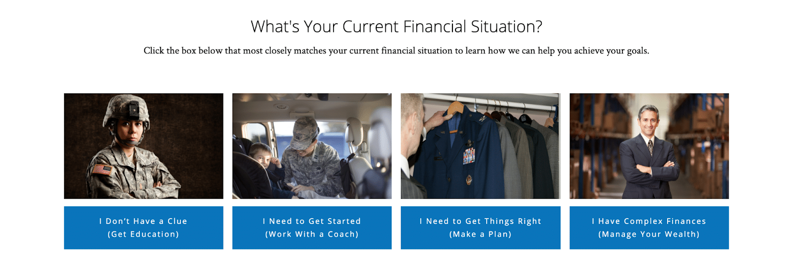
C.L. Sheldon & Co. has done a magnificent job with this tactic. The four bits of CTA they have on the homepage are honest, playful, and quite clear on what you can expect when you click on each of them. They’re also tailored well to the needs of their clients and instantly establish a more relaxed rapport.
 (Source)
Provide Social Proof
Social proof is often mentioned as a conversion-boosting tactic. It helps establish trust with you as a brand that is unknown to your new leads and visitors, and it shows that you have already managed to satisfy a certain number of customers.
Social proof comes in all kinds of shapes and sizes, but testimonials and reviews are its most popular (and effective) guise. By featuring them on your main pages (and your product pages, too), you can overcome some of that initial hesitation everyone has when looking at something new. You can, in fact, prove your worth.
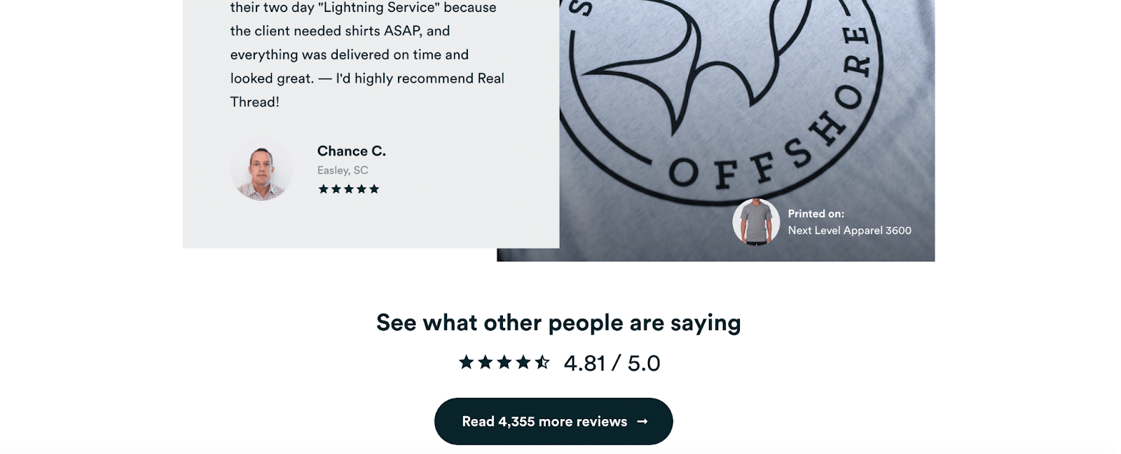
How can you incorporate social proof in your CTAs? Here’s an example from Real Thread, which features two social proof elements. First, they have the Read customer stories CTA, and then below there’s Read 4355 more reviews. Do also note that the number in the CTA changes along with the number of reviews.
 (Source)
This is a great way to direct traffic to your success stories. Plus, you’ll showcase your value and expertise without having to brag about it yourself.
Overcome Potential Objections with Microcopy
When anyone first lands on the page of a company they’ve never worked with before, and most likely a company they’ve never heard about before, most visitors instantly develop questions and objections.
After all, you couldn’t possibly design a page and write copy that caters to everyone. But what you can do is try to foresee the most common objections a lead is likely to have. Then, try and preempt them with your CTAs.
You can collect your information from different sources:
- Your customer service teams
- The questions you get most commonly asked
- Researching the habits and gathering user data about your target audience
Another important point to think about: you may be asking your users for information they may feel reluctant to provide. By explaining why you need it, you can effectively overcome any hesitation.
For example, if you ask your leads for their birth date when they sign up for your newsletter, you can use microcopy to explain you need this data to send them a birthday discount.
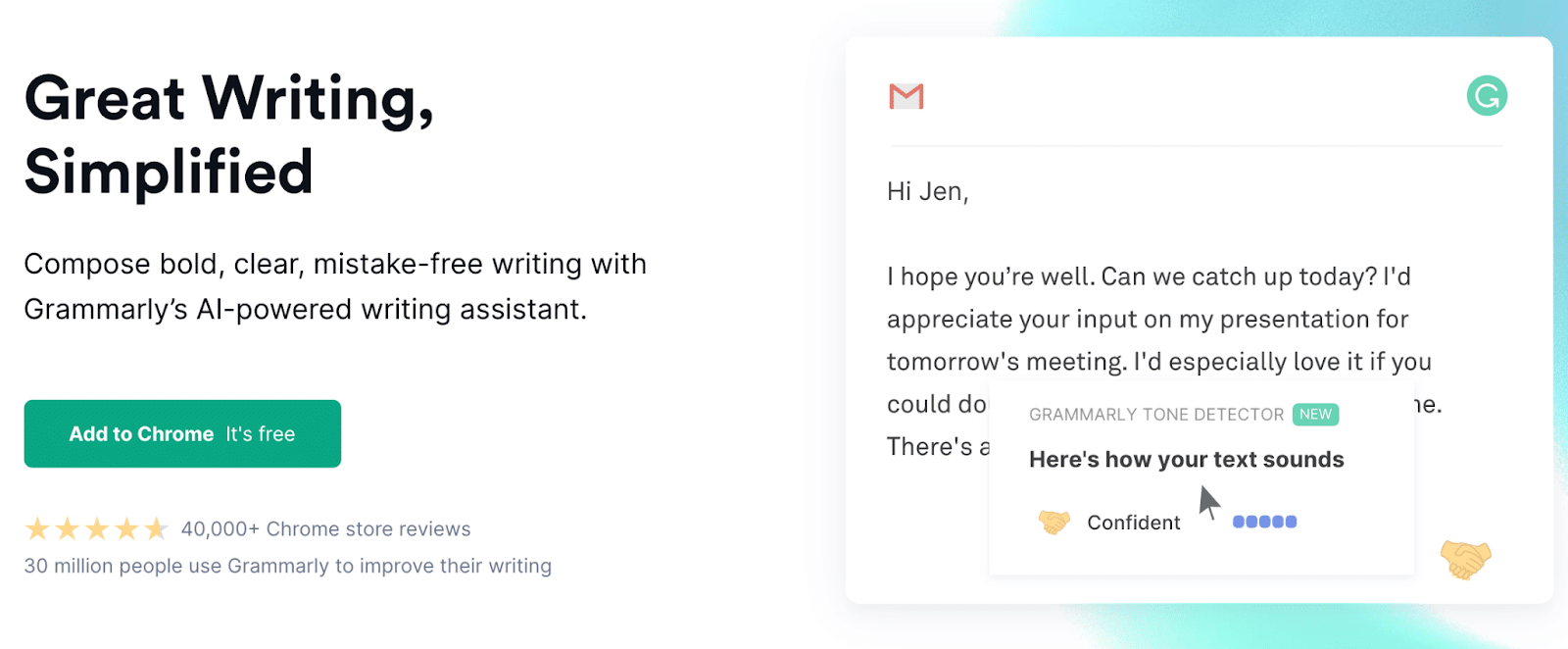
A great example of CTA microcopy comes from Grammarly. Their Add to Chrome (it’s free) blurb works like a charm. Plus, it takes into account an objection the less tech-savvy among their users may have.
(Source)
Draw Attention to the Main Offer
There’s one essential point to keep in mind about CTAs: there will likely be more than one on any given page. In fact, there should be more than one. If you are placing all of your eggs in one basket, so to speak, you need to find yourself another basket as soon as possible.
Most of your pages should have a newsletter signup CTA (or any other CTA that will serve to capture leads), as well as a sales CTA. You can also offer other options, such as:
- Read a blog post
- Watch a video
- Check out another product
- See what our customers are saying
- Here is a guide on how to use this product
- These are our most frequently asked questions about the product
Your main offer has to stand out more than the rest. Every page should have one main conversion goal and several other, smaller ones. The main goal’s CTA needs to stand out the most and be the easiest to spot.
You can achieve this by cleverly contrasting the background color with the color of the CTA button or banner. Just make sure that you don’t make the contract too harsh.
You can also use white space to emphasize the importance of a certain button or bubble. Negative space is your best ally here. Its sheer emptiness will instantly draw the eye to the colorful elements on the page.
Don’t forget that there is also no rule against using the same CTA several times. Likewise, you can even ask for the same action to be taken several different ways.
For instance, Aura has done a great job highlighting their main CTA. The green stands out against the darker background, but it’s still in line with the other green elements of the page. They also have a nifty little microcopy CTA at the bottom of the page, if you’re curious to see another example.
 (Source)
Keep It Simple
Finally, our last tip is a simple one: keep your CTAs simple. You don’t need to reinvent the wheel. And you certainly don’t need to outshine all the other CTAs that other brands in your industry have already used.
All you have to do is speak the language of your audience and stick to your own voice and point of view as a brand. Sometimes the simplest wording is all that’s necessary. Other times, you may want to let your creativity shine and incorporate some humor. As long as the message is clear and the action you want the visitor to take is obvious, you’ll be just fine.
Here’s a very simple example from Contently. Contently has used a concise, light-worded CTA “SEE IT IN ACTION >>“. This can be more effective than the basic “start free trial” that many companies use.

(Source)
Implement CTAs in your Taboola Campaigns
Now that you understand how to craft CTAs that drive engagement, try them yourself with Taboola! Taboola lets you add CTA buttons to your ad campaigns easily, and we’ve also provided some useful CTA copy suggestions.
Bear in mind that CTAs are an optional add-on, so you will be able to launch a campaign without them. However, they can boost your conversion rates, so try using different CTAs until you find a solution that works best for your brand.
Final Thoughts
Crafting CTAs that convert may now seem more complicated and complex than it actually needs to be. We’ve outlined quite a few tactics and approaches, but the main principle remains the same.
All you need to do is align your brand’s voice with the needs of your customers and ensure that what they see is what they get. Don’t write misleading CTAs that ask for more than a customer is ready to give, and you’ll find success.
Start implementing CTAs today! (See what we did there?)
Calls to action (CTAs) are often the most underutilized and underrated way to increase engagement on your web page or advertisement. Savvy marketers know CTAs are one of the key elements of a campaign, as their purpose is to drive conversions and ensure sales. Yet many publishers and advertisers use cookie-cutter copy and mediocre buttons.