In Taboola, we deal with scale, huge scale. A small issue might turn into a disaster in a matter of hours. Re-writing and replacing an existing service with a new one is a real challenge, moreover doing it without causing downtime is SCARY.
Reading logs is not an option. Logs are gigantic, unwieldy and span over many machines. It would take hours to combine and analyze them. In this post I will share with you three graphs in Grafana that I think are a must for observing new code. Let’s start…
Did I break production?
You write your shiny code, you (even) test it, but, how would you verify that you didn’t break the production environment? Luckily, we use Grafana, and this actually makes a big difference. My plan was to compare old code vs. new in Grafana, but, where to start?
You have Grafana… let’s use it!
Frankly, I didn’t know anything about Grafana.
Walking through the office, I saw on my colleagues screens , fancy, colorful graphs. Yet, I couldn’t understand a thing about them. When I looked for existing graphs to copy, I found way too many. So copy & paste was out of the question. Frustrating…
I decided to learn Grafana from the ground up. It took me almost two days – I used Grafana Beginner’s Guide on YouTube as a starting point. This really made a big difference.
Which graphs are absolutely a must?
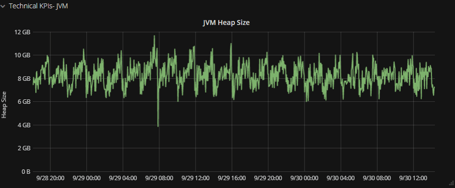
Assuming you are using a JVM, you want to watch the garbage collector and heap usage, because the JVM’s memory is critical. If it is too high it will break everything.
| Must-Have Graph No. 1: Memory (Heap) |
Tip: Use a moving average function see the saw-tooth.
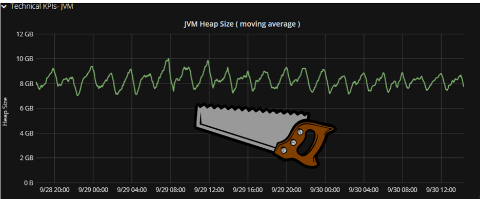
Your graph will be less accurate; yet, it will give you a clearer view of the memory pattern. Even more importantly, it will give you better insights at a glance.
Next, monitor the OS itself, track the CPU. As a rule of thumb, avoid reaching 80%-90% utilization. Remember that there are peaks, and your service needs to cope with them smoothly.
| Must-Have Graph No. 2: CPU |
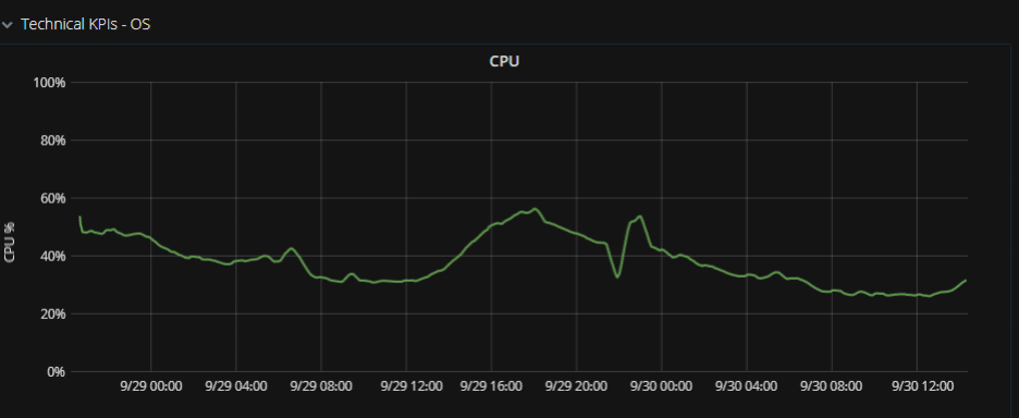
Sidestory – this kind of graph helps me to convince the production IT guys to give me more computing power, as I could show them that I was hogging the CPU.
So far these are the technical KPIs, now, what about applicative KPIs?
Compare Apples to Apples – Keep the Same Metrics
If you want to be sure that things still work, use the same KPIs in the new and old code. If your graph lines continue in the same trend – you can be sure it still works.
Put the old and new metrics together in the same graph, because you want it to be easy to see any mis-alignment.
In the following graph, the new metrics are positive and the old implementation is represented by negative numbers. This “mirror view” is easy on the eyes and helps spot variations.
| Must-Have Graph No. 3: Old & New Together |
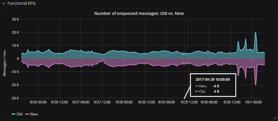
Tip: You can get this effect by multiplying the old metrics by -1.
Things to remember
- Take the time to learn Grafana – it’s absolutely critical for large scale applications
- Monitor both OS and JVM, in addition to applicative KPIs
- Stick to the old metrics – for the sake of feature parity and trend breaking
- You can use moving average and scaling to -1 for easy comparison
Although replacing a service without downtime is frightening, Grafana can really make a big difference. Grafana gives you the visibility needed to make sure your new code is running and the application is stable.