As marketing agents and media buyers you’re under constant pressure to generate new leads for your clients. Too often, however, we associate “more leads” with “more traffic.” After all, the more fish swimming in the pond, the more likely you are to make a catch, right?
Not so fast.
Traffic is important, but it doesn’t always equate to leads. To generate more conversions, you must build a smooth conversion path for your site visitors—guide them intuitively from one step to the next, until they take the desired action.
This is where conversion rate optimization or CRO comes in.
In this guide, I break down what CRO is, why it’s valuable, how to do it, and highlight some successful CRO case studies.
Let’s get started.
What is conversion rate optimization?

Before we dive into conversion rate optimization, let’s cover the basics. A conversion happens when a website visitor completes your desired action—like a form fill, a purchase or a signup. Your conversion rate is calculated by dividing the number of conversions over the total amount of website visitors for a given period of time.
Number of conversions / number of website visitors = conversion rate
For example, if one of your product pages received 100 visitors yesterday and 10 of them made a purchase, your conversion rate for that day is 10%.
10 / 100 =10%
Finally, CRO is the process of increasing the number of website visitors who perform a desired action, such as making a purchase or subscribing to emails.
In short, you’re increasing your conversion rate, which is the number of completed desired actions divided by the number of website visitors. So, if 100,000 people visit your site in a given time and 5,000 of them convert, your conversion rate is 5%.
You use CRO to increase that percentage by researching your audience behaviors, pinpointing what stops visitors from converting and then adjusting your site to fix this.
Why is conversion rate optimization so important?

There are several benefits of CRO, including:
- Increased sales—If you want customers to make a purchase or visit your checkout page, effective CRO will boost sales. Even if you’re just guiding people to download an asset or sign up for a newsletter, increasing your conversion rate will help you generate more high-quality leads, which can then become buyers.
- Increased high-quality leads. If you build a tailor-made journey for your target customers—with specific language and information—you’ll realize that those who bite are truly interested in your offering. They’re also more likely to enjoy your product, return and spread the word.
- Increased ROI. Since CRO is about optimizing the journey for people already visiting your site—instead of just trying to funnel in more visitors—it helps you get more bang for your marketing buck.
- Increased brand affinity—The smoother your customer’s journey, the happier your customer. Have you ever gone to a website and tried to make a purchase, but found the setup confusing? Your opinion of that brand probably wasn’t great. CRO helps to avoid or remedy these problems.
Now that I’ve shared the CRO gospel, let’s jump into what the CRO process entails and how you can start generating conversions.
How do you manage conversion rate optimization?

The first step of CRO is to choose the conversion you want to track, such as making a purchase, form-filling, or signing up for a trial. Once you know your goal, you can find gaps or obstacles in the conversion path and optimize accordingly.
Here’s how:
Research your audience and their behaviors
This is all about data. You must figure out how visitors move through your website and what stops them from converting. For this you’ll need to conduct qualitative and quantitative research.
Quantitative research
Use a web analytics platform like Google Analytics to gather your site metrics, including:
- Where visitors come from—say via an ad or social page
- Which pages they visit most
- Which pages they spend most time on
- Which devices they use to access your website
- Which pages they leave your site from
- How many pages they visit before leaving
- Demographics—age, gender, location, interests, etc.
For CRO, it’s important to add conversion tracking to your site. Many analytics’ platforms let you do this by adding a simple string of code to your conversion page. This will help you see how many people convert, which demographics they belong to, and the journey they take along the way.
Qualitative research
Now you need to add context to your metrics and flesh out the customer journey by gathering feedback about customers’ experiences.
Do this by using surveys distributed via email or through your website using platforms such as SurveyMonkey, Typeform or Google Surveys. Ask customers:
- Why did they visit your site?
- What were they looking for?
- Did they find what they were looking for? If not, why?
- Was the experience intuitive or confusing? What made it so?
- Why did or didn’t they decide to convert?
- Why did they leave your site?
- What issues were they looking for your products to solve? Did this match the messaging that they saw?
Audit your landing page
Now, it’s time to cross-check your data with your landing page. If you found that people left your landing page, for example, instead of clicking on a product page or converting, maybe your call to action isn’t visible or enticing enough? Or if people accessed your landing page via their smartphones, maybe you need to optimize your site for mobile.
Using data as a guide, go through the elements of your landing page and find opportunities for improvement. Use tools like Unbounce’s Landing Page Analyzer to help.
Optimize your landing page
Here are some important elements that you might want to optimize or include on your landing page:
- A compelling and visible call-to-action button
- An effective headline
- Design and language that matches your ads
- High-quality, relevant images—but not overly large as they will slow your page speed
- Simple, clear graphics and text
- A user-friendly navigation bar
- Customer testimonials
- Fast loading time—try SpeedTest.net or Pingdom Website Speed Test
- Mobile friendliness—try Google’s Mobile Friendly Test
The key is to make the path to conversion simple and intuitive. If people have to wade through several pages before they get to your core offer or checkout page, they may get frustrated and leave. Unbounce discovered several key learnings about how frustrated load times impact consumers―22% say they’ll close the tab, and 14% say they’ll visit a competitor’s site.
That’s why it’s vital to optimize these elements and simplify confusing pages.
Continue optimizing with A/B testing
The work doesn’t end there! You can continue to experiment with different elements of your landing page through A/B testing. This involves creating two variations of an element and testing them against your audience to see which performs best. Use tools like Optimizely to run these tests.
You might test a red call-to-action button versus a blue call-to-action button, for example. If the red button drives more conversions, you can keep it and move onto another variation. Or test the red against a new color. Go crazy!
There’s an almost endless amount of ways to play around with your landing page, but only run tests for one element at a time, otherwise you won’t know which variation drove your results.
Some inspiring conversion rate optimization case studies
Feeling overwhelmed? It’s understandable, but unnecessary. Here are some brand CRO case studies that prove the tangible results of CRO.
Bonia
Luxury fashion retailer Bonia wanted to increase online sales. After surveying website visitors, they found that 85% hadn’t found what they were looking for. Why? Because the products they sought weren’t clearly displayed in their navigation bar.
Fashion & Beauty Benchmark Report
Bonia made a simple fix: they added these products to their navigation bar and increased their font size to make them more visible. Consequently, clickthrough rate for these products increased by 28% and conversions rose 66%.

Kaya Skin Clinic
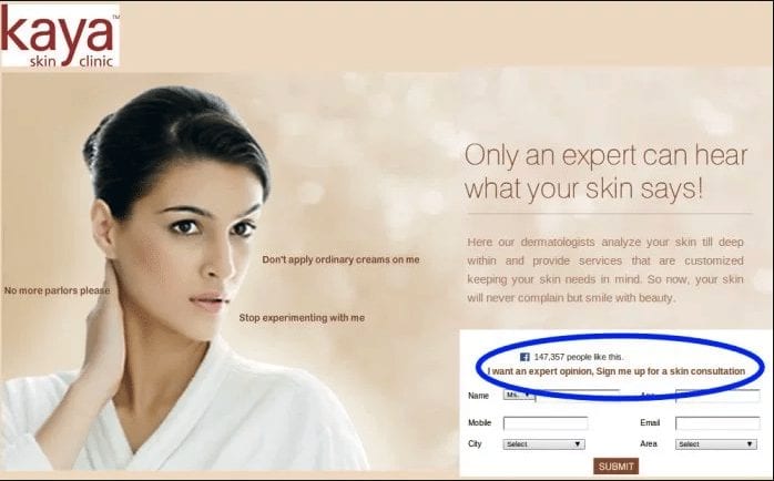
Kaya Skin Clinic noticed that their conversion rate was lower than the industry average. Keen to generate more online appointment bookings they ran tests on their landing page and decided to make two changes. They placed a call-to-action with the words “expert opinion” above the sign-up form and included social proof—a count of Facebook users who “liked” their business. The call to action increased sales by 22% and the social integration saw sign-ups jump 70%.

Protalus
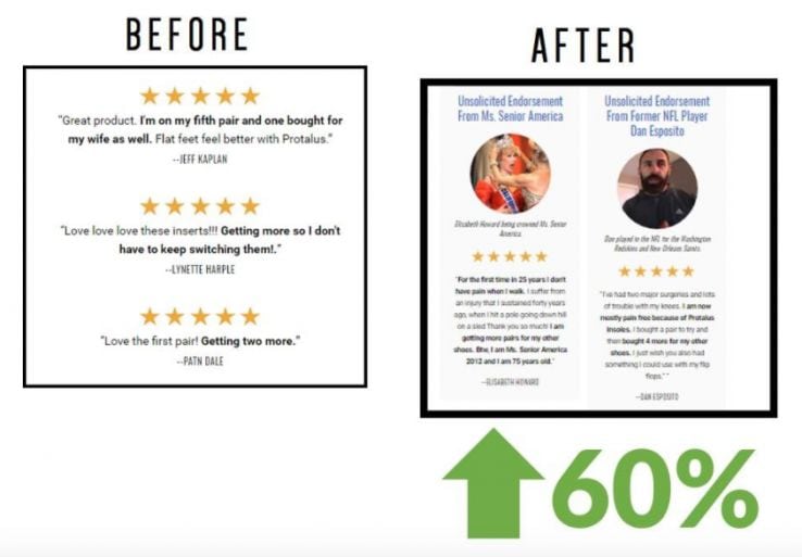
Footwear company Protalus increased sales by 91% in just six months with CRO. Analytics and customer surveys encouraged them to move the “free upgrade” offer to the top of the page; add celebrity testimonials; remove unnecessary code to reduce load time; and, address customers’ pain points through testimonials and revised copy.
These brands prove CRO isn’t intimidating. A landing page tweak can generate a major uptick in sales. You just have to pinpoint that change and make it happen.

You Have The Traffic But It’s Not Driving Conversions
Does this sound familiar? You’re running paid campaigns, you know the ads are working, you’re driving traffic to your site, but the momentum stops there. You can’t get visitors to convert.
CRO can help. While there’s no one-size-fits-all way to do it—because every brand and audience is unique—there are steps you can take to ensure you’re getting the most from this process.
Check your analytics, survey your audience, scrutinize that landing page, and continually test. With these strategies to guide you, you’ll be primed to drive more value from your site and pave a path that leads customers to convert.
Conversion rate optimization checklist

To wrap this up, here’s a handy conversion rate optimization checklist:
- Choose the conversion you want to track—purchasing, form filling, email sign up…
- Research your audience and their behaviors:
- Conduct quantitative research—via Google Analytics
- Look at where visitors come from—maybe via an ad or via social
- Which pages they visit most
- Which pages they spend most time on
- Which devices they use to access your website
- Which pages they leave your site from
- How many pages they visit before leaving
- Demographics – their age, gender, location, interests…
- Conduct qualitative research—surveys
- Look at why people visit your site
- What they’re looking for
- Whether they found what they were looking for. If not, why not?
- Was the experience intuitive or confusing? What made it so?
- Why did or didn’t they decide to convert?
- Why did they leave your site?
- What issues were they looking for your products to solve? Did this match the messaging that they saw?
- Audit your landing page
- Optimize your landing page and look for:
- A compelling and visible call-to-action button
- An effective headline
- Design and language that matches your ads
- High-quality, relevant images optimized for web
- Simple, clear graphics and text
- A user-friendly navigation bar
- Customer testimonials
- Fast loading time—try speed test tools like Speedtest and Pingdom
- Mobile friendliness—try Google’s Mobile Friendly Test
- Continue to optimize with A/B testing
See our articles on performance marketing, top of the funnel marketing, mobile vs. desktop traffic and media buying to learn exactly how to use this traffic to hit your goals.
Finally sit back and watch that conversion rate rise!