How many times have you felt like you wrote a blog post or created a slide deck, only for it to receive little to no engagement?
It sucks, right?
The problem is, there are a lot of things demanding our attention every day. But it’s been known for a while now that visuals are more memorable than text.
That’s where infographics come in.
By now, you are probably familiar with what infographics are. In a nutshell, infographic can:
- Simplify complex information.
- Condense longer content like blog posts, white papers and reports.
- Engage your audience by offering visuals.
- And enhance boring information by presenting it creatively.
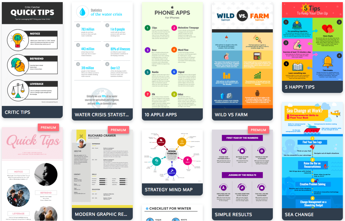
There are a lot of good reasons to incorporate infographics into your content strategy. They’re one of the most versatile types of visual content. You can share them on social media, in presentations, in blog posts, in white papers, in video—in virtually any kind of content.
At Venngage, we aim to make creating infographics as straightforward as possible, even if you don’t have any design experience.
Here is a quick rundown of how you can create and promote infographics.
1. Pick a topic people will care about and collect relevant data
Before you even dive into the infographic creation process, it’s important to have a clearly defined idea of what information your infographic will cover.
In high school english class, my teacher told us to ask ourselves this question when coming up with a thesis for an essay: so what, who cares?
Basically, it’s not enough to just create an infographics that says, “here’s the data.” You need to show people why they should care about the data.
Here are eight approaches you can take to choose an engaging topic for your infographic:
- Solve a burning problem.
- Ask your audience directly for a problem they face
- Solve a problem you’re facing yourself
- Challenge the status quo by offering a different opinion than the majority
- Reframe a popular question
- Find origin stories of popular topics
- Find extreme case studies
- Go outside of your immediate field for a topic
- Find niches and subcultures to target
- Mashup two or more topics to create a new topic
Once you know what you want your infographic to be about, collect relevant data to back up your topic. If you already have your data collected, then you’re set! But if you don’t, you will need to collect it.
There are a handful of different methods you could use to collect your data:
- Append the word “data” to the end of your search
- Append “Filetype:xls” (or xlsx, csv, or pdf) to the end of your search
- Use image search to find the sources of charts and other data visualizations
- Use an existing data repository like Data.gov or Pew Research Center
- Use Google search within a site by searching “domain: topic”
- Peruse academic resources like Google Scholar
- Conduct your own original research
The benefit of conducting your own research is that you are the primary resource for other people to reference with a link.
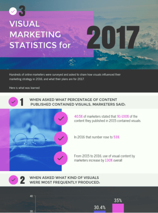
For example, for the Venngage blog, we conducted a study asking marketers how they planned to use visual content in 2017. Then we compiled our findings into a blog post and accompanying infographic.
2. Use the ICCORE method to pick your data visualizations
A lot of people find charts intimidating. But they don’t have to be. Start by figuring out what type of chart to use for your data sets.
We developed the ICCORE method at Venngage to help you figure out which charts and graphs work best for different types of data.
ICCORE stands for:
- Inform,
- Compare,
- Change,
- Organize,
- Show Relationships, or
- Explore.
Depending on what the goal of your infographic is, certain types of charts will work better than others.
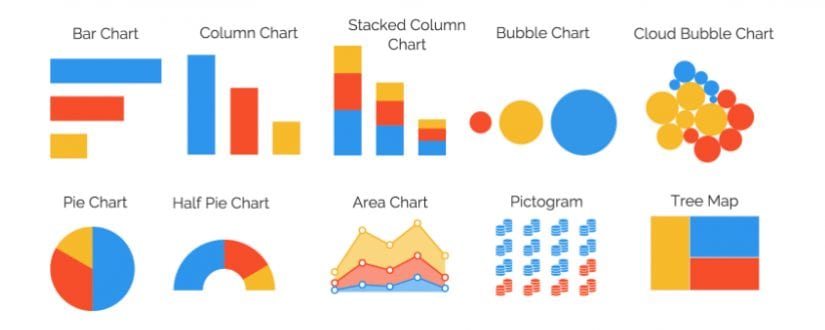
For example, if you want to compare information, charts that allow you to show data side by side works best. Such as:
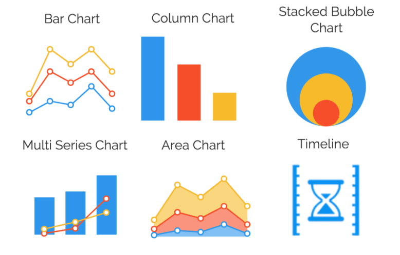
But if you wanted to show change over time, charts that allow you to visualize upward and downward trends would work better. Charts like:
The types of data visualizations you want to include in your infographic will help you pick the best infographic template for your purpose.
3. Pick the best infographic template for your data
Not all infographics are created equal. Depending on the goal of your infographic and your particular data, certain infographic templates will work better than others.
Broadly speaking, infographics can fall into six major categories:
- Statistical Infographics
- Informational Infographics
- Process Infographics
- Comparison Infographics
- Timeline Infographics
- Geographic Infographics
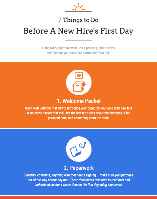
You can probably get a general sense of each one. For example, process infographics break processes down into easy to follow steps. They can do this using numbered steps, a timeline, or even a flowchart.
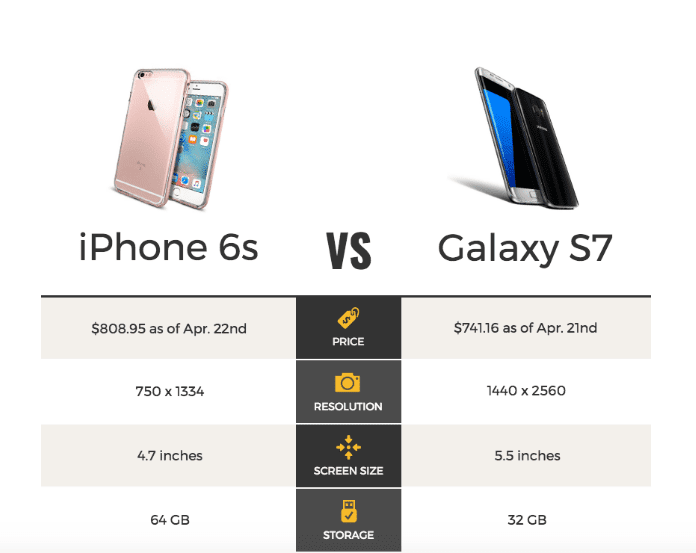
Meanwhile, comparison infographics generally show two similar sets of data side by side.
Look for a template with a layout that makes the will help you tell a story logically and effectively.
Want to read the rest of our tips, tricks and strategies for creating and promoting infographics?
I’ve only scratched the surface of how to create and promote highly shareable infographics. For a much more in-depth, step-by-step guide to creating and promoting infographics, read: Infographics For Beginners: The Ultimate Guide.
In this guide, you will get:
- In-depth, step by step instructions for how to conceptualize, create and promote highly shareable infographics
- Case studies for how to successfully use infographics
- Plenty of examples of crazy engaging infographics
- Infographic templates to get you started on your design
Read the full guide here:
