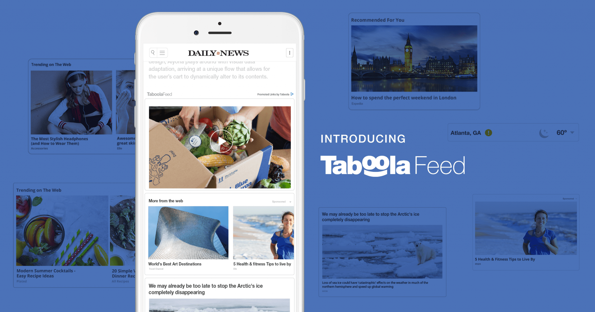
Publishers will always fight for both the attention and time of visitors, and to do so, the industry has widely experimented with different forms of infinite scroll.
The idea behind an infinite scroll of articles is that a never ending web page encourages people to spend more time on site, interact with more content, and click on more ads.
Sites like Quartz, Time and Bloomberg have adopted infinite scroll, and their executives told Digiday that they believe this experience encourages people to view more stories than pagination.
For some publishers, like Forbes, infinite scroll for articles hasn’t yet provided the benefit they were expecting.
“We understood the appeal of infinite scrolling, but there wasn’t a lot of extra browsing or consumption of stories happening after people clicked that first article. People were reading maybe one or two in the stream.”
– Lewis DVorkin, Chief Product Officer, Forbes
While it’s different for every publisher, it’s likely that the problem isn’t a user’s inclination to stop browsing, it was that the environment didn’t encourage engagement.
The type of infinite scroll that is failing publishers is the infinite scroll of articles—an endless display of long-form content often displayed in reverse chronological order. An infinite scroll of content that we know people want to see—algorithmically chosen content displayed as a teaser, as opposed to the entire article, can be more effective.
The way publishers are implementing infinite scroll of articles isn’t always conducive to a good user experience. Viewers need more variety, relevancy, and engagement opportunities.
First, publishers will focus even more on visitor intent in the future.
Those who negate the benefits of infinite scroll in its entirety might cite a specific statistic about Google:
When users search for information on Google, only 6% advance to the second page. So, 94% of users are satisfied with receiving only 10 results, which suggests that users find Google’s ranking of results to be relevant.
The idea is that if users are content with seeing ten results on Google, then they must be content with a shorter amount of articles on a page.
There’s one huge problem with this assumption—the intent of the Google user is vastly different from the intent of a user coming from almost any other channel, as is the experience they expect.
Google users are searching for something specific, and upon finding it, are less likely to be open to something new—this is not the case for everyone. Visitors linking directly to publisher sites or from other channels are more likely to consume multiple pieces of content if they are presented with the opportunity. It all depends on the user and his or her context.
Moving forward, publishers are focusing on the intent of visitors from different channels, and implementing the right types of environments for certain users.
Second, they’ll need an infinite scroll environment with a better user experience.
It’s overwhelming for users to travel down a page that’s full of infinite organic publisher content. The idea behind publishers implementing their own infinite scroll environments is that people can browse the vast ocean of information they have when on site.
The thing is, people already know in a sort of unspoken agreement that they’re not going to get to browse all of your content. So, why does it work on social sites? The environment is more engaging, more relevant and has much more variety.
Users see personalized updates, products and news, and can comment and engage with content easily. The interface has the advantages of infinite scrolling without some of its drawbacks—one of them being that users see content in a teaser format as opposed to a full article.
In addition to targeted content and variety, this type of infinite scrolling experience is better because users aren’t flying through content before your ads load.
The solution is to bring social’s diverse infinite scroll experience to the open web.
On a publisher’s site with an infinite scroll of long-form articles, users are often scrolling without purpose. On sites with algorithmically displayed content the experience is in fact, enjoyable.
This in-feed experience encourages more engagement with publisher content, and proves to be a better monetization opportunity. Infinite scroll of long-form articles loses the attention of users who might have wanted to explore your site, versus a teaser format, which capitalizes on users’ content consumption mindset and enables them to explore.
“If a user is just exploring a site with no definitive goal in mind, they often enjoy the concept of infinite scroll. It allows them to “wander” the site to find what interests them and to discover content in a leisurely manner.”
– Kristine Schachinger, MarketingLand
For publishers, this is important context to their infinite scrolling experience—those users that are open-minded and ready to browse are the ones that will thrive in these engaging environments.
We find that those users generally hang around for awhile at the bottom of the article—we’ve brought the infinite scrolling experience of social media to the bottom of the article with Taboola Feed.
Taboola Feed includes a variety of card options—from video, to newsletter subscriptions, to comment boxes and more—to keep users engaged on-site and clicking. For more information, contact us.


