Usually, my initial conversation with a media planner, digital marketer or PPC team about content goes the same—each fully believes content is valuable, but once I recommend sponsoring that content with paid media, the conversation changes.
Once media dollars enter the picture, you naturally want to stick with what you know works for you—traditional landing pages.
“I see the value of traffic on our blog for awareness goals, but right now, sales and leads are my priority.”
“We’ve seen a lot of traffic to our blog and advertorials, but the CPA is too high for us to make this work.”
“I tested sponsored content campaigns, but the ROI just wasn’t there.”
In these examples, prior experiments with paid campaigns driving traffic to content just hadn’t converted consumers, but for one reason: the content wasn’t built for performance marketing goals.
So, what content would work for your performance goals?
To answer this question, we took a look at the landing pages behind millions of Taboola campaigns running on publisher sites each month.
The result: content works best for performance marketing when your audience needs a little more storytelling.
Based on these findings, we recently laid out how to create a content strategy for performance marketing goals, which dives deeper into determining whether or not your audience is ripe for the content picking.
Assuming they are, what does content for performance marketing look like in action? Using those same results, we’ve developed best practices, relevant examples and a full-proof template for content that hits performance marketing goals every time. I’ll walk you through how to map content to your funnel, design your landing pages, and create copy that converts consumers, quickly.
Mapping content to the funnel.
Your content strategy should pinpoint an area of the funnel where your campaigns will focus, including specific goals and key performance indicators (KPIs) you need to meet.
To illustrate this, I’m going to use a basic four-step funnel, including awareness, consideration, decision and loyalty.
At each of these stages, your content will target a different persona. For the purposes of our example, we’ll work with Alex, Ana and Joseph.

Each of these people represents a general view of where a consumer could fit in your funnel, no matter the product you’re working with.
Awareness: content for impressions, traffic, completed video views and more.
Alex is our awareness stage representative. He doesn’t think he needs your product or service, has never heard of you before, or isn’t aware that your type of product or service could benefit him.
If your Alex persona is completely green to your offering, targeting him with press coverage or a video is a great start. Retargeting him with blog articles or advertorial content that captures increased time on site, a newsletter subscription or a call-to-action (CTA) for a content download or sign-up will help you hit those awareness goals.

Consideration: long-form content for sign-ups and conversions.
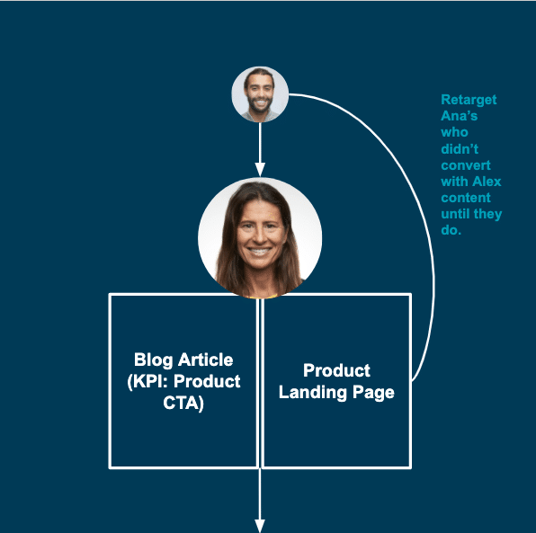
Ana is our consideration representative. She knows she needs a product or service in your category, but isn’t convinced that your solution in the one that’s best for her.
She needs more storytelling, more convincing on your part that your solution is the best one for her. Here, blog articles with strong calls-to-action (CTAs) to purchase, or longer-form landing pages can really shine.
And for those in the Alex category that didn’t convert, retarget them with Ana-specific content to move them down the funnel.
Decision: content to drive purchases.
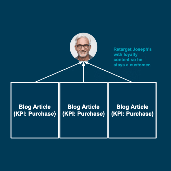
Joseph is our decision representative. He knows he wants to purchase from you, but hasn’t converted. He either forgot, or hasn’t had the opportunity to do so yet.
Stay top of mind with Joseph by targeting him with traditional product landing pages or blog articles with strong purchase CTAs throughout.

Loyalty: content to keep current and former customers purchasing.
Once Joseph has made a purchase, or has become a customer, target him with blog articles that continue to showcase your value proposition, to keep him coming back again and again.
This strategy is more easily said that done, what does this content actually look like? To illustrate this, let’s dive into three different vertical examples.
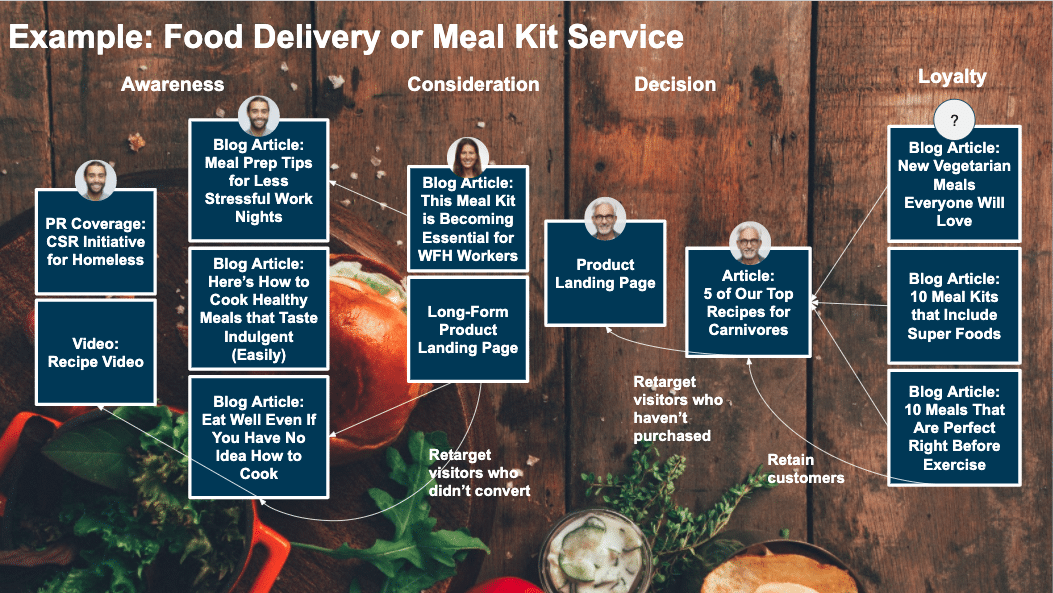
Example: food delivery or meal kits.
In the food category, meal delivery and kit services are especially hot right now as more people seek easy ways to eat at home.
For Alex, in the awareness stage, target him with content that convinces him a meal-kit will bring value into his daily life.
For Ana, in the consideration stage, target her with content that speaks to your specific offering, and why it’s the right choice for her.
For Joseph, in the decision stage, stay top of mind by targeting him with product landing pages and content that keeps him coming back for more.
Example: home & garden products.
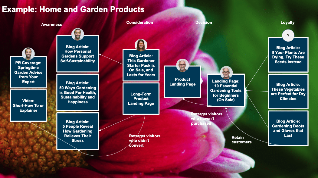
In the home category, consumers are turning towards gardening products as a way to stay busy at home.
For Alex, in the awareness stage, target him with content that convinces him gardening as whole will bring value into his daily life.
For Ana, in the consideration stage, target her with content that proves your gardening products are more valuable than others.
For Joseph, in the decision stage, stay top of mind by targeting him with product landing pages or content that alerts him whenever you have a sale, or a new product to offer.
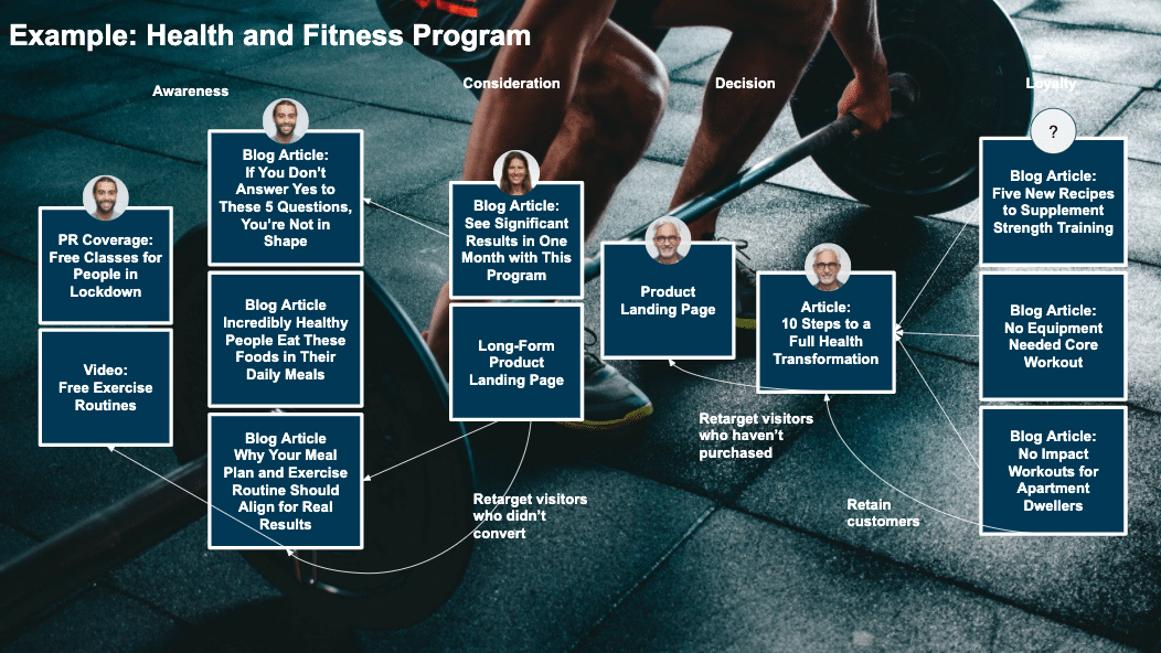
Example: health & fitness program.
Finally, let’s take fitness as an example, as people seek new ways to stay healthy and fit indoors.
For Alex, in the awareness stage, target him with content that convinces him fitness should be his priority.
For Ana, in the consideration stage, target her with content that speaks to your specific program, and convince her that she will see real results.
For Joseph, in the decision stage, stay top of mind by targeting him with product landing pages and content that keeps engaged in his fitness plan.
Competitive analysis: how to stand out.
Your content won’t be successful if you simply say the same things your competitors are saying. Without truly separating yourself from the pack, how can consumers be convinced that you’re the right choice?
A simple analysis of your competitor’s content will provide insight into where you should focus, and can be done in five easy steps.
- Identify which of your competitors is creating content. Use those competitors as a gauge to determine what your potential customers are already being targeted with.
- Determine their content strategy. Are they educating consumers? Are they focused on thought leadership? Are they strictly selling themselves with their content? If you find there’s room for more content in any of these areas, focus there first.
- Map the topics they’re covering. If you have expertise in any area that your competitors do not, lean-in there when thinking about headlines and content topics. This will help you stand out from the pack.
- Map their tone. Others might be targeting newbies in your category, and others might be leaning into the expert crowd. Find a tone that your competitors aren’t using, and be that new voice for a group of customers left-out by content that’s too amateur or too advanced.
- Find your niche. Using all of these signals, identify your niche. While you’ll likely still need to create some content similar to that of your competitors, the majority of your focus should be on content that differentiates your brand.
Once you have your map, ideas, and competitive analysis, it’s time to dive into content creation.
Taboola's Sponsored Content Checklist
Content design that converts.
Content creators often start with words before anything else. I’m here to argue that the design of your page is important to take into consideration before pen hits the paper (metaphorically).
The infographic below was created based on an analysis of millions of landing pages on the Taboola network, and illustrated all of our best practices. Here are the most important takeaways:
- Multiple CTAs. You should have a CTA a third of the way down the page. This CTA should be in-line text that links to a landing page or product page of some sort. It should explain the value proposition behind converting, with longer form text than the typical one to three word CTA. At one-third of the way through your page, users might not have heard enough of your story to convert with a harder CTA. At the end of your content, use a more traditional CTA.
- CTA placement. Don’t put CTAs on the right rail or underneath areas like the comment section of a blog article. Users won’t see them there. They should be a natural part of your article, so they’re not ignored, hence the reason we recommend in-line linked text.

Copywriting: create articles that convert (with template).
Once your article design is set up for success, dive into writing. The first step is simple, but often forgotten. The title of your article should match the promise made in the title of your ad creative.
To illustrate this process, I’ve picked on our fitness example from our mapped content funnels. The final template will always include:
- Titles that satisfy a promise
- A hook that answers that promise and entices continued engagement
- A nutgraph that reveals what you’ll cover
- CTAs made for conversion throughout
- Subtitles that are scannable
Title your post according to what you promise in your ad creative.
If this is your ad creative…
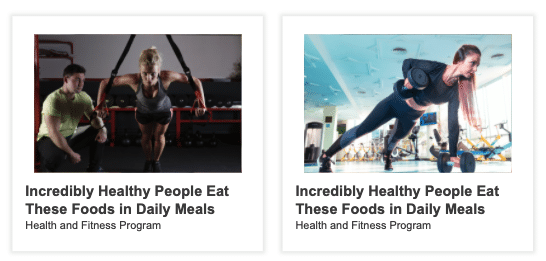
….these are examples of bad titles…
- 5 Recipes With Affordable Ingredients
- How to Cook at After a Long Day, Easily, and Healthily
- Fitness Tricks to Complement Healthy Meals
- These Belly Busting Foods Can Trim Down Your Waist
These may be good titles overall—they’re engaging and could convince a reader to continue throughout an article. But a consumer that’s clicked on the ad above will immediately bounce, because it’s clear what they were promised won’t be delivered with this content.
…and these are examples of good titles.
- Same title*
- 5 Superfoods to Take Your Health to the Next Level
- How These Ingredients Boost Health and Fitness
- These Secret Ingredients Boost Health and Strength All in One
Write a hook that fulfills the promise made in your title, in an enticing way.
Your hook is what convinces the reader that they indeed will read about what they were promised, and also makes them excited to do so.
Working with the title, “Incredibly Healthy People Eat These Foods in Daily Meals,” these are bad hooks….
“The best foods to eat to boost your health are nutritionally dense, and include a high volume of vitamins, fiber and proteins.”
“Jenny lost 10 pounds and increased her max bench by 15 pounds in just one month when she started this new program.”
The first hook answers our promise, but isn’t enticing, while the second is enticing, but has nothing to do with the promise we’ve made in the title—to showcase foods healthy people eat everyday.
…and these are good hooks…
“Jenny has a sweet tooth—which she satisfies every day while still making progress on her weight loss and strength goals. She incorporates naturally sweet superfoods like sweet potatoes and blueberries into her daily meals.”
“You probably already have these superfoods in your pantry—you simply need the tools to incorporate them into your diet more regularly.”
These examples accomplish both goals of enticing the reader, and ensuring them that the content they wanted to read is coming their way.
Nutgraph’s that get to the point, and don’t drag the reader on.
A nutgraph is term journalists use frequently. It’s a one to three sentence paragraph that sums up the entirety of the article. It’s a misconception for some marketers that you shouldn’t reveal the purpose of your article until the end of the post, and you should slowly entice a reader to read the whole piece.
This annoys most consumers, and will cause them to leave the page.
If a consumer has read this hook: “You probably already have these superfoods in your pantry—you simply need the tools to incorporate them into your diet more regularly,” then this is a bad nutgraph….
Your current meal plans aren’t working hard enough on your behalf. You need new ingredients to truly reach your goals. We’ll show you the foods that work hard for your body.
This nutgraph is a waste of consumer’s time, and doesn’t provide value beyond what they’ve already learned in the title and hook.
….and this is a good nutgraph…
With just a few added ingredients, or tweaks to your current meal plan, you can improve your overall health and strength. Including ingredients like avocados, sweet potatoes, blueberries, kale, salmon and others in your regular diet will not only help you hit your weight loss and strength goals, but also leave you feeling more energized and healthy overall.
Here, you’ve satisfied their curiosity about the coming article, and they know what they’re getting.
CTAs that work: subtle CTAs that convert users that aren’t done reading yet.
Your first CTA should be place one-third of the way down the page, and presented as in-line text, so as to not disrupt the consumer that wants to continue reading.
Using our nutgraph example above, these are bad CTAs…
- Sign Up For Our Program
- Get the Meal Plan
- Sign Up For 50% Off Our Program
At this point, this consumer hasn’t heard enough of your story to convert with short CTAs like this.
…These are good CTAs that do a bit more convincing at this point….
- Let Us Incorporate these Superfoods for You, Sign up for our Program
- Sign up for our Program for Meal Plans that Incorporate Superfoods
- Download our Recipe Plan When You Sign up for our Program
Subtitles that discourage readers from bouncing.
Before making the leap to start reading, consumers will scan the page first. Our data shows that once pages load, they scroll all the way down then back up again, before deciding to bounce or read through each piece.
This means your subtitles throughout need to explain to your consumer exactly what they’ll get from reading the piece.
Following our in-line CTAs above, these are bad headers…
- Vegetables that Energize
- Healthy Fats to Fill You Up
- Proteins that Keep Disease at Bay
…these are good headers that do a better job explaining the piece more thoroughly…
- Vegetables That Energize: Kale, Sweet Potatoes and More
- Healthy Fats to Fill You Up: Beans, Nuts and More
- Proteins That Keep Disease at Bay: Salmon, Sardines and More
Final CTAs that convert consumers post-storytelling.
Unlike your in-line CTA, your final CTA can be more aggressive. Consumers that have read through an entire article are more likely to respond to direct, short CTAs.
After reading through our sections above, these CTAs would be considered bad….
- Make Incorporating These Foods Easy
- Register For Our Program to See Recipes
- Use These Foods to Boost Fitness Progress With Our Program
…while these good CTAs would further hit these goals.
- Sign Up For Our 6-Week Program
- See Real Results: Sign Up For Our Program
- Sign Up For Our Program Today
I’ve collected this entire content brief in here, for you to copy and use for any article you’re creating for performance KPIs.
Examples of content for performance marketing at every stage of the funnel (with links).
I always find it helpful to start with something to emulate. These performance marketing examples leverage content to hit their respective KPIs.
Awareness examples.
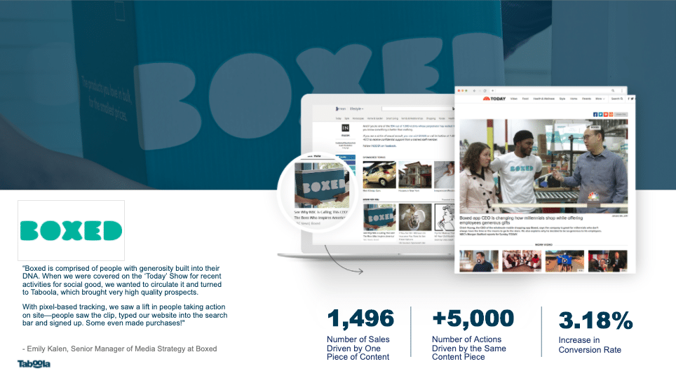
Boxed promoted this Today.com press coverage and used pixel tracking to discover that after reading the piece, consumers searched for their company and made purchases.
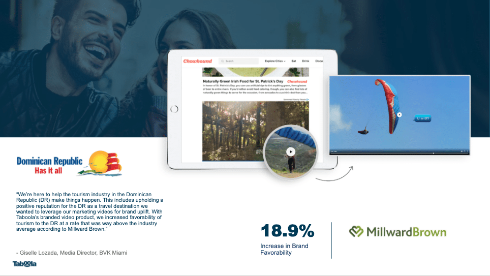
The DR Ministry of Tourism ran this video, and found that afterwards consumers were more favorable towards the destination, effectively moving consumers down the funnel.
TUI Group used their editorial portal, Passenger 6A, to publish blog articles like this one promoting travel to India. The campaign successfully drove bookings beyond their expectations. They used in-line CTAs throughout that pointed to a more traditional landing page, where consumers successfully converted.

Consideration examples.
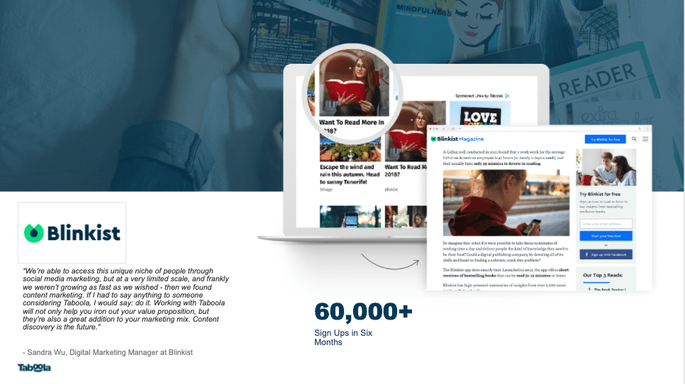
Blinkist is an education app that summarizes long-form fiction content. They needed a bit more storytelling to explain their value to consumers. With articles like this one published on Blinkist magazine, they successfully saw more app downloads.
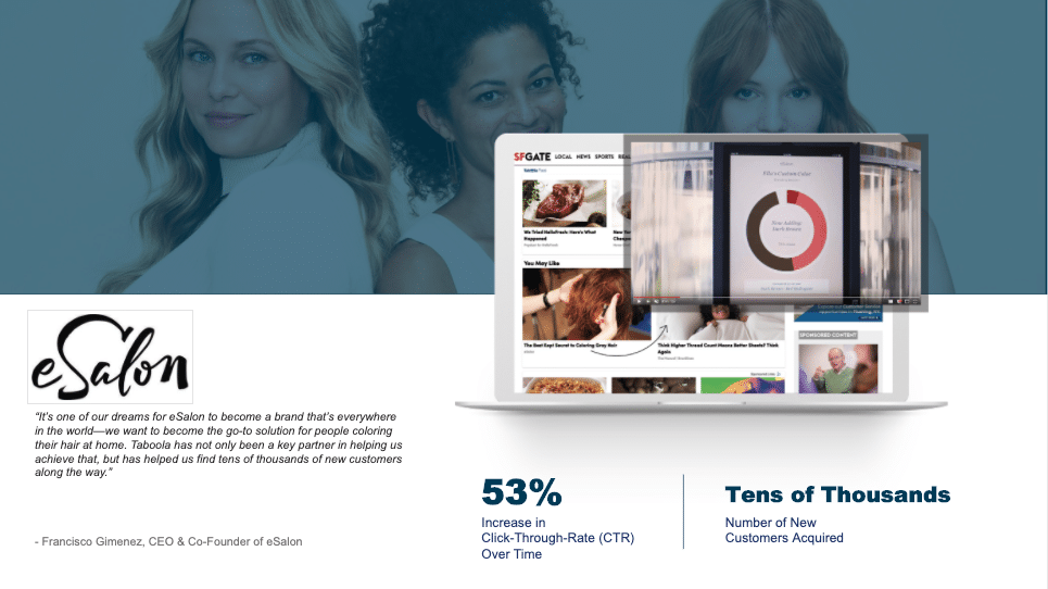
eSalon provides custom DIY hair color solutions for consumers. Articles like this one helped them explain their story a bit more thoroughly, resulting in more purchases.
Decision examples.
Honda used a more traditional landing pages like this to target consumers already looking for a dealer, increasing dealership searches in Australia.

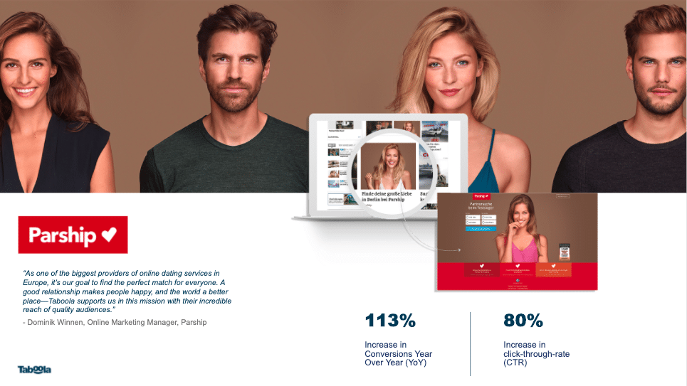
Finally, dating app Parship used more traditional landing pages like this one to successfully capture app downloads from those already looking to break into online dating.
Conclusion: content works for performance marketing goals, when it’s created with performance in mind.
Content has its place in the performance marketing toolkit—and it’s especially useful in times when your target audience needs a little bit more storytelling or convincing before they’ll convert.
Following these basic principles—mapping content to your funnel, designing your landing pages for success, and copywriting with conversions in mind—will fuel your performance marketing channels with new success, easily.