As part of the optimization team at Taboola, we are constantly working with publishers and conducting AB tests, to find the best user interface (UI) for our widget. In doing so, we improve sponsored content (SC) revenue per mille (RPM).
When we dealt with a very large news site in India, as part of an ongoing optimization, we needed to get a bit creative.
We were already implementing our best practices for our widget on the publisher homepage — so we came up with a different solution. We tested a native UI, one that would help blend the widget into the design of the page.
User Behaviour on the Homepage
Unlike article pages, where users come to read an article, and then sometimes leave after finish reading it, a user who enters a homepage directly will sometimes scan it from top to bottom to find something to read. When they finish reading everything interesting a Taboola widget with additional reading material at the bottom of the homepage could be a good idea.
This behaviour of scanning the homepage until reaching the bottom of the page, can be related to our brain’s tendency to need to finish what it starts, as Russian psychologist Bluma Zeigarnik talks about in a 1927 study.
Our widget location on the client’s homepage was the 3rd row from the bottom of the page — a sometimes unattractive location that can be easily missed when scrolling down.
So, our first step was to test placing our widget at the far bottom of the page. That way users will see it when they reach the bottom. This generated a conclusive 4 percent uplift in SC RPM — but we didn’t stop there…
AB Testing a Dark Background
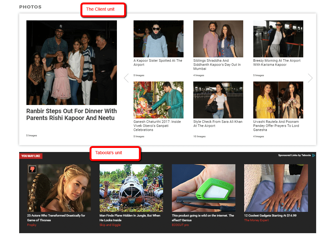
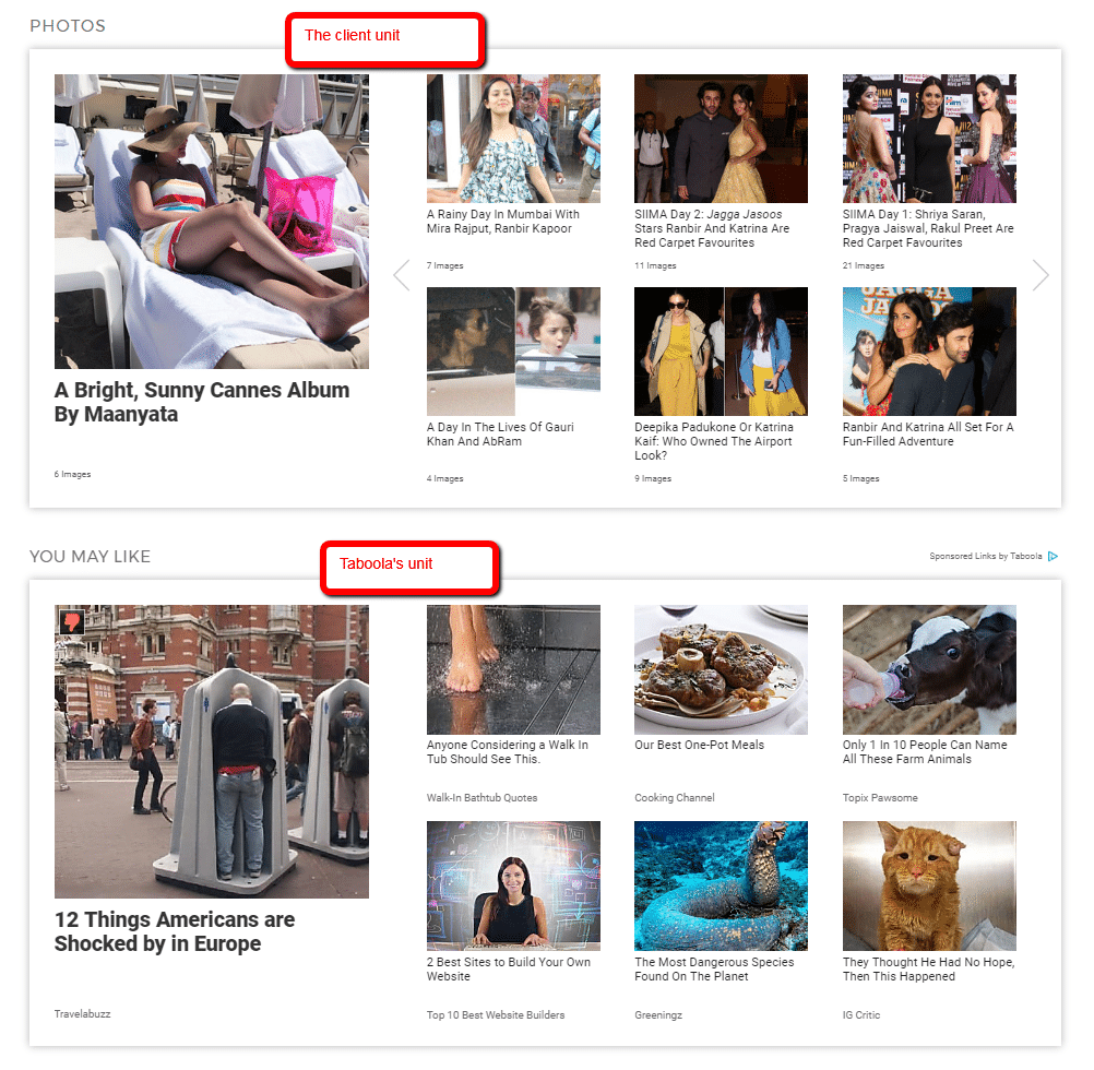
Atop the new location, there was a photo gallery surrounded by a dark background.
Since a dark background on a white page causes high contrast that attracts the eye, we decided it could be interesting to add the dark background to our widget as well. We wanted to mimic the exact UI, font style, text color, etc.
This spiked the SC RPM by 40 percent.
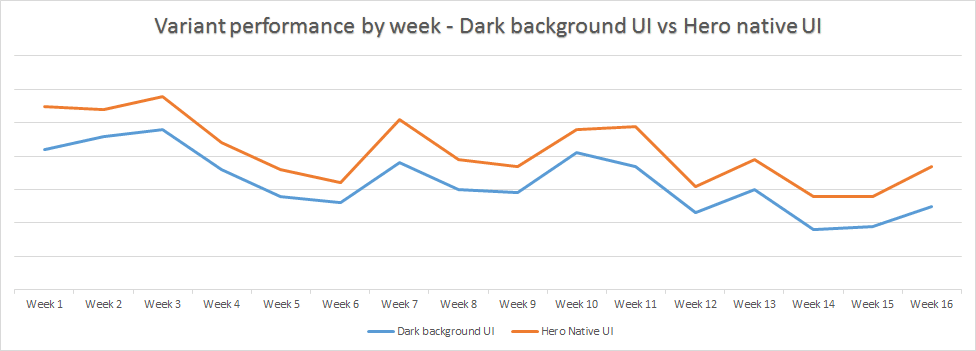
Trying Out a Hero Image
After a few months, we were suddenly faced with a new challenge — The client changed the entire homepage design in order to bring in more content cards. The dark gallery above was completely changed, and our widget was a complete stranger on the site.
Since mimicking site design had worked previously, we again A/B tested a design, like the unit that was placed above ours — a unit with one large image, commonly referred to in the industry as a Hero image, and 6 smaller images to the right. There was also a subtle gray shadow around it. This generated a 20 percent uplift.
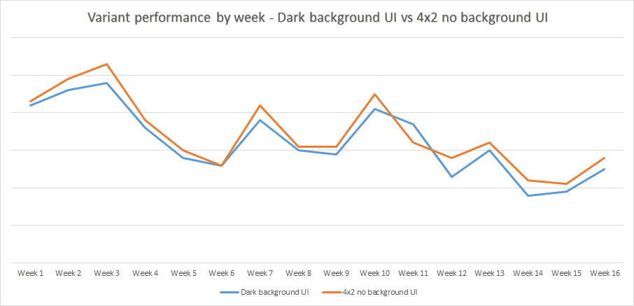
Size matters? Adding a control variant
After seeing the SC RPM increase, and examining the homepage layout, we realized we had missed an important step along the way.
By mimicking the Hero unit, we increased the size of our widget by almost 50 percent. So, what caused the RPM uplift? The size, or the UI?
If we tested Taboola’s best practice widget, but with the same size as the Hero unit, would it perform better?
To measure this, we added two additional variants:
A regular 4×2 widget — almost the same size as the Hero unit — and a variation of it, with a light shadow surrounding the widget, mimicking the shadow surrounding the client’s unit. Below is an example:
Variant 1: 4×2 widget – generated 6 percent uplift
Variant 2: 4×2 widget, with surrounding shadow to mimic the client’s unit – generated 7 percent uplift
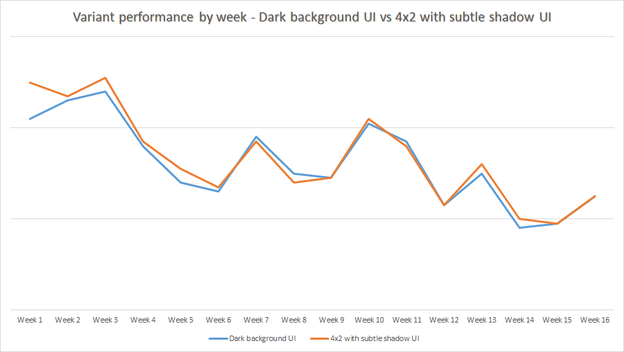
Both variants, though successful in results, gave a smaller uplift compared to the variant that looked most like the site’s design. This proved that it wasn’t just increasing the size of the widget that helped.
Outcome:
After viewing the results, the client agreed to change the previous, dark background unit to the new Hero design.
Before:
After:
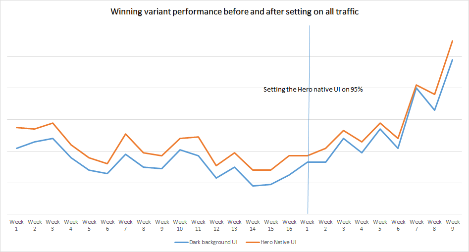
After keeping the old UI on 5% traffic in order to measure the long term effect of the new UI, we still saw a conclusive and positive uplift of 12%
AB Testing Conclusion
Using A\B testing to compare between two different designs is an amazing tool that can help Taboola explore and identify what works best for publishers and what should be avoided, thus improving performance.
Don’t be afraid to take chances and test new and innovative designs.
You’ll never know unless you try.