Taboola is one of the largest content recommendation companies in the world. We maintain hundreds of servers in multiple data centers around the world, while obligated to strict SLAs. Thus, you might understand why our engineers would appreciate a little heads up when the system gets overloaded. Like most companies today, we use metrics to visualize our services’ health, and our challenge is to create an automatic system that will detect issues in multiple metrics as soon as possible, without any performance impact.
A real life example
Wouldn’t it be nice if we could predict the impact on our response time metric when major events are about to happen? For example “Black Friday”, “Cyber Monday” or even the “Kobe Bryant’s tragedy”, on the 26/1/2020? – as can be seen below:
Figure 1: Kobe Bryant’s downtime 26/1/20
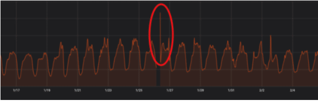
And yes – the gap with no metrics around the 26/1 is the downtime we had …
Our current anomaly detection engine predicts critical metrics behavior by using an additive regression model, combined with non-linear trends defined by daily, weekly and monthly seasonalities, using fbProphet. Today, we get a single metric as an input and predict its behavior for the next 24 hours. Lately, we became interested in predicting the health of our entire data center based on multiple metrics given as an input to the anomaly detection engine. The motivation is to solve the common use case of an anomaly being detected in one metric – but there is no real issue, where multiple anomalies in several different metrics might indicate with higher confidence that something is wrong.
Can we do better?
In this blog, we will describe a way of time series anomaly detection based on more than one metric at a time. Our demonstration uses an unsupervised learning method, specifically LSTM neural network with Autoencoder architecture, that is implemented in Python using Keras.
Our goal is to improve the current anomaly detection engine, and we are planning to achieve that by modeling the structure / distribution of the data, in order to learn more about it. In our case, we will use system health metrics and we will try to model the system’s normal behavior using the reconstruction error (more on that below) of our model. If the reconstruction error is higher than usual we will define it as an anomaly.
Anomaly detection can be modeled as both classification and regressions problems. In classification we usually need tagged data (at least for some of the samples) and then we train the model to distinguish between samples labeled as normal vs those tagged as anomaly. In our case, we do not have labeled data. So we chose to model the problem as a regression problem where we try to quantify the reconstruction error of the model. Our hypothesis is that repeated events are easy to reconstruct since the system is mostly healthy, and healthy events are abundant while unhealthy events are rare. Thus, the higher the error, the more confident we can be that the current sample is an anomaly.
Some preprocessing for breakfast
Let’s start by examining our dataset, as you can see in Table #1 below there are 6 different important system health metrics. These metrics differ from one another in scale.
| Datetime | Requests rate | Requests rate in a 5 minutes window | Failed requests
rate |
Successful requests rate |
Request response time p95 (ms) | Request response time p99 (ms) |
| 04.11.2020 0:00 | 8,783 | 8,842 | 142,618 | 7,983 | 310.40 | 398.37 |
| 04.11.2020 0:05 | 9,971 | 10,307 | 170,124 | 7,319 | 306.07 | 399.30 |
| 04.11.2020 0:10 | 9,798 | 9,836 | 152,490 | 7,331 | 304.69 | 395.92 |
| 04.11.2020 0:15 | 9,879 | 9,939 | 153661 | 7,617 | 308.57 | 404.71 |
| 04.11.2020 0:20 | 10,086 | 10,158 | 153,972 | 7,188 | 306.93 | 400.64 |
Table 1: Example of our dataset. The metrics that were used as an input to our LSTM with Autoencoder model, and were calculated over the entire data center, each data center holds >= 100 servers.
We chose to normalize the dataset by using min max scaler:
# Python
# ensure all data is float
values = values.astype('float32')
# normalize features
scaler = MinMaxScaler(feature_range=(0, 1))
scaled = scaler.fit_transform(values)
And here is the dataset after normalization:
| Datetime | Requests rate | Requests rate in a 5 minutes window | Failed requests
rate |
Successful requests rate |
Request response time p95 (ms) | Request response time p99 (ms) |
| 04.11.2020 0:00 | 0.37637 | 0.38709 | 0.34508 | 0.27990 | 0.26912 | 0.0533 |
| 04.11.2020 0:05 | 0.42730 | 0.45124 | 0.41163 | 0.25659 | 0.26165 | 0.05412 |
| 04.11.2020 0:10 | 0.41988 | 0.43063 | 0.36896 | 0.25701 | 0.25927 | 0.05127 |
| 04.11.2020 0:15 | 0.42334 | 0.43511 | 0.37179 | 0.26704 | 0.26598 | 0.05867 |
| 04.11.2020 0:20 | 0.43223 | 0.44470 | 0.37255 | 0.2520. | 0.26314 | 0.05525 |
Table 2: Example of the normalized dataset, after using min max scaler.
Choosing a model or where the fun begins…
We decided to use LSTM (i.e., Long Short Term Memory model), an artificial recurrent neural network (RNN). This network is based on the basic structure of RNNs, which are designed to handle sequential data, where the output from the previous step is fed as input to the current step. LSTM is an improved version of the vanilla RNN, and has three different “memory” gates: forget gate, input gate and output gate. The forget gate controls what information in the cell state to forget, given new information that entered from the input gate. Our data is a time series one, and LSTM is a good fit for it, thus, it was chosen as a basic solution to our problem.
Since our goal is not only forecast a single metric, but to find a global anomaly in all metrics combined, the LSTM alone cannot provide us the global perspective that we need, therefore, we decided to add an Autoencoder.
Figure 2: The Autoencoder architecture
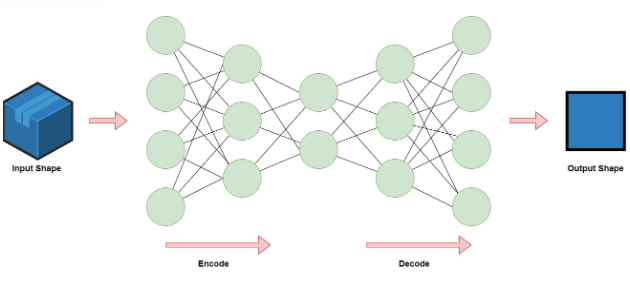
An Autoencoder is a type of artificial neural network used to learn efficient data encodings in an unsupervised manner. The goal of an autoencoder is to learn a latent representation for a set of data using encoding and decoding. By doing that, the neural network learns the most important features in the data. After the decoding, we can compare the input to the output and examine the difference. If there is a big difference (the reconstruction loss is high) then we can assume that the model struggled in reconstructing the data, thus, this data point is suspected as an anomaly.
The LSTM Autoencoder is an implementation of an autoencoder for sequential data using an Encoder-Decoder LSTM architecture. By using this model we can have the benefits of both models.
Lunch time
The LSTM Model
#Python
self.model.add(LSTM(units=64, input_shape=(self.train_X.shape[1],self.train_X.shape[2])))
self.model.add(Dropout(rate=0.2))
self.model.add(RepeatVector(n=self.train_X.shape[1])
self.model.add(LSTM(units=64, return_sequences=True))
self.model.add(Dropout(rate=0.2))
self.model.add(TimeDistributed(Dense(self.train_X.shape[2])))
self.model.compile(optimizer='adam', loss='mae')
Fit
self.history = self.model.fit(self.train_X, self.train_y, epochs=50, batch_size=72, validation_split=0.1, shuffle=False)
For training we’ve used features as the health metrics described above, and we aimed to predict what would be the data center health in the near future.
Let’s focus on line #9:
- train_x is a vector containing the server health metrics at some point of time.
- train_y is a vector containing the same metrics at a later point in time.
Note: We are using shuffle=False in line #9 because in a time series data the order is important.
Predict
# Python
X_test_pred = self.model.predict(self.test_X)
test_mae_loss = np.mean(np.abs(X_test_pred - self.test_X), axis=1)
test_mae_loss_avg_vector = np.mean(test_mae_loss, axis=1)
For our “Reconstruction error” we used Mean Absolute Error (MAE) because it gave us the best results compared to Mean Squared Error (MSE) and Root Mean Squared Error (RMSE). In both MSE and RMSE the errors are squared before they are averaged, this leads to higher weights given to larger errors. This causes the model to be more sensitive to noise which might cause false positives. Since our data is noisy by nature, we defined (a business decision) that an “anomaly” is a spike or a trend that is lasting at least 10 minutes. Therefore, in this model we needed a loss function that is more “forgiving” to small spikes in a feature or two.
With that in mind, let’s start plotting!
Static threshold
The simplest way of deciding what is an anomaly could be: “anything greater than a fixed threshold considered to be an anomaly, otherwise normal”.
Figure 3 presents the reconstruction error, which is being measured by the mean absolute error (MAE). In addition, we plotted a static threshold which is calculated as the overall mean + 2 std steps of the MAE on the entire trained data. In figure 4 we can see the points that are detected as anomalies according to the static threshold defined, plotted over the total success request rate actual data.
Figure 3: Mean loss over time with a static threshold
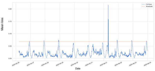
Figure 4: Total success request rate anomalies, using a static threshold
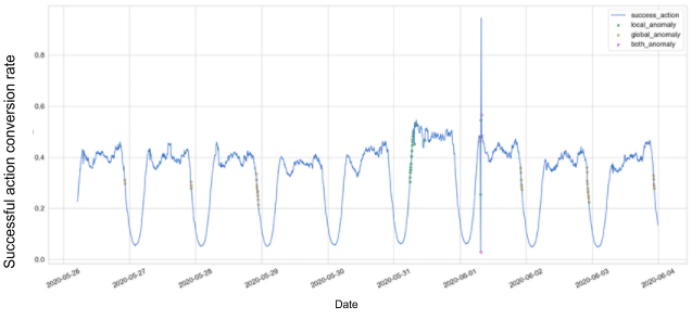
We differentiate between two types of anomalies: A local anomaly (green points) is triggered when a single metric loss crosses a threshold, and a global anomaly (yellow points) is triggered when the mean loss of all metrics cross a threshold (which is lower than the local anomaly threshold). When both local and global anomalies are triggered, we colored it as pink.
Dynamic threshold
Figure 4 is noisy and full of anomalies while we know they are not. The “noise” is seasonality, which made us realize we should use a dynamic threshold which is sensitive to the behavior of data.
We can change the static threshold by using rolling mean or exponential mean, as presented in the graph below.
Figure 5: Loss over time with static and dynamic thresholds
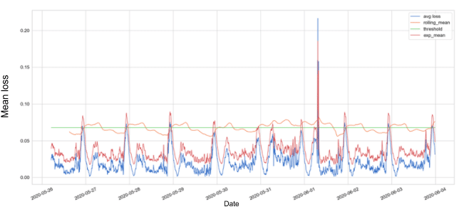
Figure 5 presents the mean loss of the metrics values with static threshold in green, rolling mean threshold in orange, and exponential mean threshold in red.
We decided using the EMA (i.e., Exponential Moving Average) threshold for detecting anomalies.
The alpha is the smoothing parameter. Higher alpha values will give greater weight to the last data points, and this will make the model more sensitive.
Following, are the results using the EMA on the total successful request rate metric.
Figure 6: Total successful request rate anomalies
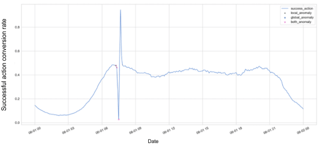
Success! The exponential mean threshold is less noisy and here we predicted a major
drop in successful action conversion metric 30 minutes before the disaster really happened!
Better be smart than right
While implementing the LSTM model, we tried two different strategies, the Batched model and the Chunked model.
- Batched model
This model gets all the data at once, splits it into train and test sets.
The bigger the batch – the more accurate the model, but more expensive in resources and prune to drifts and changes in the data. - Chunked model
This model gets the data in small chunks (e.g., 5 minutes chunks) and is being updated online. This model can sometimes be less accurate than the batched model but it is much more dynamic.
In sum,
We recommend using the batched model when conducting a POC in order to estimate how good the model is. In production, the data mostly comes in a stream, thus the chunked model is better.
The Golden Model for desert ?
The following parameters were chosen by us to create the best model using the above architecture.
- train_size = 0.7
- epochs = 50
- batch_size = 72
- n_nodes = 64
- time_steps (how many time steps ahead we want to predict, each time step stands for 5 minutes, so 6 time steps = prediction of 30 minutes ahead) = 6
- prediction_size (how many days ahead we want to present in our prediction graph) = 1
We are on Github!
Acknowledgements
This blogpost was created by Michal Talmor and Matan Anavi, undergraduate students from the Software and Information System Engineering at Ben-Gurion University, who were mentored for four months in the Starship internship program by Taboola mentors Guy Gonen and Gali Katz.